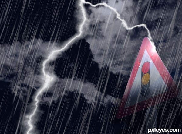
only outside source is the sky, which is a photo of my own. For the rain I created a brush myself (5 years and 3334 days ago)
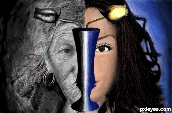
Two images were clubed part by part.Both of them were a bit posterized.Image on the right side was photo filtered with a variety of orange colour.Mainly brush tool was used to paint.Pen tool was used to select the vase.A little blur effect was given.
Sorry guyz nothing from source 2 was used. (5 years and 3544 days ago)
the idea is quite nice...
good work...
Please post your valuable comments. 
I think the blending of the two images needs attention where they meet in the middle. Lovely idea thought!
It's a nice idea, but I suppose source 2 is not valid (from blogs).
Source 2 is from blog. Please read http://www.pxleyes.com/blog/2009/06/how-and-where-to-find-legal-source-images/
I think you need to pay more attention to the size of the faces, it would be more effective if they line up well and look like the same person aged and un-aged.
thanq for ol da comments...
@raytedwell:-I thot tht when one gets old their face shrinks 
Howdie stranger!
If you want to rate this picture or participate in this contest, just:
LOGIN HERE or REGISTER FOR FREE
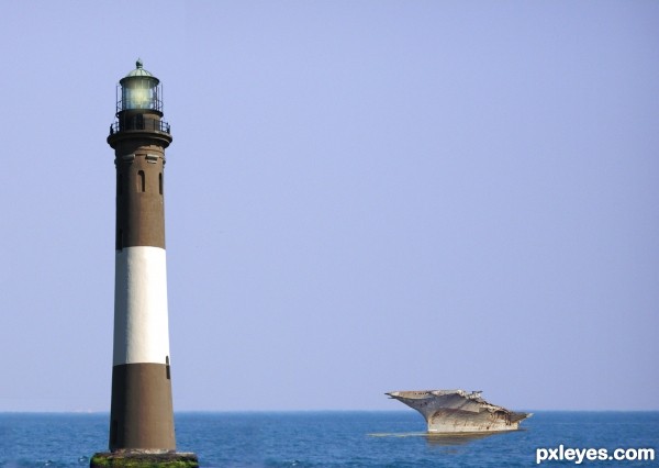
This is the transcript of an actual radio conversation of a US naval ship with Canadian authorities off the coast of Newfoundland in October, 1995.
Radio conversation released by the Chief of Naval Operations on November 10, 1995.
Americans: Please divert your course 15 degrees to the North to avoid a collision.
Canadians: Recommend you divert YOUR course 15 degrees to the South to avoid a collision.
Americans: This is the Captain of a US Navy ship. I say again, divert YOUR course.
Canadians: No. I say again, you divert YOUR course.
Americans: THIS IS THE AIRCRAFT CARRIER USS LINCOLN, THE SECOND LARGEST SHIP IN THE UNITED STATES' ATLANTIC FLEET. WE ARE ACCOMPANIED BY THREE DESTROYERS, THREE CRUISERS, AND NUMEROUS SUPPORT VESSELS. I DEMAND THAT YOU CHANGE YOUR COURSE 15 DEGREES NORTH, THAT'S ONE FIVE DEGREES NORTH, OR COUNTER-MEASURES WILL BE UNDERTAKEN TO ENSURE THE SAFETY OF THIS SHIP.
Canadians: This is a lighthouse. Your call. (5 years and 3553 days ago)
Having been a navigational radar technician on board a US Navy Aicraft carrier I can truly appreciate the humor in this! Well, I guess anybody could. I just like saying all of that.
Not a true story (per snopes.com) but a very funny video.
http://www.youtube.com/watch?v=ePi4dieDS8Y
Did it really happen? Oh my... I'm cracking up with that! 
I have heard this 'joke', good job illustrating it, tho the ship's water could be blended a bit better. You 'got it', tho, author!

Dang Canadians are a stubborn lot :P lmao this is a good one
i know this one....GREAT...
Howdie stranger!
If you want to rate this picture or participate in this contest, just:
LOGIN HERE or REGISTER FOR FREE
(5 years and 3563 days ago)
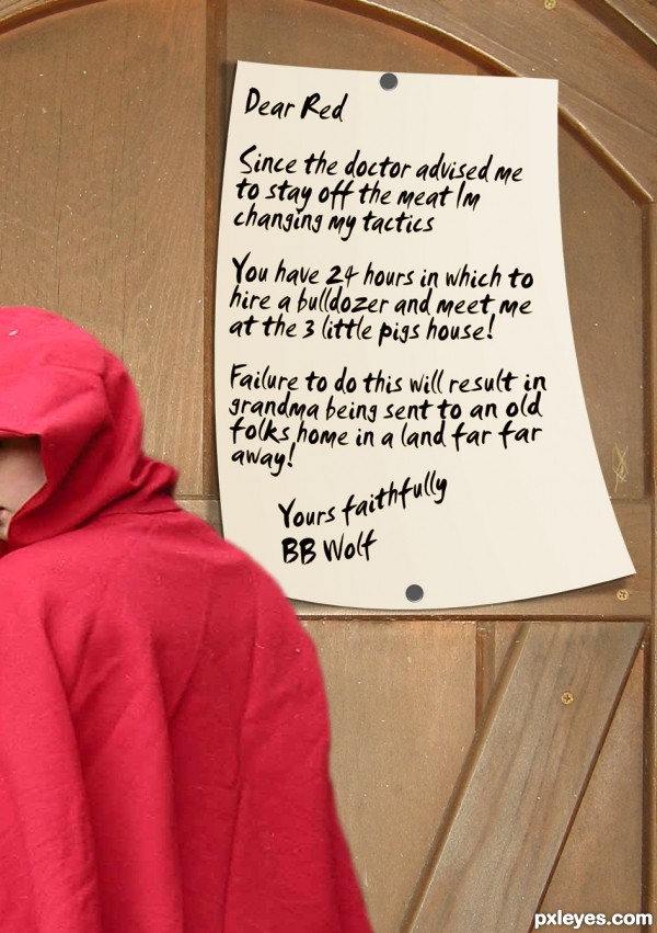
 Wolf's diet will fail... wait a minute? Didn't doc prohibit wolf by eating pork? Only human meat?
good work

Howdie stranger!
If you want to rate this picture or participate in this contest, just:
LOGIN HERE or REGISTER FOR FREE
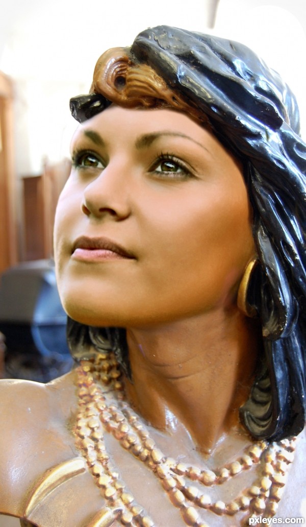
Thanks patkisha
Masked the face
Clone the background to cover bit of distracting background
Used colour adjustment to correct neck colour
Curves to brighten the necklace
(CS3 & Tablet) (5 years and 3587 days ago)
nice blend!! noticed a spot above the eye (subject's right eye) that could use a little touch up.. and a small spot on the neck has some color bleeding through
wow! love it.
Great blending! Keep up the good work! GL
Would be better to match the colors of the new face & old chest.
nicely done!
Made colour adjustment -- thanks CMYK
Beautiful job . . . . Nice blending . . . . GL to u author . . . . 
very good work.good luck
great job author...maybe to add a bit more plastic wrap on her face to match better with the hair...any how this is great work...good luck
great job ! awesome blending 
Really nice blended. I just don't know how to react... I mean she is really beautiful... Does that mean i like him? Or her... Or him... Or... Hmmm... Awkward... :O Heh
Good choice to follow CMYK's advice. Looks better. Good blending and one of the better entries. GL!
it is great but you can try to make it a little more plastic, i think it will be better. good luck
Interesting... 

Howdie stranger!
If you want to rate this picture or participate in this contest, just:
LOGIN HERE or REGISTER FOR FREE
The sky is too desaturated. It should have some blue to it, rather than just B&W.
thank you for pointing that out. I slightly colored the sky blue, I wouldn't want to overdo it, as it's supposed to be a dark, rainy night.
Nice idea author....and good mood but demands a bit more work...first thing is if thunder hits sign there would be way bigger spark and lightening there...also u could create a bit softer rain with smaller but brighter rain...sorry for the nit picks...
Nice, but agree with above. The sign looks washed out for a lightening strike, a little more saturation would give it a stronger effect IMHO
Howdie stranger!
If you want to rate this picture or participate in this contest, just:
LOGIN HERE or REGISTER FOR FREE