(5 years and 1322 days ago)
(5 years and 3674 days ago)
Fix your source link. It takes me to the log in page. on SXU.
Interesting.
We can't see the original image... 
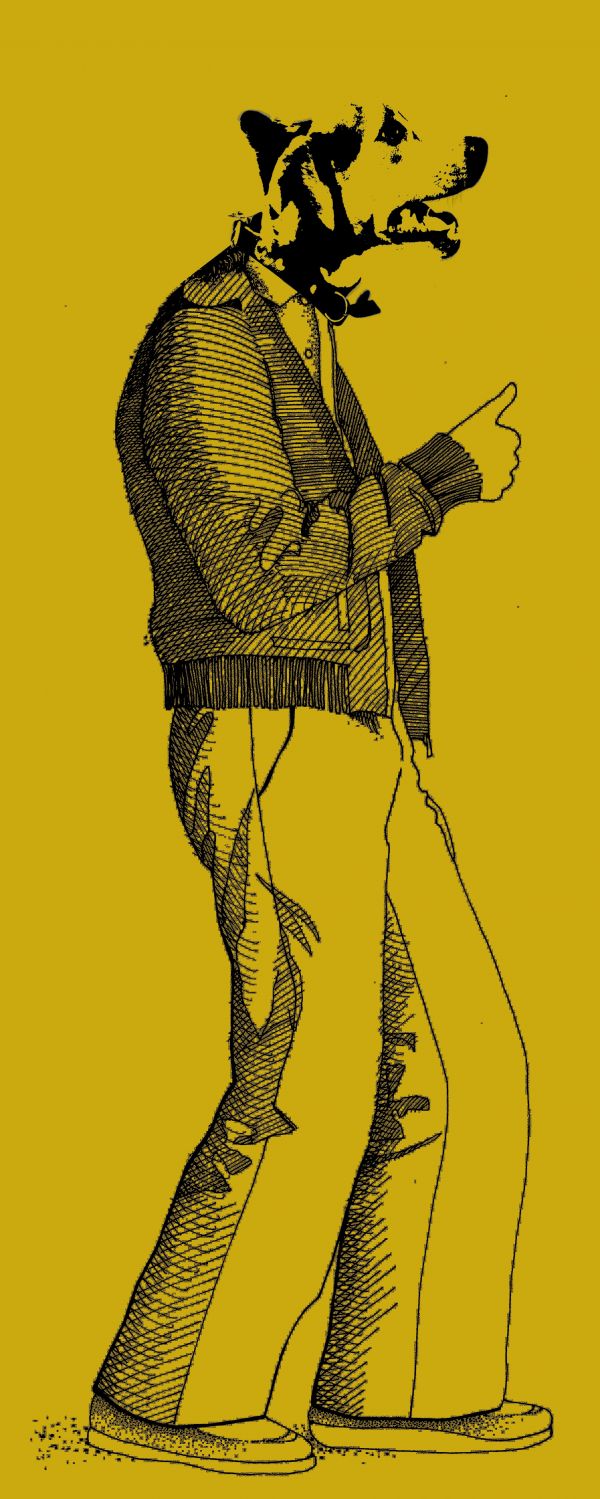
Head doesn't match the line style of the body...
Howdie stranger!
If you want to rate this picture or participate in this contest, just:
LOGIN HERE or REGISTER FOR FREE
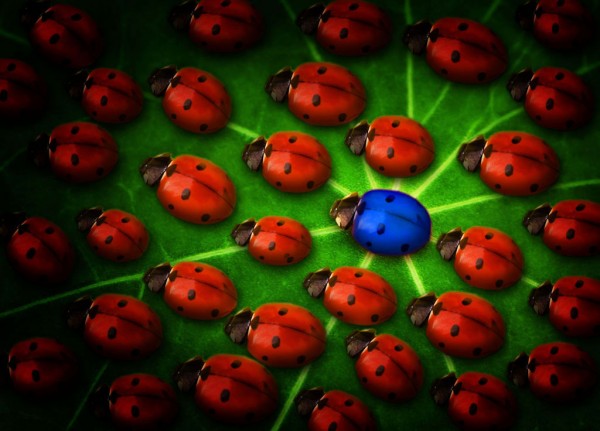
Originally I changed the spots on ladybugs, but eventually decided to leave them like they are.
Hope you like. =) (5 years and 3772 days ago)
Very nice idea, i like the difference in size and orientation. Great job!
Thanks! =)
Maybe give it more light, the vignette makes it very dark...
Nah, when I brighten it it looks to contrasted, and when I remove the vignette, it looks bad... I'll brighten it just a liiiiittle bit cause you're right about it being to dark =)
EDIT: Done. did +20 to the brightness, and it looks OK to me now. =)
Nice work! But a suggestion: instead of using a new layer filled with pure black, try to use, on this new layer, a very large soft black brush with 10% opacity, applying half of its diameter, or less, around the image border until you get satisfied with the result. You can always use the eraser tool with the same settings. It'll give you more control on your work and it'll look more natural  Good luck!
Thanks Divair! I'll make sure to try it out with this image and update it if needed. =)
Nice
Great message and nicely done. I like that you took the time to make them different sizes etc. 
Thanks. =) I also changed the spots on each one at first, but then I decided to leave them all the same, since it kinda fits the title even better. =) Tho, maybe I should've changed the spots on the blue one....? Nah, nevermind =)
Very nice idea,lighting is very good,maybe to make upper right corner a bit lighter because is closer to the central bug then lower left,and u have the same lighting on both sides...Beside that very nice final result...good luck author
Nah, I actually like the kinda 'asymetry' of the lighting compared to the blue bug.... The bug is already in the centre of attention. 
The vignette was done well and I think it puts more focus on the blue one. Well done and good luck. 
Thanks. =)
Howdie stranger!
If you want to rate this picture or participate in this contest, just:
LOGIN HERE or REGISTER FOR FREE
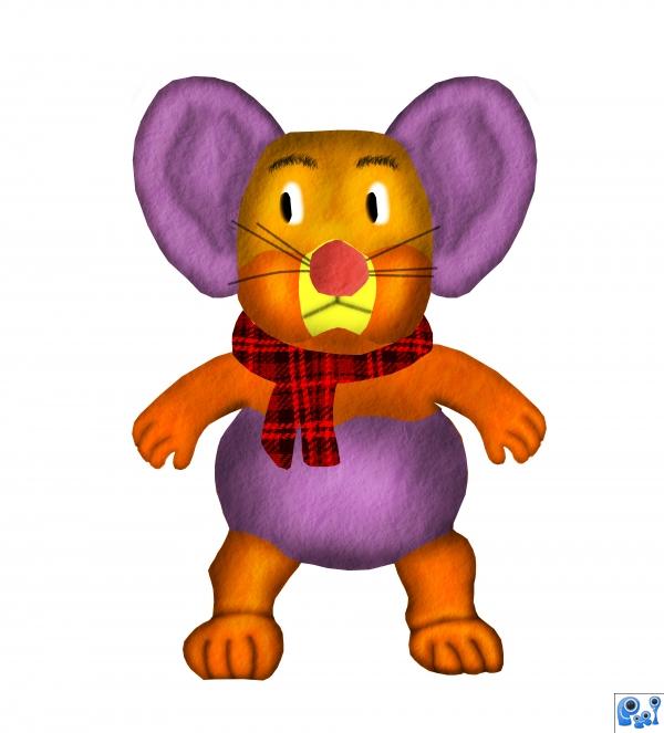
i didnt have time to finish my idea.. (5 years and 3797 days ago)
so cute would be great with a background
Very nice,eyebrows are fabulous.Its to bad why u dont have background for this little guy....
cute mouse. nice scarf. I just hate when time is not your friend when creating works. Looks great to the point you were able to finish too. GL
Howdie stranger!
If you want to rate this picture or participate in this contest, just:
LOGIN HERE or REGISTER FOR FREE
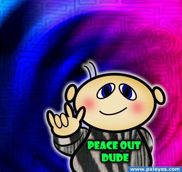
I was just having fun making the zebra psychedelic, not intending to enter this particular contest until I decided to add one of my little characters into it.
Edited to add in more zebra parts (5 years and 3867 days ago)
source is not recognizable.
No, it's really not, which is why I made sure I included it in the sbs, as the background is the source.
im sorry but its cool you showing you lil creature but isnt the contest about chopping the zebra?
hmmm, ok, I have an idea 
Peace out? But... But he's making the "Rock On" gesture!
Alot of people use textures for creating things that totally do not look like the source.... I think it's cute and I like it! Awesome!
Yeah, that what I see too, but I wasn't going to argue 
Why is there a maze in the background?
Why is there a maze? Why is there a guy wearing zebra with a peace out dude shirt while dong the rock on sign (thanks for pointing that out vladimir735 lol) it is what it is, just fun to play...
i usually don't have a problem with (apparently) unrecognizable sources, but after careful examination (possibly after seeing the sbs) you should recognize parts of the source (the more the better), but what you made here (before editing) could be done using any (and i mean ANY) other source, and the final image would be 99.9% the same. that's why i pointed out that source is not recognizable. now (after editing) is better though.
cute!
Howdie stranger!
If you want to rate this picture or participate in this contest, just:
LOGIN HERE or REGISTER FOR FREE
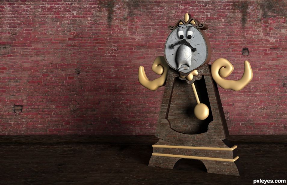
The arms are EXCEPTIONAL.. I have no idea why but I want to eat them. Amazing. Everything else is pretty great too except the eyes.. they give me the willies for some reason. They just seem a bit off (don't change it if you don't want to, its just me) Though I would try Pillow Emboss to give them less of the OFF feel they are causing. Once again, that's just me. It just that the I'm drawn to the eyes because my mind is telling me something is wrong with them. (Still gave you a great vote because this is freepin brilliant).
Agree on the eye thing and changed them up
Eyes a A GAZZILLION TIMES BETTER now.. woo HOO
Nice and fun chop..
Thanks George!
super fun. love the eye changes, nice use of source ..
Thanks, appreciated!
Howdie stranger!
If you want to rate this picture or participate in this contest, just:
LOGIN HERE or REGISTER FOR FREE