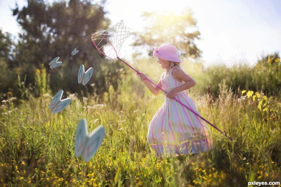
Chasing butterflies (5 years and 663 days ago)
- 1: girl
(5 years and 2800 days ago)
Howdie stranger!
If you want to rate this picture or participate in this contest, just:
LOGIN HERE or REGISTER FOR FREE
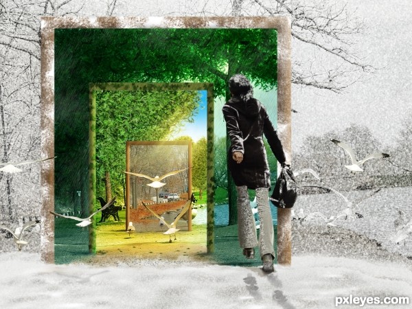
Winter, Spring, Summer or Fall...All you have to do is call. This image was inspired by the Carole King tune..."You've Got A Friend". Source image only from this previous contest... http://www.pxleyes.com/photoshop-contest/15749/park-walk.html. Made some changes...per suggestions. Special thanks to Jaskier for the great photo. (5 years and 2935 days ago)
brilliant concept.....
Thanks. Quite a compliment coming from you!
cool, liked the idea, just found it odd lighting of doors.
Thank you rodrigo73. Wish you were more specific about what you see that is odd lighting. I looked it over and think it looks good.
Really nice job author! Nitpicks would be if the snow could extend behind the first doorway and perhaps some ivy to accompany the leaves on the second doorway. Lots of work and well executed though! Good Luck!
Thanks Chalty! I like your suggestion and it will greatly improve this. I'll work on it this evening. Thanks again!
I think it is a nice image. Like the idea that the woman is ready to fly into the seasons. Good luck author.
Thank you George55. Really appreciate it.
Beautiful conception... very romantic and dreamy! Good luck!
Thanks erikuri. 
Thanks to Chalty...I've made some improvements to the entry. Most notably the rain drops on snow and addition of the fallen ivy on the ground.
Pure awesomeness!!! GL author! in my fav list.
Thank you. I've been enjoying your work greatly!
Wonderful use of source imagery to create a truly stunning and visually pleasing composition. I especially like the way the colorless Winter then becomes more colorful as the woman goes deeper through the doorways.
Very imaginative and technically well done.
Means a lot to me to get such a kind and appreciated comment from you.
I'm impressed and shocked at the same time, author! Great execution and imagination to the concept!
I'm impressed by you too. In a big way. Thanks again!
friendception and birdception  nice colour + idea
Thank you
Howdie stranger!
If you want to rate this picture or participate in this contest, just:
LOGIN HERE or REGISTER FOR FREE
source (5 years and 3115 days ago)
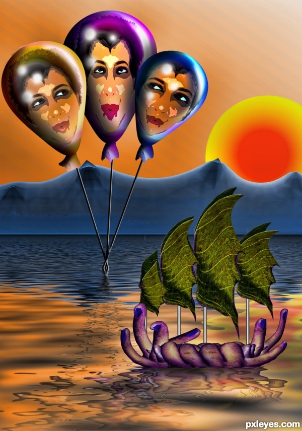
I wonder if I will catch any of these weird sisters one day! 
Nice work author!
"The weird sisters, hand in hand,
Posters of the sea and land,
Thus do go about, about."
- William Shakespeare, Macbeth
You are amazing author and you know it 
Howdie stranger!
If you want to rate this picture or participate in this contest, just:
LOGIN HERE or REGISTER FOR FREE
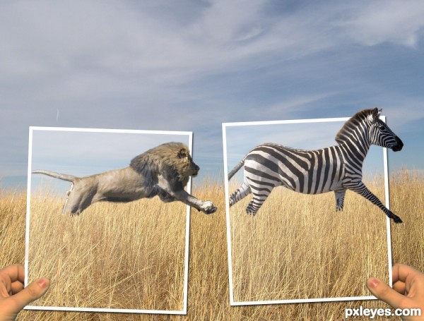
I wanted to do a picture with a lion and at first I wanted the zebra to be a person instead. But I couldn't find a good stock image of a person running away so the zebra is going to get eaten. (5 years and 3185 days ago)
This is a pretty good piece. I really like it. I do have a couple of suggestions though and will wait to vote. First, do a little research of the size of a lion relative to a zebra. Your picture seems like the lion is a bit large. If both are in the original then I will just accept that I know very little about lions and zebras  Second, putting one of the frames in front of the lion might add a little more dimension. Finally, the exposure on the hands doesn't really match. Not sure how to fix it, just seems not quite right. Just some food for thought.
thanks for your suggestions. Instead of making the lion smaller I made the zebra a bit bigger. I moved both animals to the left and put the frames in front of their tails to make it seem more like they are in the pictures. And lightened up the hands to make them a bit more pale because the whole picture kind of just has a pale look to it. 
i like the concept. maybe darken the background a bit, to draw attention to the photograph frames?
also, there are some sort of mask on top of the animals, is a little distracting.
I lowered the brightness of the background and it does help the foreground pop out a bit, thanks. and the mask that is over the photographs is suppose to be some gloss how pictures have, but I lowered the opacity of it over the animals. 
Very cool image author...one of the best ideas for OOB image...u should fix some minor details such making edges of animals bit softer and maybe with smudge tool u could work on hairs and fur....also, this is OOB image but don't forget shadows...GL
Howdie stranger!
If you want to rate this picture or participate in this contest, just:
LOGIN HERE or REGISTER FOR FREE
Interesting butterflies. Did you make them? Maybe a step by step is in order or a source link. Good concept, nice execution.
On a second thought, nice work. I get it, those butterflies are the backboard.
Thanks...There is a SBS now
Congratulations
Thank you
Congrats!
Thanks mate
Congrats Lifetime, very poetic
Congrats man
Thanx mate
Howdie stranger!
If you want to rate this picture or participate in this contest, just:
LOGIN HERE or REGISTER FOR FREE