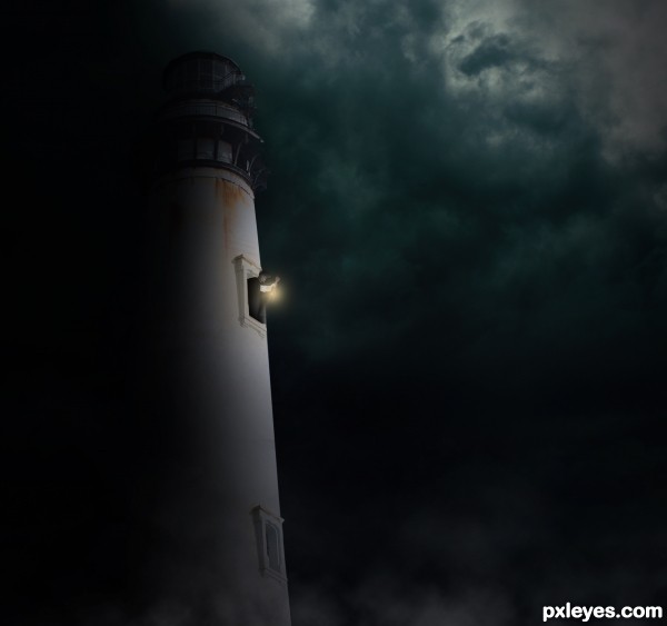
Light Bearer - Credit to ~Cat-in-the-Stock on DeviantArt
Sky - Credit to ~blueangelstock on DeviantArt (5 years and 2678 days ago)
- 1: Light Bearer
- 2: Sky

Light Bearer - Credit to ~Cat-in-the-Stock on DeviantArt
Sky - Credit to ~blueangelstock on DeviantArt (5 years and 2678 days ago)
(5 years and 3155 days ago)
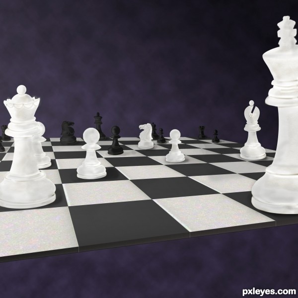
You can't really tell you used the contest source, since a simple black and white square made with the rectangular marquee would accomplish the same thing...
Now, if you made the chess pieces better resemble the male and female figures, THAT would be creative, but this really is too CBR to be of much relationship to the contest source...
@MossyB, Thank you for your input. I agree on the square thingy, but I guess that's what SBSes are for, eh? Plus the source had the texture for the "marble-y" feel. 
My first thought was the male & female figures only, but I lack the skills to make them look 3D from their current appearances.
The entire thing is the source pic after liquifying, warping & blending.
The perspective of the play figures is not the same as the board, they should be leaning back a lil more
Will try to fix it ASAP. Thanks.
I tend to agree with MossyB's comment, the source wasn't really needed to create this. I'm also curious about your response, you say you lack the skills to make the male/female source figures look 3D yet you say you created the chess pieces yourself with liquify and warp. The figures are a very simple form and much easier to add dimension to them than to create the complex shapes of chessmen from scratch. You don't show any source for the chessmen but they're all in correct perspective with complex details. Wonder how this is possible?
@spaceranger Thank you for your comment. What I meant wast I considered it'd be easier to create figures from scratch rather than warp the original figures. I can create simple constructions with warp & liquify, but am not as fluent with it as many other talented members.
As for the image, if you're suggesting I outsourced it, I'm kinda offended. The placing was more of a hit & trial (hence the sloppy perspective) & details were very generic.
SBS step 4 shows multiple layer above each other hence the lines.
SBS step 5 shows the strokes I made with pen tool. These ain't complex IMO.
There's nothing wrong with using reference as a guide which is all I suggested, it is difficult to draw those chess pieces from memory and they are most certainly more complex than the male/female icons. It was your statement that you lacked the skills that prompted me to ask.Your SBS doesn't show any steps in the liquify/warp creation of the pieces,step 4 just shows a silhouette with elliptical ridges and step 5 the lines added for detail. If you did create them without reference I'd say you do have the skills to have made the figures work contrary to your statement. Creating the pieces with liquify and warp without a base drawing seems a lot more difficult than drawing them digitally which is a more logical approach to me.
The pieces are standard pieces & their elliptical bases made it possible for me to make them look 3D. The original shapes were too plane. I couldn't get them to stand believably on the board. Now that I think of it, I could've used bases & snipped their legs, but that's for another time I guess. I agree with the logical approach but I tried, couldn't, hence changed the idea.
As for the reference, I first drew the silhouette using Pen tool, filled it, then warped the pieces accordingly.
Howdie stranger!
If you want to rate this picture or participate in this contest, just:
LOGIN HERE or REGISTER FOR FREE
(5 years and 3686 days ago)
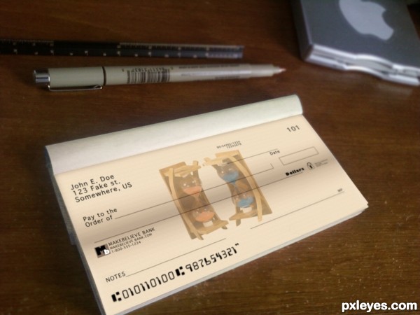
I like this a lot because it is basic photoshopping and it looks real. If I were you though, I would really cover up your name and numbers more in your SBS :o
thanx, its an old account thats been closed for years so i'm not too concerned about it.... : )
yea... definately cover them better.. nice entry tho
Author, you may not be concerned about it, but contest must be anonymous... Or mods will remove your entry! 
Edit: well, I wrote the comment above before voting; after voting I saw it's not your name! Author, it's a very realistic anc convincent work! GL... 
thanks, i went back and blurred it...
good luck
Howdie stranger!
If you want to rate this picture or participate in this contest, just:
LOGIN HERE or REGISTER FOR FREE
(5 years and 3776 days ago)
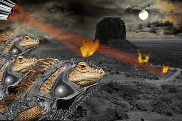
Have you uploaded the right image?
Where's the iguana?
what??
yeah, author I think you definitely uploaded the wrong image. Perhaps the 3D contest was the correct intention.
sorry guys, I`m a noob at this and dont know how to delete or change the entry
Hey dude, go into My Stuff> My Contests> find this entry and then >edit entry.
Weapons check hot...over
@ top of page find "my stuff" drop down the menue and select my contests find your particular and edit it 
EDIT: I see you figured out how to navigate the page some... 

Thanks Guys! ... it was only a quick "what the hell " enrty lol .....learning new things already! (thx 2 Ory & Ichappell)
Hmm, now it's okay! Nice work... I think the first ball is that one on the neck, am I wrong? 
Fantastic work...good luck
Howdie stranger!
If you want to rate this picture or participate in this contest, just:
LOGIN HERE or REGISTER FOR FREE
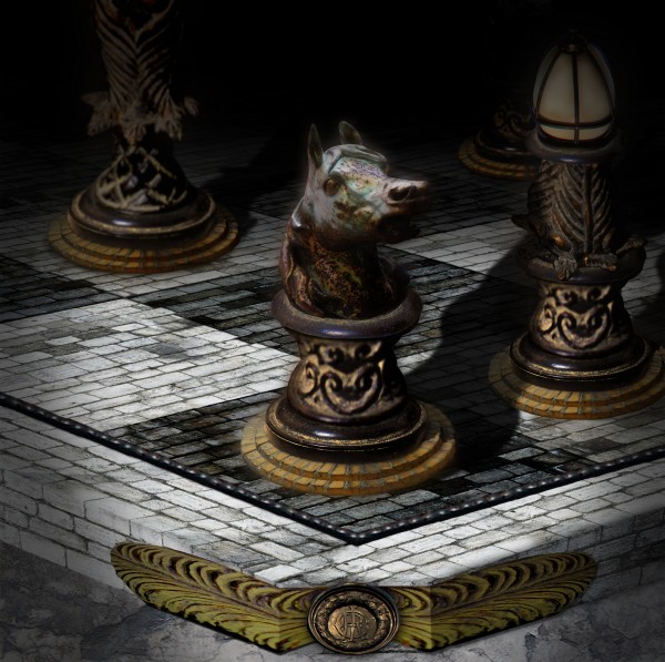
The prestigious Knight in a Medieval iron chess set.
Chess, like Photoshop requires great patients and perfect concentration.
thanks GREATONE! and Pxleyes for the nice source pics
(5 years and 3858 days ago)
beautiful use of source author.... a fav for me.
Very very good, fav for me too 
Damn this is what I ws going to do... I already had something I was chopping too. Oh, well back to the idea board. EDIT: agrees about the following comment but still very well chopped.
Eventhough it has some minor perspective problems I love what you did author. You might want to rethink the vignet, personally i like step 9 of the SBS better. The colours are great and the mood is wonderfull, you did a good job on the source and you are thinking out of the box here  Good find on the outside sources and perfect combination. Overall: good job!
beautiful and very good
I agree with the perspictive issues.. but your step by step guide is amazing! If only everyone took the time to make one like you did.. it should be posted as a tutorial ASAP!!
nice effect
Thanks guys so much for your comments and help!! Ponti your opinions are highly respected, Thanks And i'll get that TUT out as soon as i can.
One of the best entries in this contest this week.... High thumbs up! Good luck author.
Nice state of the art check horsie 
Congratulations for 1st
Congrats for another first place, Buzzy! 
Congrats on your 1st place!
congrats! for 1st place.
Thank you all soooo much! this is just awesome!
Congrats for your first place
Howdie stranger!
If you want to rate this picture or participate in this contest, just:
LOGIN HERE or REGISTER FOR FREE
Great images,author. Looks very natural......
I like that.
GL.
Thank you very much
Howdie stranger!
If you want to rate this picture or participate in this contest, just:
LOGIN HERE or REGISTER FOR FREE