(5 years and 2583 days ago)
I did this image for the first time the contest was posted on PST....but for some reason I didn't get to post it....so I am very happy that I got a second chance!
I hope you like it!
I used some old chess pieces that I've found in the house as general reference!
Credits to "Andreyutzu" for the chess board backround. Official account at: http://www.sxc.hu/profile/andreyutzu. (5 years and 3818 days ago)
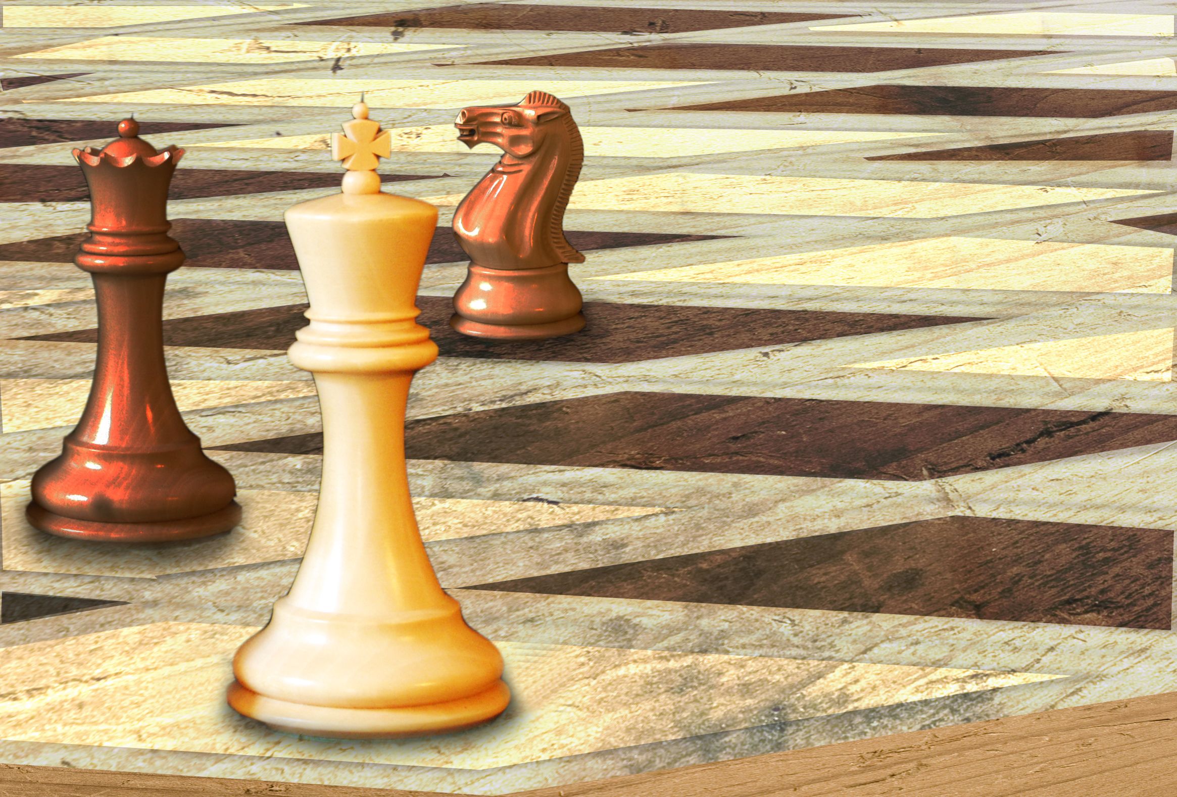
Funny one. The pawns in front seem to float a bit, maybe because the chess board has a bit different perspective. What if you just use the original wooden floor (incl the reflection from the original pieces) for your entry, then the floating might be fixed. Good luck!
This is REALLY cool. The only thing I would nic pick would be the background. It takes away from the real looking chop.
great job.. good luck
Lower the pawns to solve the perspective problem...
Coool : D.
very nice work!  gl
gl
nice
Good work!
Great job. Nice idea.
I not sure if you did the editing but it looks good to me and a nice take on the theme. GL!
excellent job with the figures but I have to wonder why you couldn't have done a better job with the background
great job 
Congratulations for 3rd
Congrats for your third place, Cornelia!
congratulations...
congrats
congrats
Congrats
Howdie stranger!
If you want to rate this picture or participate in this contest, just:
LOGIN HERE or REGISTER FOR FREE
Thanks:
http://commons.wikimedia.org/wiki/File:ModernStaunton.jpg
chesspieceswhite
jud mccranie
http://www.sxc.hu/photo/1221254
woodtexture
yoyojaw (5 years and 3868 days ago)
I like this alot. Well done.
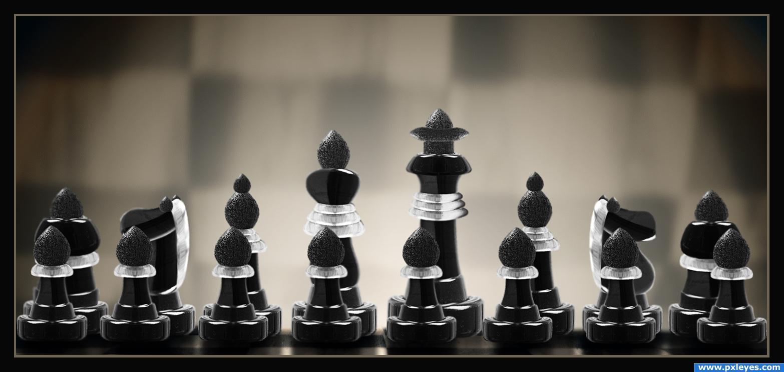
This is a nice image. I would like it more if it didn't have the corner lines of each diamond showing depth. Right now, the chess pieces are floating. If you remove the lines and give the chess pieces a set down shadow it will really help.
EDIT: I was liking the less saturated previous version more, but I DO like the edits to those lines mentioned above. Your set shadows are currently wrapping too far around bottom of pieces. Cut them off where the piece width ends softly.
great
Texture doesn't follow the different planes...
I dont like this new version. too much contrast. better the way it was.
good use of source.good job
Howdie stranger!
If you want to rate this picture or participate in this contest, just:
LOGIN HERE or REGISTER FOR FREE
You're not going anywhere!
P.S.: My first try at an image like this, not completely satisfied, but hey PST is back :)
P.P.S. I suck at shadows...
Thanks to: Nebulant
Done with:
- cutouts: pen, magic wand, eraser
- colors: levels, hue saturation and gradients
- bord: Lines and paint bucket (5 years and 3966 days ago)
Nice idea!!!
nice
Not Check Mate.. King takes Rook (and who ever moved the king into the corner should be beaten) Need a black queen in the scene to be check mate ... I'm JUST JOKING.. great chop and fun idea Good luck.. very dark mood
technically - to infer from visible area of board, it is not check-mate!  just kidding - good luck!
edit: GolemAura dämn!
Omg! i puzzeled it out so nicely :S haven't played chess in a while xD I think ill adjust the black a bit, ill keep you posted 
Edit: Altered the image slightly
good idea, good luck
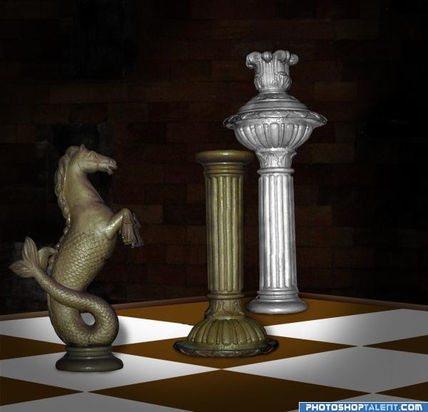
You could add some shadow o some reflect
very nice
looks nice i have to agree with DML, some shadows and reflections would set thi off
nice neat work on this image, you cleaned up the horse rather well too goodluck.
The perspectives are off, it does not look right, the squares at the back are too long, it seems you did this to show all of the king but it would look better if it were realistic. The pieces also loook like they are floating, try and add some shadows Nice concept tho.
good luck
author if u make some shadows it'll be more realistic
interesting idea good luck!
good job and good luck
Great ide. Some shadows would plant the pieces in the surface
good. add shadows
congrats
you did very well
Howdie stranger!
If you want to rate this picture or participate in this contest, just:
LOGIN HERE or REGISTER FOR FREE
Photography and photoshop contests
We are a community of people with
a passion for photography, graphics and art in general.
Every day new photoshop
and photography contests are posted to compete in. We also have one weekly drawing contest
and one weekly 3D contest!
Participation is 100% free!
Just
register and get
started!
Good luck!
© 2015 Pxleyes.com. All rights reserved.


fantastic...
Thanks
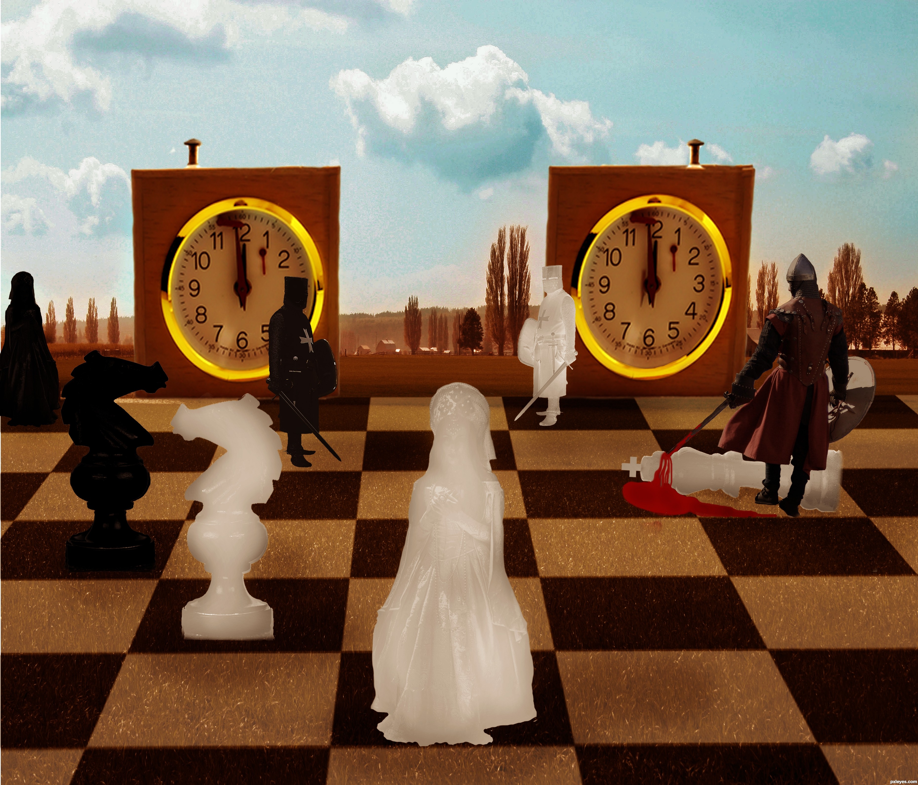
Good luck on this author (Do you think some burning on the super white pieces may add to their depth? They are giving off a bit of a flat feel at the moment, but that might have been your goal)... (The clock timers look a bit stretched horizontal in my eyes as well) but in the surreal that is perfectly fine. once again.. GOOD LUCK
Thank you!

I made some changes
good luck author!!!
great idea, great fantasy, bravo
Howdie stranger!
If you want to rate this picture or participate in this contest, just:
LOGIN HERE or REGISTER FOR FREE