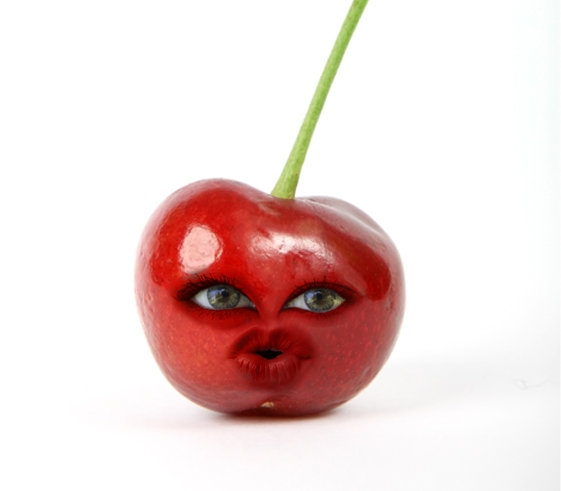
Cherry...with a face....yup. (5 years and 3919 days ago)

(5 years and 3935 days ago)
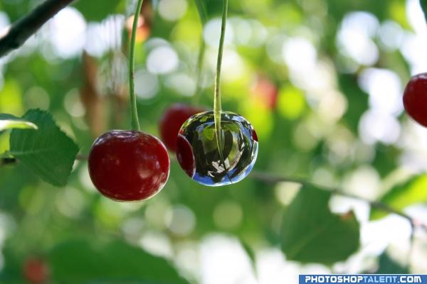
Awesome high res! And good reflections!! High marks all around! :p
LOL... I wanted to write "Hey... you missed chrome some part of the cherry..." But then I looked properly, and realized it was a reflection of the adjacent cherry... You fooled me man...  Nice work
Very nice indeed.. I am not sure - but your edges might be a touch sharp? I am not great at working with chrome, but you have done a great job!
nice!! good job! 
Right on target... super on theme... happy dance happy happy joy joy
veeery nice!
Looks good! 
cool
nice entry
Holy Cow! That's awesome. It may look a little like water as opposed to chrome. You might think about adding a photographer in the reflection! Either way, Simply incredible.
good
Good work..I had seen the tutorial on worth1000... Nicely done 
yep, a pretty good tutorial. i had the cherry idea before i saw that though.  AND he already had the chromed ball (or whatever that is) as a source so i had to change that
I think it's brilliant! well done and good luck 
Very nice work, good one 
nice
Congrats on 6th... 
Howdie stranger!
If you want to rate this picture or participate in this contest, just:
LOGIN HERE or REGISTER FOR FREE

Just little displacement and work (5 years and 3952 days ago)
ditch in chessboard!  good reflection
  good luck!
good work
creative! gl, author
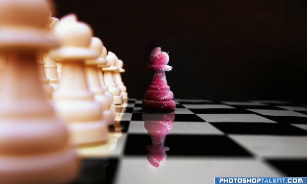
The reflection of the drips on the cherry piece is different to what is actually on it. I think it would be better if you applied the drip thing to each piece individually as well, thewn you won't have them floating in mid air in between the pieces. You will also be able to apply some perspective to them as well, making them smaller as they go further back into the distance. Hope this helps.
Always like chess art.
i made pawnn this way that its reflection made it differ too
Nice idea - but your chess board squares dont line up? ]i see its in the source also - but I would slide it to suit. It may not be accurate - but will not draw the attention away from your figure] Also the water droplets on the row of pawns does not blur with the depth of field.
Not bad, but I'd make the reflection more transparent. For example, use a layer mask for the reflection and then in the mask make a gradient (white above, more grey till maybe even black down) to let it fade out more. Or play with the blending modes. Good luck!
Great job. i really like how the blurry effect is but it's not on the reflection on the one peice that line is blurry but the red peice is crisp... i think that's is the only minor thing that is messing with me! Still Wonderful idea, and Wonderfully put together!
i newer think acherry pawn!!! good lick author
nice work
Good image nice sense of depth well done..
nice job 
Howdie stranger!
If you want to rate this picture or participate in this contest, just:
LOGIN HERE or REGISTER FOR FREE
nice image
This one made me smile!!
today I was eating cherries and I remembered your image hehe
omg dont u just wanna kiss that cherry!!!
I like the image overall, but the eye on the left of the image (Her right eye) has a red outline thet doesn;t match the highlight of the cherry, and it looks a little dark, maybe try clonestamping the left bit of the cherry to make it fit. Other than that, i really like the image. Good luck!
cool
Howdie stranger!
If you want to rate this picture or participate in this contest, just:
LOGIN HERE or REGISTER FOR FREE