(5 years and 3070 days ago)
(5 years and 3100 days ago)
Howdie stranger!
If you want to rate this picture or participate in this contest, just:
LOGIN HERE or REGISTER FOR FREE
Credits to
auroradreams
NefaroStock (5 years and 3118 days ago)
very neat interpretation of the source author, GOOD LUCK!!!
I really love this one! Very nice soft blending 
Beautiful mood, good work!
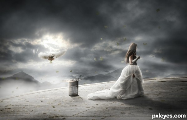
The top edge of the owl kinda dies against the background, but nice work. 
Very nice, good luck
I think the darkoutline behind the skirt is A little too thick or dark maybe it really made the edge of the skirt sharp like a knife in contrary to the ege of the flooring where theres the same kinda dark outline on. dont get me wrong I really love the image , these two things just need to be matching a little better to make it perfect  high score anyway
Thank you all for the comments! @ bob, i darkened the edge of the owl just a little bit. @ Eladine, thank for bringing that to my attention, its fixed now. again thank you all for your comments. 
Super Awesome..!!! smells like a winner to me 
my fav also..
nice looking image, gl
Nice ethereal mood in this author, and interesting concept. 
Congrats, beautifully done 
Congrats!
Congratulations, very well
Congratulations,it's a remarkable work 
Howdie stranger!
If you want to rate this picture or participate in this contest, just:
LOGIN HERE or REGISTER FOR FREE
(5 years and 3296 days ago)
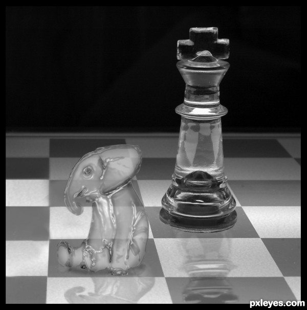
Umm... excuse me, author... IMHO, you need to add shadows to the chess & elephant as well. Nice idea though. Would like to see it improved a bit. ^0^
suggestions:
1) add more contrast to certain areas (observe the chess piece behind elephant)
2) create a tiny shadow underneath the elephant
3) smooth out the elephant skin to make it more "chess-like"
nice idea!
@ Aheman. Thanx for the comment and advice.. Ive changed it a bit 
Howdie stranger!
If you want to rate this picture or participate in this contest, just:
LOGIN HERE or REGISTER FOR FREE
(5 years and 3376 days ago)
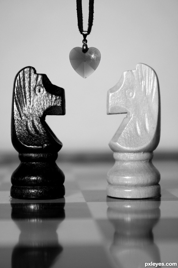
Good idea, but I'd adjust the perspective on the pieces. 
Howdie stranger!
If you want to rate this picture or participate in this contest, just:
LOGIN HERE or REGISTER FOR FREE
great job, i like it
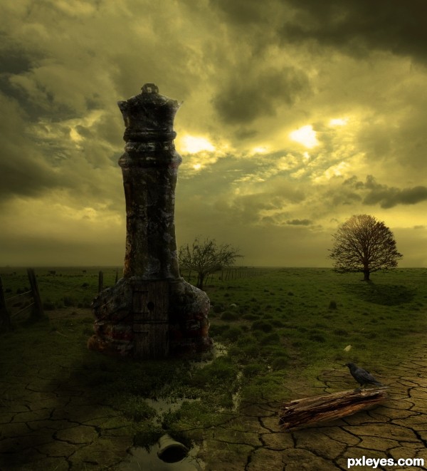
like the idea, and the feel of the image. as for execution, it leaves something to be desired. Many many masking and blending issues throughout. Also, one quick fix would be to blur the tree you added to the background. it should be slightly less in focus than the tree that is behind your castle. Good luck!
Well bjaockx, at first thx for ur comment, but i think ur over reacting by saying that there r many many masking and blending issues. Im pretty familiar with photoshop and won serveral prices in here, and i have to disagree with u. If there were many blending issues like u said, it would mean that i just copy and paste the images without blending them together and that is just not true. The only thing u mention is the tree well then just tell me what more is wrong with this image
I really like the overall look of this author! The color and idea make for a really nice composition. What bjaockx might be referring to is the masking of the main chess piece. The upper left area side is a hard edge, but the rest of it seems really, really soft. If you perhaps make the soft edges a bit less soft and slightly soften the area mentioned...it might help. You've done well with this and would love to see those changes which undoubtedly would improve it...especially when viewed high res. GL author!

EDIT: Looks
thx pxlkid for ur compliment and suggestions, i changed the image of the chess piece, found one that i liked more, made the changes hope u like it
Wow, very nice mood. Good luck!
Howdie stranger!
If you want to rate this picture or participate in this contest, just:
LOGIN HERE or REGISTER FOR FREE