(5 years and 3136 days ago)

(5 years and 3856 days ago)
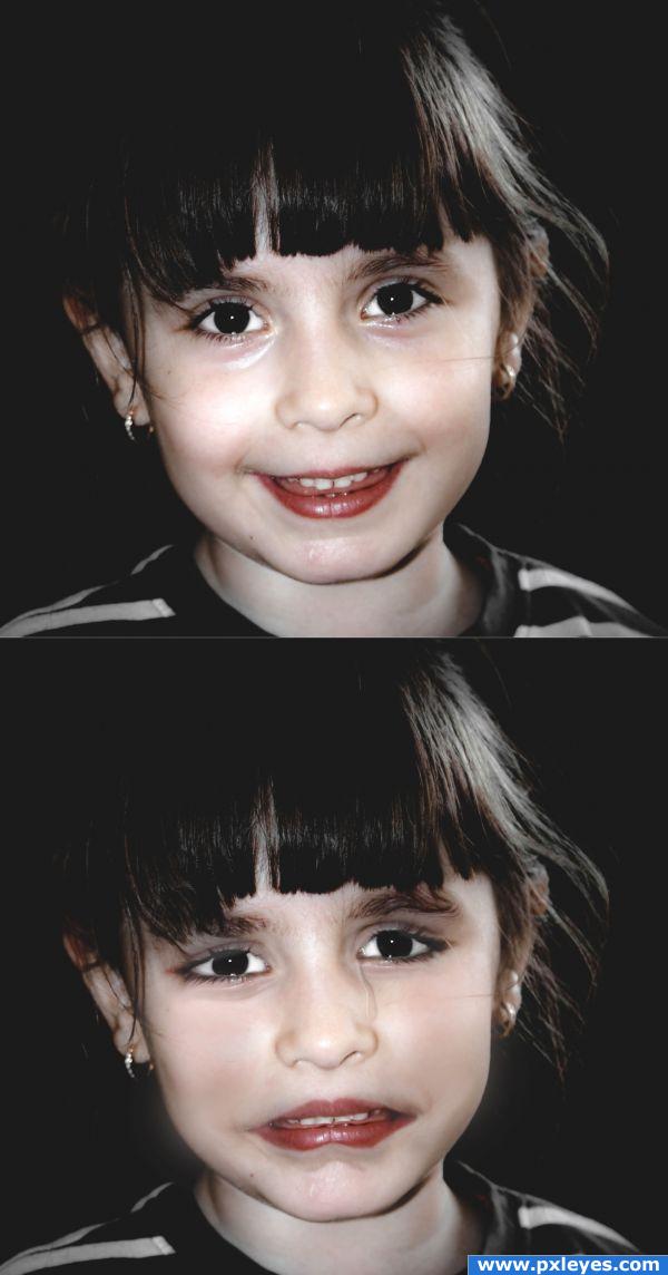
Not bad. Perhaps I miss the ehhmmm..."lines between the corners of the mouth and nose" (sorry, my english sucks, hopefully you get what I mean), right now it's a bit too solid there. If you add that, then just subtle, like in the source image. Ow, and maybe her lower lip is a bit too cartoony. Good luck!
Howdie stranger!
If you want to rate this picture or participate in this contest, just:
LOGIN HERE or REGISTER FOR FREE
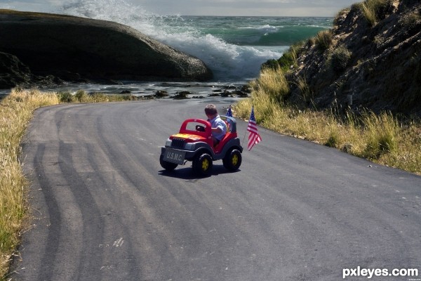
Great idea and blending.
Thanks
Good job . I like it .
You did a good job on the blending of the image.... good luck author.
Howdie stranger!
If you want to rate this picture or participate in this contest, just:
LOGIN HERE or REGISTER FOR FREE