(5 years and 3231 days ago)
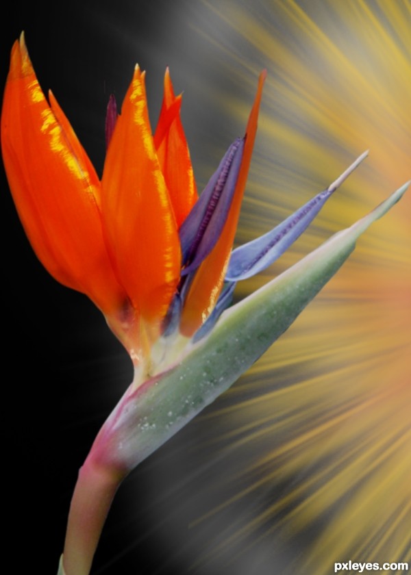
Used the source image to cover the petals of the plant. Manipulated with the warp tool and highlights added. Thanks to edgeplot for the image of the bird of paradise plant (5 years and 3498 days ago)
Add SBS
Yes - coming soon to a monitor near you......
A great way to use the source. Would be more 'your own' if you did not just cover up the reference material, but just used it really as a reference to create your flower. Even the green and purple portions could be made from the source by using color changes (hue/saturation) .
Howdie stranger!
If you want to rate this picture or participate in this contest, just:
LOGIN HERE or REGISTER FOR FREE
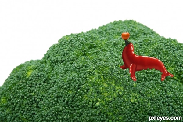
hope you like it guys (5 years and 3501 days ago)
nice seal -- a shadow would help this
Very cute!
Very good job. But shadow is definitely missing.
Howdie stranger!
If you want to rate this picture or participate in this contest, just:
LOGIN HERE or REGISTER FOR FREE
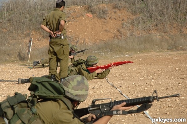
source picture is mine to use. (5 years and 3501 days ago)
simple and funny,.....LOLs.......
Ha! The best part is the guy in the foreground...you can almost see his expression... nice job on the chop too. My only little suggestion (after looking at the hi-res) would be to add some shadows on the pepper at his hands, and possibly on his arm, where the pepper stem flares up. Good luck author! 
Good idea. Soldiers can try this in war-fields.
Very good work and idea. GL ! 
Humorous, simple & effective....that gets my vote everytime
Spicy gun LOL! 
ahahahhahaahhaha great imagination!
Congrats for another third place! 
Congrats!
thanks everyone!
Congrats!!
Congrats 

Congrats
Congrats!!
Howdie stranger!
If you want to rate this picture or participate in this contest, just:
LOGIN HERE or REGISTER FOR FREE
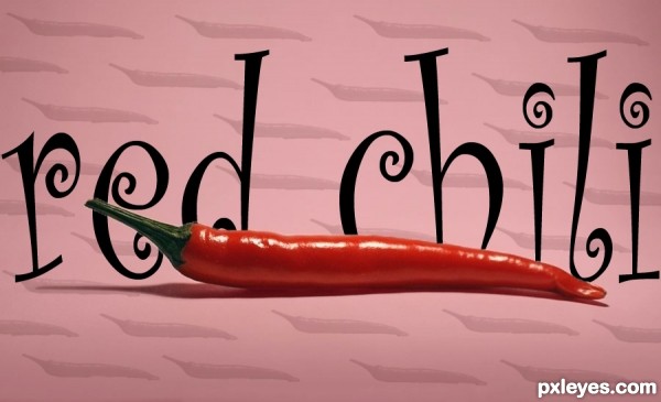
Took the photo into photoshop. used the magic wand tool around the chili and duplacted it. Then made the chili into a brush and stamped it around the page and lowered their opacity. added a font in between the two layer of the chili. lastly i add a red gradient in the backround and lowred its opacity. (5 years and 3502 days ago)
A bit too simple IMO.
very simple, but is ok.
Maybe try make something more difficult, have a look at other entries 
All the tools you used are great to start with & practice makes perfect, try having a go at some tutorials. You`ll be amazed at what you can do!
Howdie stranger!
If you want to rate this picture or participate in this contest, just:
LOGIN HERE or REGISTER FOR FREE
Author, sorry I am only getting around to all of these entries now, but here are a few tips for the future:
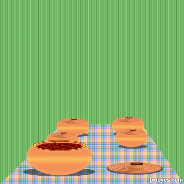
1. As the shape of the bowls are rounded, so the yellow stripe should bend. Try a radial gradient instead of a linear gradient.
2. With the light from above, the bowls would appear darker color at the bottom near the table. That's because the top half of the bowl (to its widest part) will block the light and cast some shadow on the bottom half.
3. You created a very nice illusion of depth with the edges of the table and the pots - wider / larger close to the viewer (bottom) and narrower / smaller farther away (toward center). To complete the illusion, the plaid pattern should also appear smaller and narrower at the end of the table farthest away. You can accomplish this by applying the pattern to a rectangle first, flatten, then apply Perspective - it will change both the shape and the pattern.
Hope this helps!
Howdie stranger!
If you want to rate this picture or participate in this contest, just:
LOGIN HERE or REGISTER FOR FREE