Lock Ness monster found in China. (5 years and 2522 days ago)

(5 years and 2889 days ago)
Now that is good! Excellent.
Very very nice idea. GL!
Howdie stranger!
If you want to rate this picture or participate in this contest, just:
LOGIN HERE or REGISTER FOR FREE

revisited, and redone
sbs may not happen as I was piecing this together and not saving.
thanks violentz
thanks jadis (5 years and 3251 days ago)
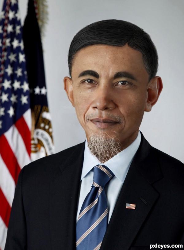
i think the face is too smooth around the eyes and the skin tone difference on the forehead is distracting...great take on the theme though author! i'll hold my vote
very well author like it
The skin tones are all over the place, and the eyes are a bit too dark in contrast, like he's wearing very heavy eyeliner.
Yes Mossy as usual he is.
The hair unfortunately was all hand drawn as there doesn't seem to be many salt and pepper Chinese men
And for MossyB this is all Obama's skin, check his photo in hi res, he has a rather bad complexion
Sorry author, but no. You've made some color adjustments to Obama's skin, resulting in a weird pinkish patch on the side of his nose and his cheek, and have lost some of the cyan tones on the face, while keeping them on his ears..."Bad complexion" is one thing, inconsistent coloring is another.
As for the hand drawn hair, it looks it. There is no skin visible at all beneath the eyebrows - Even the thickest hair shows small bits of the face along the edges - and the color of the hair on the head (as well as the eyebrows) shows far too little gray to correspond with the basically white beard...
Good attempt author, the idea is great but the blending needs a little more work!
Best of luck!
Where does the hairline come from? Seems like a SBS is needed here...
Great entry, I think the blending is fine....and I believe the hair is drawn (drawn well too) only nitpick would be that I would have prefered the hair to be more grey. Best of luck author & well done 
Howdie stranger!
If you want to rate this picture or participate in this contest, just:
LOGIN HERE or REGISTER FOR FREE

(5 years and 3298 days ago)
I think postcards should be colorful & happy  Presuming this is one, I would throw in more vibrant colors.
Howdie stranger!
If you want to rate this picture or participate in this contest, just:
LOGIN HERE or REGISTER FOR FREE

:-) Enjoy (5 years and 3298 days ago)
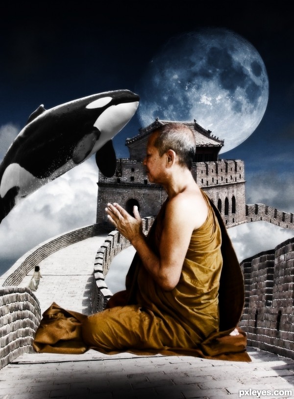
Flip the moon so the light source matches the lighting on the wall & the monk.
EDIT: Better now.
the monk is too huge. the whale can be much much smaller, and jumping over the moon may be better?
Awesome!!! I love it..... GL author
The light on the whale (above) does not match the moon (beneath) or the monk (shadow beneath) or the wall (shadow to the left).
Consistency of lighting is a basic, yet very important consideration to a good chop, regardless how "surreal" the concept may be.
The light on the whale (above) does not match the moon (beneath) or the monk (shadow beneath) or the wall (shadow to the left).
Consistency of lighting is a basic, yet very important consideration to a good chop, regardless how "surreal" the concept may be.
The light on the whale (above left) does not match the moon (beneath) or the monk (shadow beneath) or the wall (shadow to the left).
Consistency of lighting is a basic, yet very important consideration to a good chop, regardless how "surreal" the concept may be.
Howdie stranger!
If you want to rate this picture or participate in this contest, just:
LOGIN HERE or REGISTER FOR FREE
Nice job. I like the coloring.
Fantastic work,I like the color scheme and the overall theme is well thought out.. I like the reflections of the Dragon body in the lake of water.
Sad there is no SBS and hi-res...but also without it is really well done!
Congrats!
Congrats!
Howdie stranger!
If you want to rate this picture or participate in this contest, just:
LOGIN HERE or REGISTER FOR FREE