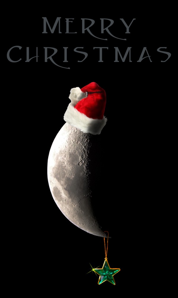
(5 years and 3773 days ago)
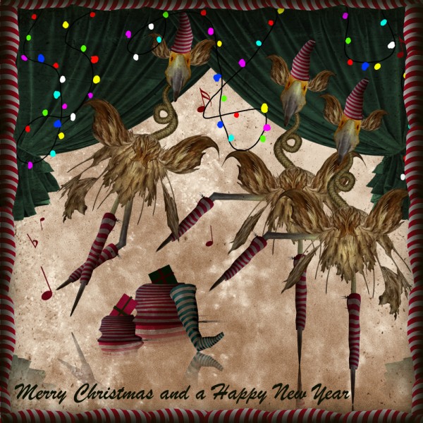
(5 years and 3773 days ago)
Funny and cute ! Nice one.
Very creative  It's what we can say MERRY
very cool entry... good luck
love the novelty of the image!
Cool idea. but what are those :-P
Doesn't look like there's a reflective surface for the reflections, otherwise good & surreal. 
Howdie stranger!
If you want to rate this picture or participate in this contest, just:
LOGIN HERE or REGISTER FOR FREE
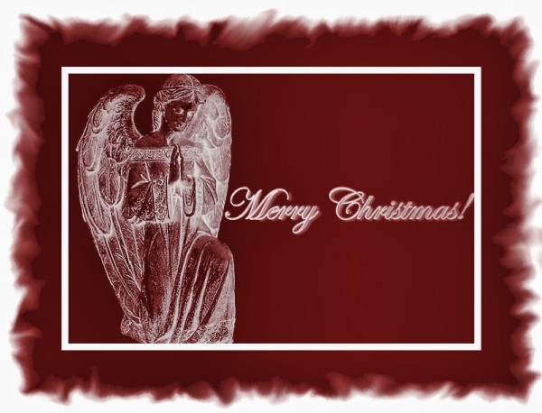
thanks to obsidian brushes (5 years and 3774 days ago)
It is a nice image...gl
Interesting, but perhaps a bit too somber. The font choice looks great on "Christmas," but the "Merry" is difficult to decipher without the "Christmas" clue that follows it.
Howdie stranger!
If you want to rate this picture or participate in this contest, just:
LOGIN HERE or REGISTER FOR FREE
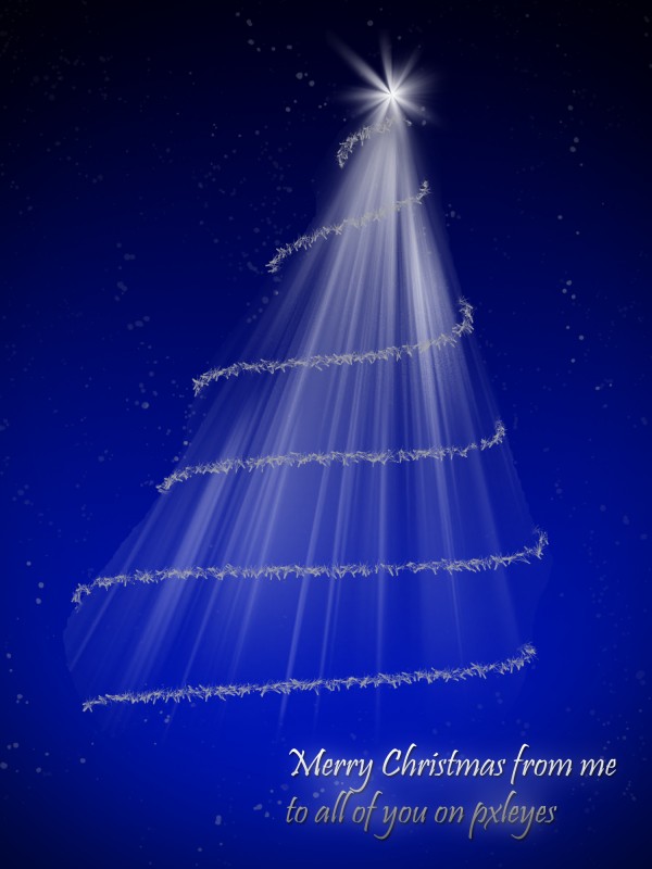
Merry Christmas!
I've used a gradient as background. The three is a lightbeam brush from obsidian dawn (http://www.obsidiandawn.com/light-beams-photoshop-gimp-brushes). The star in the top of the three and the stars on the background is from the same brush pack. The ornament on the three I've made with pen tool (and I stroked it with one of the default brushes in photoshop). (5 years and 3774 days ago)
I wonder where did you get the idea for your text...anyway, nice work...gl
I'm not sure if I understand your question... Is this not a common way to wish people merry christmas? (English is not my native language)
Do not get me wrong author. I made the comment, because I saw another entry with almost the same text you used. Yes, this is the way to wish people Merry Xmas. Your English is fine, and your entry is beautiful. My comment is just that.... a simple comment. I apologize if I made you feel bad. It is beautiful to be able to speak different languages! Good luck!
Christmas does not lend itself to a lot of originality in textual messages. Why one line is white while the next is gray is more curious. I really like the image but am concerned that the left side of the top three garlands don't wrap tightly to the tree shape. I also think a brighter star that doesn't blend into the tree shape would be more dramatic.
Thanks for comments!
It's true that it's not easy to be creative with textual messages in christmas
About the text: one is white and one is grey because I put a gradient on it, and I wanted it to fade in to the vignette. I obviously didn't succeed too much on that :/
You will see that the garlands wrap tightly to the tree shape if you see it in high res.
Thanks again for your comments, I really appreciate it and have no hurt feelings!
I think separate gradients for each line of text so each letter essentially goes from white to gray would be more dramatic and less curious.
Howdie stranger!
If you want to rate this picture or participate in this contest, just:
LOGIN HERE or REGISTER FOR FREE
(5 years and 3774 days ago)
nice entry... gl
There's a lot to like here, but I'm not sure it comes together as a whole. The problem may be the ribbon which is neither a drawing [like the rest of the image] nor realistic. The knot should have edges, the interior of the loops should be darker, and the ribbon should cast more realistic shadows.
Maybe give the wraping a texture?
The polka dots make me ill...
Howdie stranger!
If you want to rate this picture or participate in this contest, just:
LOGIN HERE or REGISTER FOR FREE
the light need some work.
cool idea...good luck
no comments,thanks for the help that u gave to me.tday i dt miss a shadow and my spelling is much better

and honest thanks u can believe.
Okay, mister NITPICKY Lodd, I worked on the lighting! (Thanks, it does look better now).
u have to darken the hat same as the planet...beside that this is very nice entry....good luck author
Gee, the moon is a spheroid? REALLY? Golly, next you'll be telling me it's not made of green cheese! Hat leaning left? It's on the part of the crescent that leans RIGHT, genius...
Simple but nice take on the theme. Who cares if the moon has anything to do with xmas? You still made it creative but simple.
congrats... for your good work.... merry christmas to you too...
Howdie stranger!
If you want to rate this picture or participate in this contest, just:
LOGIN HERE or REGISTER FOR FREE