(5 years and 3366 days ago)
Photography and photoshop contests
We are a community of people with
a passion for photography, graphics and art in general.
Every day new photoshop
and photography contests are posted to compete in. We also have one weekly drawing contest
and one weekly 3D contest!
Participation is 100% free!
Just
register and get
started!
Good luck!
© 2015 Pxleyes.com. All rights reserved.

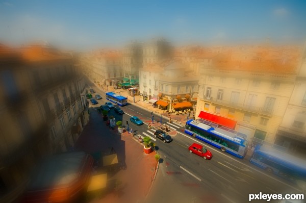
Good source-pic choice (critical in this contest) and the enhanced color saturation is appropriate. However, the blurring is too extreme as well as too pervasive, especially on the rear end of the right-edge bus and the far edge of the left-side building which seem to be the same focal distance from the camera as the very-in-focus elements.
I agree with Dan. The blur effect is too strong; it's ideal for a romantic mood to the image, but for a tilt-shift it's better to reduce the effect to a soft level.
very nice work author...gl
Howdie stranger!
If you want to rate this picture or participate in this contest, just:
LOGIN HERE or REGISTER FOR FREE