This image is based and created on my own pictures, and I have all rights reserved but still under PxLeyes.com's condition. My image may therefore not be reproduced in any form without my written permission. (5 years and 2462 days ago)
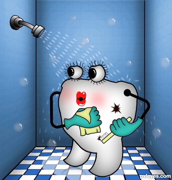
Clean Teeth Healthy Teeth (5 years and 2973 days ago)
Fun image. GL author. 
i like this...good job
Thanks CMYK and RickLaMesa.
I really love this, it is funny, colorful, and has all the ingredients to make a nice poster! Good luck author.
congrats! nice entry!
Congrats!!
Congrats  well done
Very Nice Congrats 
Howdie stranger!
If you want to rate this picture or participate in this contest, just:
LOGIN HERE or REGISTER FOR FREE
(5 years and 3135 days ago)
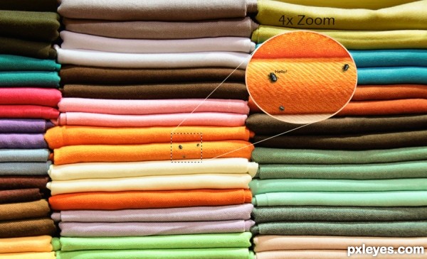
More of a minor addition than a manipulation, I would expect more based on the level of entries already in the contest, best of luck though 
Brilliant!
idea is there... but should add a "wow" or "oh!" feel..
suggest.. let the zoom-in bugs make funny faces, like sticking out their tongues 
I like your humor and good thinking! Nice job.
Howdie stranger!
If you want to rate this picture or participate in this contest, just:
LOGIN HERE or REGISTER FOR FREE
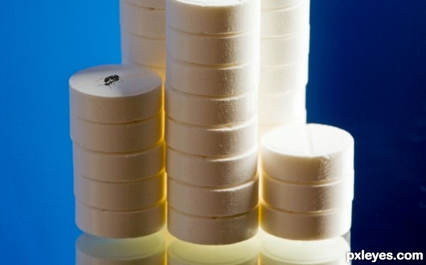
Needs extra times to photoshop this (5 years and 3281 days ago)
How about making this scene even more dirtier,rather than just adding that insect..to enhance your idea.Just an honest opinion
The reflection does not work, you should not be able to see the underside of the pill stack, they look like they are floating...
err umm, the reflection is from the source pic, good luck author
@ misthi: yes, you're right. 
@ mossyB: the underside of the pill stack? i keep the source image.. just add the ant with "extra time" to do that 
@ drivenslush: you're right.. many thanks drivenslush
simple but very very effective...best of luck
ty erathion 
Howdie stranger!
If you want to rate this picture or participate in this contest, just:
LOGIN HERE or REGISTER FOR FREE
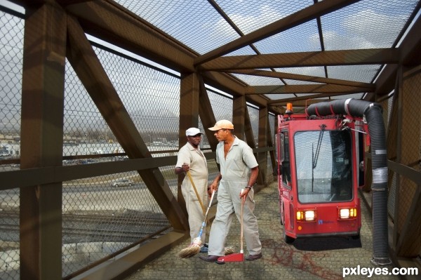
Spec Thanks to Vinytmeister for use of his picture found on flickr photo sharing.com
Thanks Derdevil again
Spec Thanks to Whalt for use of his picture found on flickr photo sharing.com
Spec Thanks to amazing textures for use of texture
used on bridge (5 years and 3328 days ago)
That seems like a really short man IMO.. ?
i agree with JamesP - if you see the driver of the ....... "red cleaner".....he is sitting and is much bigger, and the broom guy is closer to us so he should be almost double the size .
good job on the pavement texture
Hey Thanks J-ames P & gornats I was playing around with that when I first did it thought I hasd right size but here's a redo any better?
edit I will be doing another redo on this
The workers look squished and weird. They should be at least about as tall as the vehicle...
Hey ! MossyB Thanks I Know How it happened I was playing with raster deform tool and saved wrong one in my tubes I just redid any better?
Howdie stranger!
If you want to rate this picture or participate in this contest, just:
LOGIN HERE or REGISTER FOR FREE
You might want to smooth/blur a few hard/ jagged edges.
Author, you need to post each of your photos uncut in a step-by-step guide. (SBS).
5.3. Use of Personal Images as Source: If you use your own personal images, the uncut source must be placed in the step by step with an explanation that it is your image.
Please take time to read http://www.pxleyes.com/guidelines/photoshop/
Thanks! It has all been fixed by now.
I can't see the images in your sbs... just a progression of your work.
you should place each original image uncut as a seperate step, this way it's much clearer.
Sure, I will show you as fast I reach my computer, I'm at work you see.
Clean up looks good, nice work overall!
Thank you so much Spaceranger!!
Good job author, good luck
Well thank you very much James, I hope for the best!
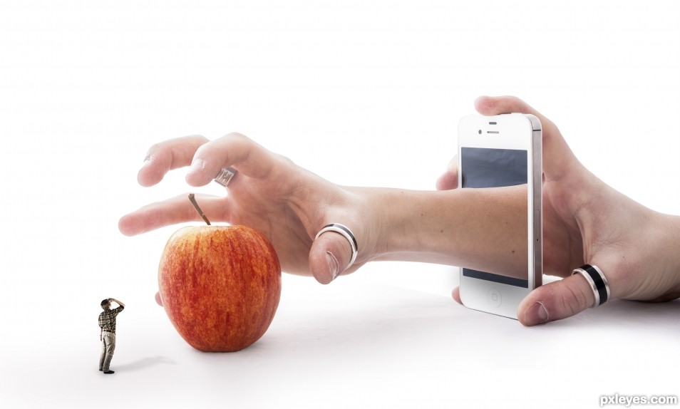
Clearly Photoshopped per the contest requirements, but I wish I understood the point of the image. The title makes sense without the little you. Alternatively, a little you also reaching for the apple with a new title could be intriguing (and more fun).
Given that the title references the iPhone, it should be crisper to stand out more.
I think replacing the variegated apple with a more-solid-colored red delicious or golden delicious apple would add a smooth texture and a stronger focal point.
The shadows are too strong IMO. The little you has a much more intense shadow than the apple. The slightly vague arm/apple shadow (that inexplicably extends far into the bottom left corner of the image) is way too expansive.
Thanks! I Well, I did not figured out any good name so it end up with this.. If you have any ideas, please, feel free to share them!
I just did turned up the colors on the apple a bit but I wont do it more then so since it's gonna look to extreme.
Yes, I agree with you that the shadows were looking to strong and therefore I did changes them, how about now?
Great take on the theme... I love the abstraction
It's nice to hear that you like it, Bob, thank you so much!!
Congrats!!
Thank you so much!!
congrats .....
Thank you!
Howdie stranger!
If you want to rate this picture or participate in this contest, just:
LOGIN HERE or REGISTER FOR FREE