Nothing more than Photoshop and lots of thinking. Good luck good artists. (5 years and 2924 days ago)

Only source used (5 years and 3175 days ago)
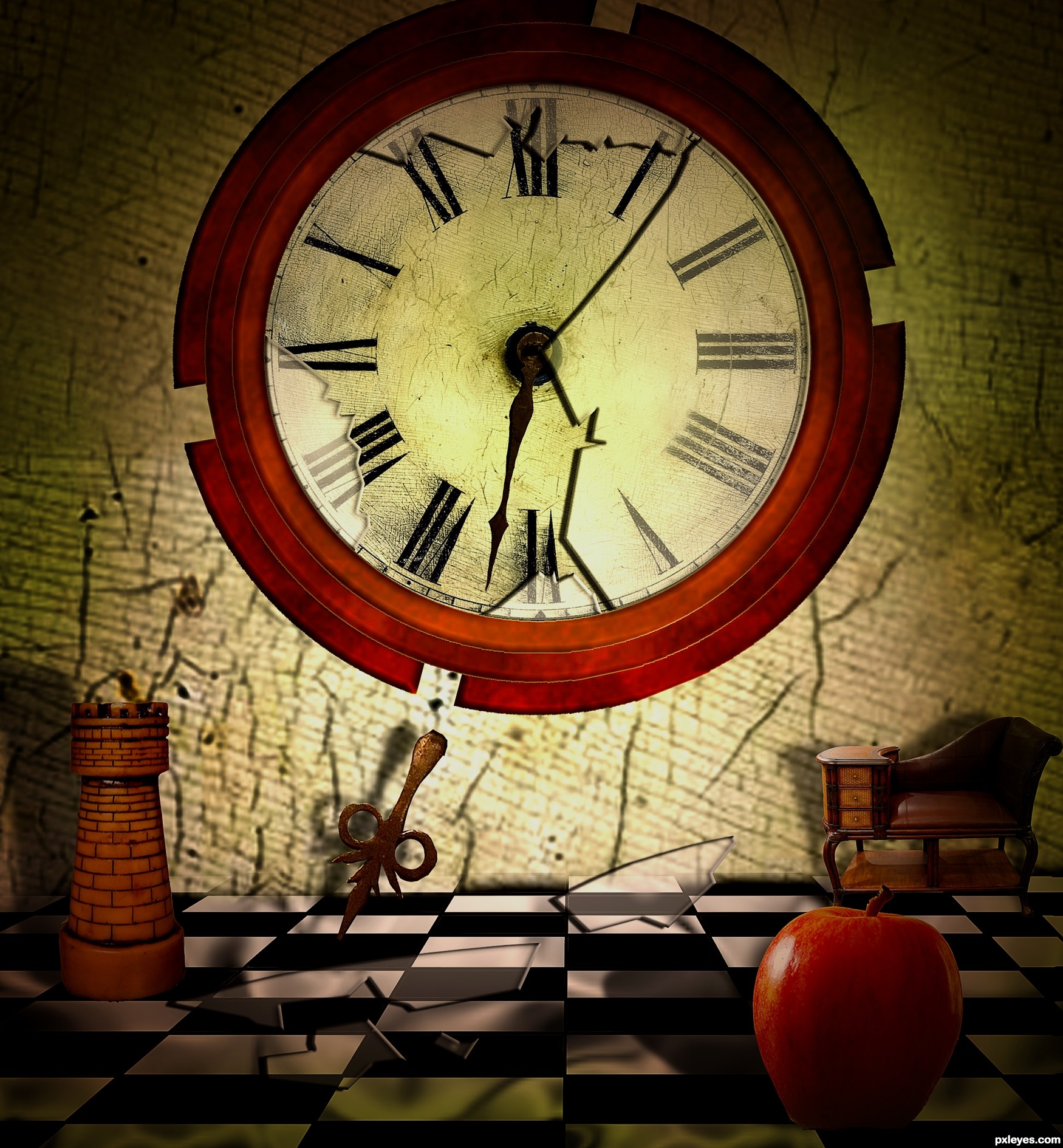
Sorry, I don't get it. I don't see any hearth, unless you're making a play on the word "heart," there is no visible support or base for this to stand properly without falling over, and the rope at the top is just plain confusing...
EDIT: "Reads" much better now.
MossyB, have made some changes to make hearth shape visible and prominent. Thanks for sugesstion. 
Howdie stranger!
If you want to rate this picture or participate in this contest, just:
LOGIN HERE or REGISTER FOR FREE

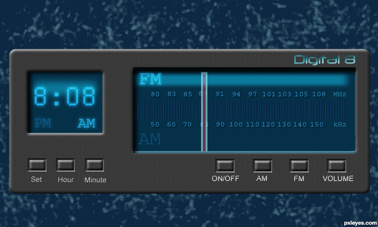
I used lots of different layer blending modes. I modified the eye with the liquify filter. I added some shadows and color with a smooth brush and the gaussian blur filter. The blood vessels in the eye are made with a very thin and sharp brush, and the gaussian blur filter. (5 years and 3363 days ago)
nice work and very nice colors...gl author
gud job.....
Well done
Howdie stranger!
If you want to rate this picture or participate in this contest, just:
LOGIN HERE or REGISTER FOR FREE
(5 years and 3364 days ago)
The edges of the broken glass (Lights & darks) are inconsistent...other than that you've made a fine image. GL author!
very very nice piece author...best of luck
i like it . good luck!
Nice work here = )
Nice image.
Congrats for 3rd
Congrats my friend....great entry...
Congratulations!
Congratulations!
Howdie stranger!
If you want to rate this picture or participate in this contest, just:
LOGIN HERE or REGISTER FOR FREE
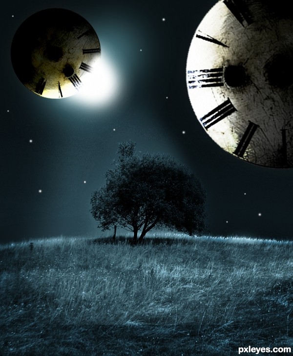
i used distort>Spherize in the filters menu to create the Clock Planet :) (5 years and 3365 days ago)
Make the moons round.
Man, this can look good and has some nice potential, for eg. I like the composition(meaning how you placed the objects) & the light cast on the ground, pretty neat.
But i don't get:
- why each moon has a diff light source;
- why did you download cosmos package, and then used only 1 moon 3 times; you know you can get moons with marque tool + desert ground + spherize & some color/lvl adjusments.
- why didn't you erase that small vertical pole under the tree - it came with the source but it's an useless distraction
And yeah CMYK's right: next time hold shift when transform so they won't distort.
It's a pretty concept but the technical flaws drag it down -so improve it if you can.
very nice lighting and cool image...gl author
Better version...GL author.
thx 
I LOVE this! I'm a huge fan of this processing!
Howdie stranger!
If you want to rate this picture or participate in this contest, just:
LOGIN HERE or REGISTER FOR FREE
Photography and photoshop contests
We are a community of people with
a passion for photography, graphics and art in general.
Every day new photoshop
and photography contests are posted to compete in. We also have one weekly drawing contest
and one weekly 3D contest!
Participation is 100% free!
Just
register and get
started!
Good luck!
© 2015 Pxleyes.com. All rights reserved.


Very nice job, author, without external sources! Good luck!
Thanks Daniela.
Perfection is the word that really fits here.
Thanks Erika......
Howdie stranger!
If you want to rate this picture or participate in this contest, just:
LOGIN HERE or REGISTER FOR FREE