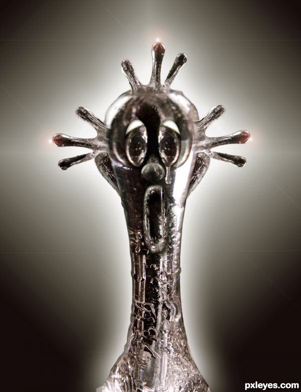
(5 years and 3666 days ago)
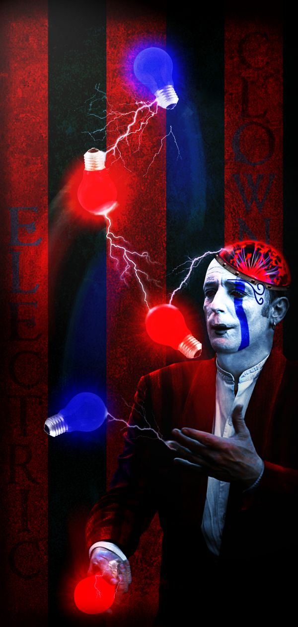
A lot of color adjustments, glows, motion blurs and a lightning brush. Thanks to Ics9 for the sphere image and to evobrained for the wall texture.
(5 years and 3697 days ago)
lol.. nice one..
I love circus! GL! 
Well done...good lighting & effects. 
Very creative...good luck
Howdie stranger!
If you want to rate this picture or participate in this contest, just:
LOGIN HERE or REGISTER FOR FREE
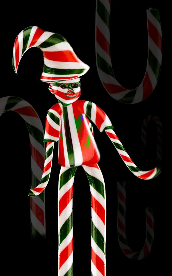
only source image is used. (5 years and 3732 days ago)
clever
nice job, but i would change the colors of Hat and teh Cloths.
I agree with Petersheep, but it's still a very well done image.
nice done, good luck
Howdie stranger!
If you want to rate this picture or participate in this contest, just:
LOGIN HERE or REGISTER FOR FREE

Only used source image.
SBS coming soon (5 years and 3794 days ago)
great job!
WOW, AWESOME! Very good idea, perfecly done! Shadows are a little bit off at some places, I'd fix that, but really it's brilliant! Very good work, you have talent!
cool
I love it.. a great use of the source - Finally!
He looks like a nasty joker - he must be the one that let pop up all those irritating dialogs and advertisements on my screen. Great job.
Great! The only thing that could be improved is to give some color to the background, but it's just MHO 
Great idea! And great result!
Good stuff! 
EDIT: Welcome back, author! 
Thanks everybody for the comments and votes...CYMK46 Its good to be back...thanks again
Great composition...shadow below his hand is missing....gl
ha ha! Wicked cool Author. Great use of source.  GL!
GL!
clear and clever use of source. a lttle on the scary side. ( runs and hides)
Very clean work and very good image.
I like it!
Congrats, nice work and he's a bit creepy 
congrats on your first place
congrats on your win
Congratulations!
congrats! for 1st place.  . Great work philty as usual.
congrats
congrats to you mr. clown 
Congrats for your first place, PhilNit!
Congrats!
very good indeed!!
Howdie stranger!
If you want to rate this picture or participate in this contest, just:
LOGIN HERE or REGISTER FOR FREE
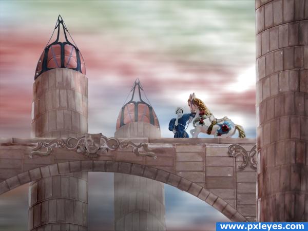
I'm not quite satisfied with the end result, but it has to do for now.
All source. (5 years and 3872 days ago)
Awesome job! Good Luck 
Awesome job!
very nice author
Nice and ethereal.
Author, I like your idea, so permit me to nitpick.  The foreground tower & arch should be darker than the others to create depth, and the tower at front right is leaning in...otherwise it's an admirable effort. Good luck.
very odd in a wonderful way... but the source has so much to offer that this entry really pays tribute to it... good luck!!
Did a wonderful job with a difficult source image. 
Love the colors! Great job! The horse and clown could have had that same pinkish/peachish tone to it but it is still great!
I have no idea why you're not satisfied with this beautiful image!
@ponti: I did a lot of experimenting on the horse to make it more 'drawn' (like the horse and the bridge) -without success. The horse is more 3D/photographic compared to the clown and the buildings. Other (minor) points where the perspective of the towers and the blending of the ornaments. But is was very pleased with the mood of the image.
gratz!
Congrats for your second place!
Congratulations for 2nd
Congrats!
Congrats!!!!!!!
Congrats!
Howdie stranger!
If you want to rate this picture or participate in this contest, just:
LOGIN HERE or REGISTER FOR FREE
great image!
Very, very impressive! So nice...
cool stuff
Howdie stranger!
If you want to rate this picture or participate in this contest, just:
LOGIN HERE or REGISTER FOR FREE