Thanx to lindowyn-stock DA
http://www.sxc.hu/photo/223465 b_heyer monkey wrench (5 years and 2983 days ago)
10 Sources:
- 1: jademacalla
- 2: Della-Stock
- 3: faestock
- 4: lindowyn-stock
- 5: FantasyStock
- 6: mjranum-stock
- 7: Cats-go-moo-always
- 8: cagedstock
- 9: ToxicStocks
- 10: flobele


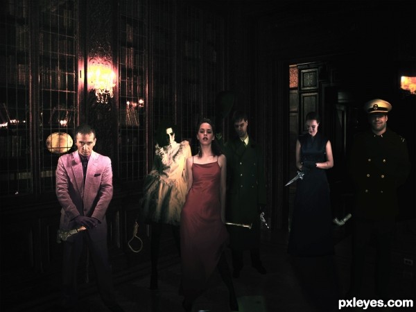
From My point of view the people in the image look a bit flat (mostly the woman in the white dress and person with the hat next to her) not sure if you where aiming for a 2D kinda look but you got it If you add some shadows and fix the light that's going right trough the woman with the black dress it's going to be way better.

P.S. I think the Captain did it. He's not fooling anyone with that fake smile
the light on the people you used is from different directions and don't match with the light sources in the picture and the shading.
everyone looks flat, but also i'm not sure what game pieces were used for this image? apparently you must use specific pieces reminiscent of the game.
i want it flat. i goin to changed the light and shadows and thats . everyone have a weapon of Cluedo
Good idea for the game, author, I had this one, but it's so dark, the weapons are nearly impossible to see. Try lightening it up a bit so they stand out.
Agree with pearlie. The captain on the right needs to be darker too to match the background.
Howdie stranger!
If you want to rate this picture or participate in this contest, just:
LOGIN HERE or REGISTER FOR FREE