(5 years and 2815 days ago)
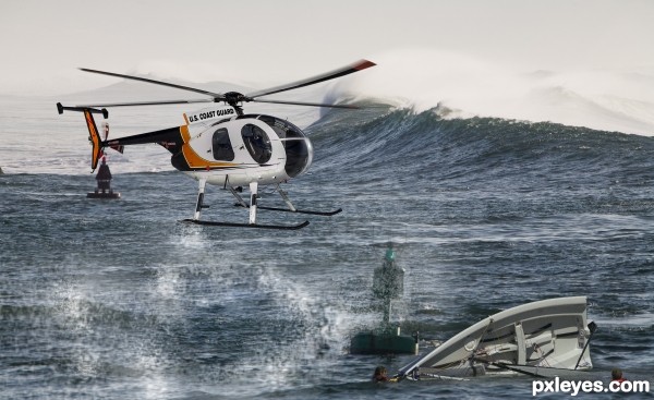
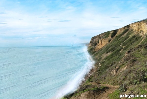
Lovely day to get rescued by the coast guard!
SBS:
1. Crop Out the helicopter and make minor adjustments
2. Replace the text on the helicopter with U.S. COAST GUARD with Swiss Black 721 Font.
3. Place it into the new picture
4.Make exposure adjustments/light source adjustments
5. Gaussian Blur white and erase parts to make it look like water spraying out.
6. Get picture of a boat and place into photo.
7. You should be finished. (5 years and 2849 days ago)
Howdie stranger!
If you want to rate this picture or participate in this contest, just:
LOGIN HERE or REGISTER FOR FREE
(5 years and 2885 days ago)
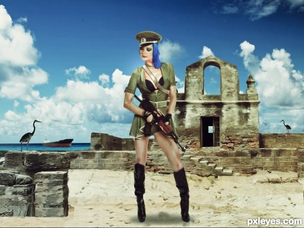
way to big for the background
Howdie stranger!
If you want to rate this picture or participate in this contest, just:
LOGIN HERE or REGISTER FOR FREE
(5 years and 3254 days ago)
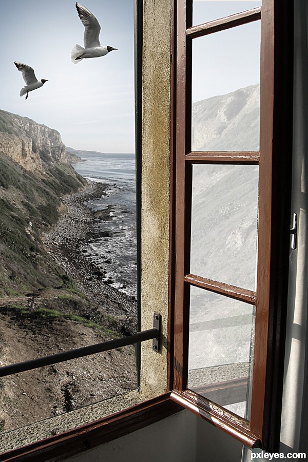
good idea! so simple, but so beautiful! good luck!
Elegantly simple. Special. Wonderful.
Thanks a lot, Androla and Marifre....
beautiful...
PARABÉNS!!!!!! UEBAAAAAAAAAAAAAAAAA
Congrats, very realistic 
congrats..
Congrats!!
Thanks a lot.....
Parabéns, hein, tio Dinulysses! 
Parabéns tio!!!!! Merecido, lindo trabalho!!!
Howdie stranger!
If you want to rate this picture or participate in this contest, just:
LOGIN HERE or REGISTER FOR FREE
(5 years and 3255 days ago)
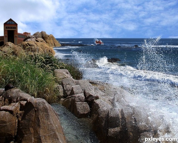
Too much obvious repetition of the waves in the outside source, and the perspective is off.
Howdie stranger!
If you want to rate this picture or participate in this contest, just:
LOGIN HERE or REGISTER FOR FREE
moving the boat more into the image (over the sand bar and closer to the viewer might help).. the boats wake is hitting the horizon in the Hi Res, a bit of a problem.. but Only IMHO good luck and cool image
good eye! i fixed the wake, but i like the boat out there. the boat in the source isn't really such that i want it in the forefront. btw... I love your art! thanks for taking the time to comment!
I think there are a few problems with lighting and implicitly with the shadows.. see the big rock formation in the lower left corner of the image ? well at the top of this formation there is a shadow that clearly puts your light source somewhere center-right over your image's top margin thus contradicting your choice in moving that cloud formation whose well lit margins indicate that they are concealing another light source of an opposite orientation ( look at the rock on the beach in the source image ). Also taking this into consideration there might be some things to ponder as to who's shadowing who regarding the close vicinity of the castle and ( or on itself ) the rock formation close-by. That's just my two cents regarding tweaking to perfection.. other then that it is a good composition and it had a nice feel to it.
Congrats!!
Howdie stranger!
If you want to rate this picture or participate in this contest, just:
LOGIN HERE or REGISTER FOR FREE