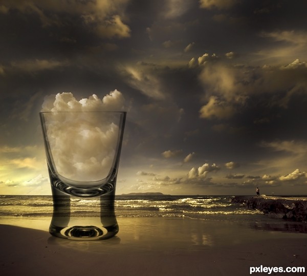
http://www.bing.com/images/search?q=magritte&view=detail&id=B784EBFF207BA5380FFD4703CF769A3F12970238&first=241&FORM=IDFRIR (5 years and 3307 days ago)
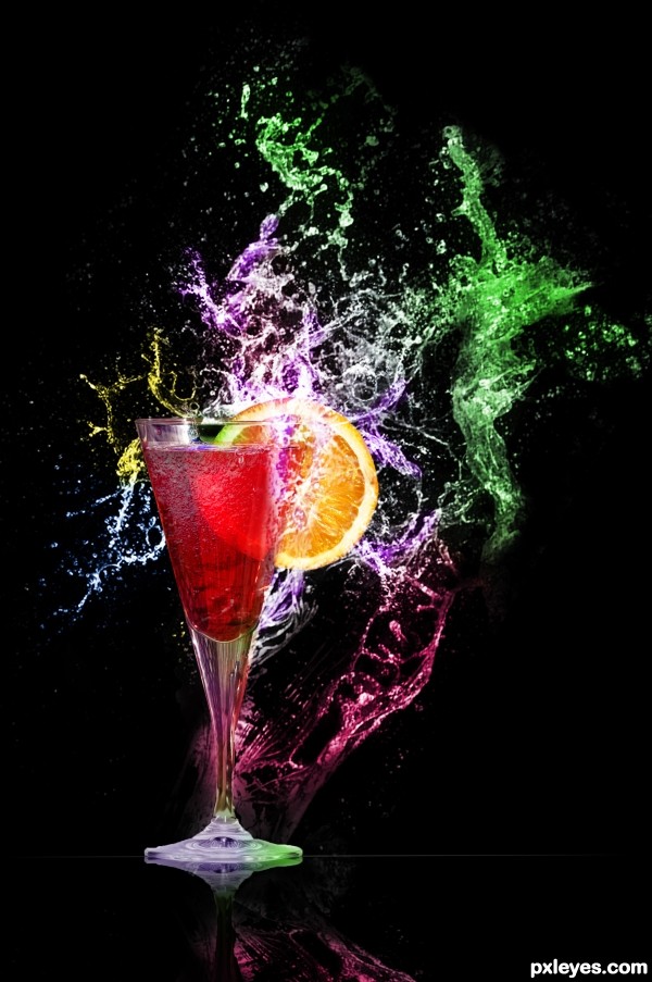
(5 years and 3507 days ago)
Stunning entry. Well done. Would love to see a high res version!
Sources are copyrighted. Please read http://www.pxleyes.com/blog/2009/06/how-and-where-to-find-legal-source-images/ to find usable sources.
Cool! 
@CMYK46 - They all say "You are free to make derivative works" - The author just needs to give the original author credit. ? As I understand it that would be ok?
That's weird...when I looked, they were all ©.
Well, nice entry, then. 
BEAUTIFUL!
New glasses CMYK.... lol.... shoot I don't know.... we must be suspect of all entries with incorrect sources... and give advice on the correct way to post......
Great job CMYK and Author for getting the job done!
Kudos to all!
very very nice...good luck
i like it!
Congrats... ...great work
Congrats!
Congratulations! 
Congrats!!
Howdie stranger!
If you want to rate this picture or participate in this contest, just:
LOGIN HERE or REGISTER FOR FREE
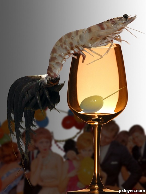
Thanks to:
- tuareq, abejo, vivekchugh and iliana @ sxc.hu;
- x-ray delta one @ Flickr.
(5 years and 3562 days ago)
In these parts we use those types of shrimp for bait.. LOL. cute Idea author
cool idea! the blending of the rooster and the shrimp isnt very good but can be easily fixed good luck author

Howdie stranger!
If you want to rate this picture or participate in this contest, just:
LOGIN HERE or REGISTER FOR FREE
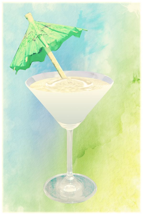
thanks to:
Shuttermon at sxc.hu for martini.
Ilco at sxc.hu for umbrella.
Xishan at Deviant Art for background, have left link on his page as per request. (5 years and 3688 days ago)
nice 
Like the way you matched the look of the watercolor-y background...nice work! 

(SBS could be more complete, though).
Howdie stranger!
If you want to rate this picture or participate in this contest, just:
LOGIN HERE or REGISTER FOR FREE
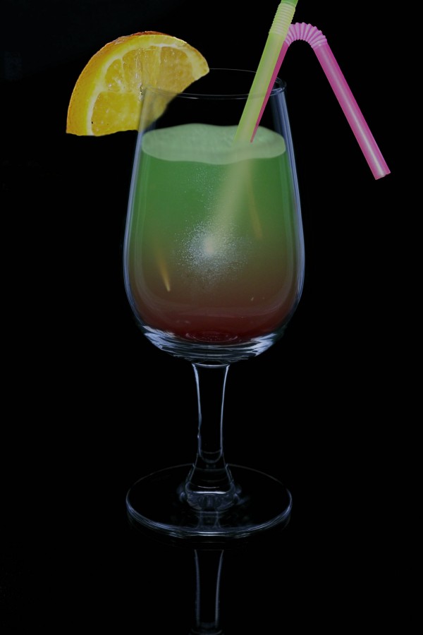
Edit: I made some corrections for lemon (sharpen edges) and for the foam (distort wave and images adjustment).
(5 years and 3780 days ago)
An antifreeze/blood cocktail...nahhh...I know it's not what you intended. Good job!
Not bad, you may want to make the edges from the lemon a bit sharper. The lemon part inside the glass already looks ok! Good luck!
Thanks to Pixelkid and Wazowski.I hope it look better.
There appears to be some noise around the edges and I'm not sure what you did. For future refference, try blur or just slightly push the edges using liquefy. I do commend you on your effort and using the original source.
yummy,, Christmas drinks early....
Howdie stranger!
If you want to rate this picture or participate in this contest, just:
LOGIN HERE or REGISTER FOR FREE
Cheers! Nice chop.
Fantastico the ambiance, the treatment given in the image and realism, we do not know if the cloud mean decreased or increased if the cup! GL
I think I can handle that shot!
Nice interpretation, I like the colors too (in fact the deep colors reminded me more to Dali than Magritte). What you may want to reconsider is the transparancy of the glass. Right now the background is pretty well visible, like you'd look through a normal window. This makes the glass itself kinda flat, one-dimensional. I think because of the roundness and thickness of the glass the background behind should be more distorted. How exactly? No clue, but maybe this image can be a good inspiration http://www.50prime365.com/days/03262005.jpg. Good luck!
great piece of work...very neat and very effective...well done
very very nice work
Great work!
Howdie stranger!
If you want to rate this picture or participate in this contest, just:
LOGIN HERE or REGISTER FOR FREE