
(5 years and 3285 days ago)
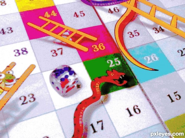
Index Mode. 15 colors (5 years and 3289 days ago)
This came out pretty well, except for the dice. The colors have blurred and now over dominate the shape, so that the pips are hard to make out.
Perhaps make a selection of just the dice, and then "fade" the color depth effect of the section (Edit>Fade effect IMMEDIATELY after making the change), to better allow the dice to look more natural.
Great
Thanx MossyB  I'll keep that in mind next time.
Howdie stranger!
If you want to rate this picture or participate in this contest, just:
LOGIN HERE or REGISTER FOR FREE
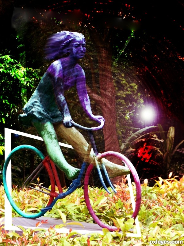
colorfull
no sources used
just added color (5 years and 3292 days ago)
Howdie stranger!
If you want to rate this picture or participate in this contest, just:
LOGIN HERE or REGISTER FOR FREE
(5 years and 3301 days ago)
This is a good monitor tester!
The hex code for purple is #4D198D or 3F0584
http://www.i-freeware-download.com/web-colors/hex-rgb-hsv-Royal-purple-cId-986.aspx
My monitor shows this color to be 2d3091...Too blue, with not enough magenta...
But that could just be my monitor. I've posted the hex codes in case it's not me.
Oh, thank you I've just discovered I'm daltonic, anyway great minimalist poster, GL!
IMO a gradient would be better than a flat color.
The movie isn't "the color gradient," tho...lolol!
Thanks! I appreciate your comments. I thought about the gradient too. But I was going for minimalism...this seemed to fit the definition better.
Howdie stranger!
If you want to rate this picture or participate in this contest, just:
LOGIN HERE or REGISTER FOR FREE
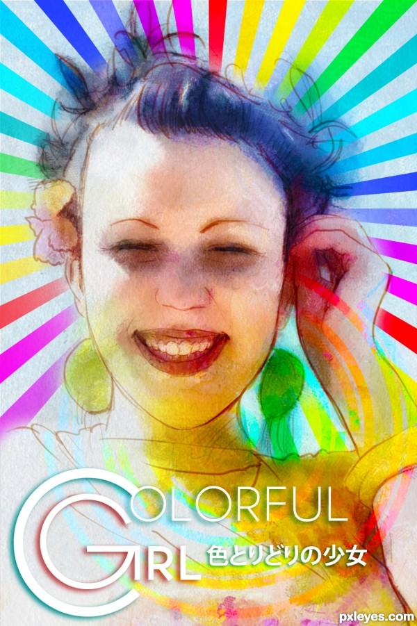
EDIT: Add Japanese Katakana.
Done with Adobe Photoshop with Wacom Cintiq plus a little help from Adobe Illustrator.
Please see SBS before comments. Thanks! (5 years and 3310 days ago)
You're not being totally truthful, here, Author.
It is a Digital TRACING that is painted, not a true Digital Painting.
You did not freehand the subject, you traced it.
That is not to take away from the beauty of the image, just a point of clarification, as tracings, like reference images and tutorial studies, should be labeled as such when entered into competitions.
so much work done, but imho it's not worth the result.... good luck!
@ MossyB & Androla: What should I do then? Am I really need to clarify it with the video?
Or maybe I change the title to Digital Tracing? So it's worth to compete? Or should I just remove it anyway.
To clarify everyone. I'm a Wacom Cintiq user, I'm not making a trace of anything so easily. IF the looks of it comes to sneaky to your eyes and not the perfection that should be, then I'm absolutely take my responsibility for mod to remove it. I'm very sorry of making things uncomfortable.
I red-flagged because I need Mod to join our discussion. Thanks.
i never told you to remove your entry nor i didn't say it's bad, and i don't really care whether it is a painting or tracing.... it's all up to you!!! and i REALLY think that your image is worth to take part in this competition. and frankly speaking i don't understand why are you so nervous about the comments?
Androla, I didn't mean to point my 'nervous' comment towards you nor I didn't mean to hurt your feelings. It's just me & my tired expressions that force me to write such a comment.
You have my sincere apology, but frankly I'm really don't understand about your 'it's not worth the result.... ' statement above. = |
well, that is just my subjective point of view, i liked up to the 3rd step.... you toiled so much on this entry... and i didn't mean to offend you.
Thank you, Androla. I'm no offend you too. It's just me with my temper. Please, forgive my rudeness of comments before. I would like to be friend with you if you don't mind & let's left what's behind that matters. = )
 it's ok
Love is in the air!!! Now you two go get a room! hehehehe.. nice job author, looking good
Drivenslush. You're such a jerk. LOL! XD
Mind if I add you to the 'party'? 3-some awesome. LOL!!
I'll pay for the Penicillin shots afterward LOL
You don't have to. It's my treat, my friend. Fair enough, eh?
Anyway... nice profile picture you got there, man. So disturbing. ROFL. >=P
About the comment section: Geezus ; about the work: nice artistique effect. i'm not sure about the text though - maybe another font/style or maybe something else instead of it. GW none the less.
Author.. chill... hehehe... You are good... Every eye has it own impression... This is art and you made it... That's what matters... Good luck to this entry... PEACE all... hehe...
Howdie stranger!
If you want to rate this picture or participate in this contest, just:
LOGIN HERE or REGISTER FOR FREE
nice colorising.... brings live to the monotone
This is very nice...wonderful colorization. The pastels work well with this image. Well done author...
Good job, clean and very creative!
Agree. great job and technique!
Here is a piece of art that can easily be underappreciated. This was a pain in the neck, eh, author? Your patience paid off - you did a great job with it!
thanks very much to aheman, itsmymoment, MossyB, lbadge320 & elemare like it!
Wonderful work, and nice palette you chose, GL!
.... I am looking at this piece and still liking it... can't explain
Huge amount of work ... masking until you were almost blind, no doubt ...not sure if that is how you did it but however it is a great, if subtle, result!
Howdie stranger!
If you want to rate this picture or participate in this contest, just:
LOGIN HERE or REGISTER FOR FREE