(5 years and 2668 days ago)

Edited... lol ! (5 years and 3111 days ago)
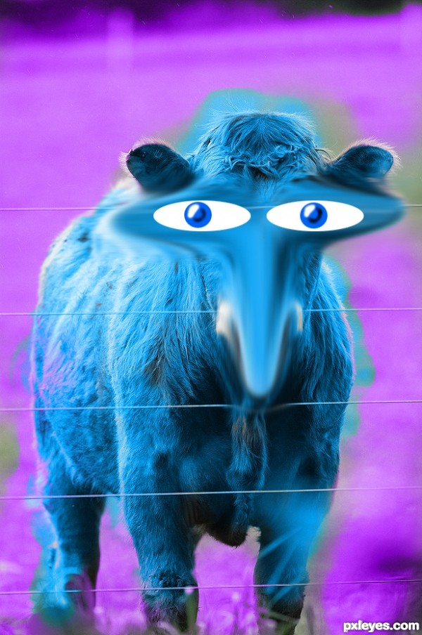
The distorted areas are very blurry looking, and the eyes look too much like stickers pasted on top, rather than integrated into the actual face. They have no depth, and look very flat.
This is an imaginative concept, but the technical execution needs some work.
Great Idea for a beginning contest, you could reproduce the LINES of the fence and place them over the manipulations for more reality and a gentle burn tool on the edges of the side of the eyes will give them more roundness.
Just a little help (I love your cookie monster colors  )... good luck author
Howdie stranger!
If you want to rate this picture or participate in this contest, just:
LOGIN HERE or REGISTER FOR FREE
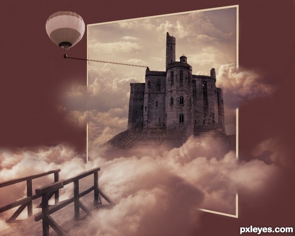
Mostly good, but you changed the perspective when you scaled the castle vertically, and the balloon would be tethered vertically, not horizontally.
Evocative elements. However, I don't get why the balloon is tethered by an out-of-scale chain let alone why one would even need a balloon if you already have a house in the clouds. Plus the balloon is the focus of my attention, not the house. I would delete the balloon. Less is more.
The simple wooden bridge strikes me as a bit too rustic for an approach to such a castle-like home. And the dark windows make the home seem abandoned and uninviting.
The title delcares 'colorful' yet the image's palette is quite muted. I think there's an appealing Instagram feel here that could be emphasized with a square crop and perhaps a hint of vignette.
thx for ur comments cmyk46 and the suggestions to make the image better, and for u Dan: full of compliments as always.... i rather have u to say nothing at all instead of all the negative criticism, i suggest u make an image urself to show us all how it has to be done..and look up the word surrealisme and u will understand such images like mine, and one more thing, if i would live there u would certainly not be invited..
Howdie stranger!
If you want to rate this picture or participate in this contest, just:
LOGIN HERE or REGISTER FOR FREE