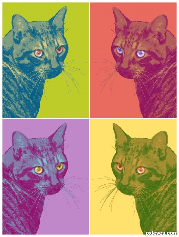
Just a pop art kind of thing. (5 years and 3341 days ago)
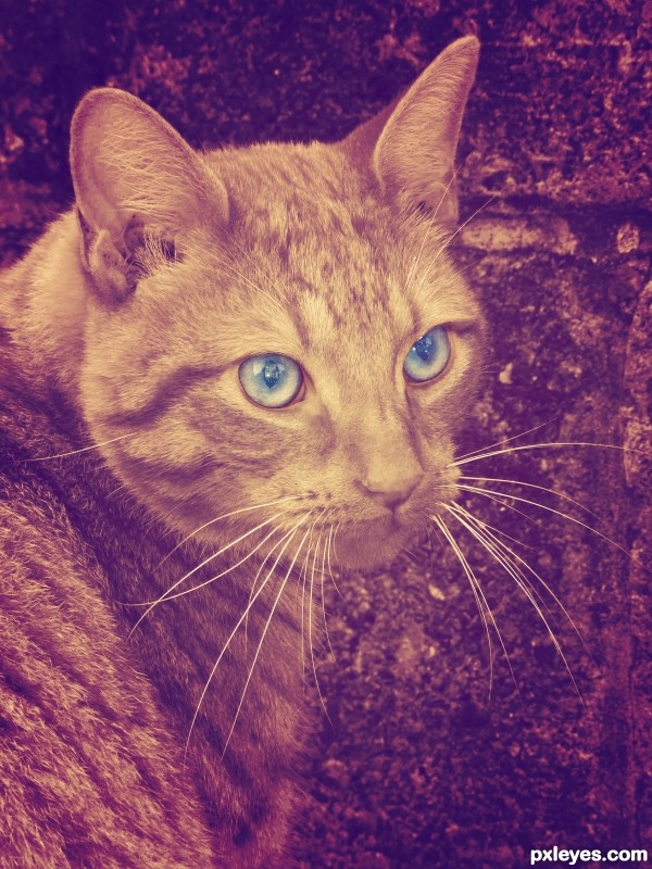
Quite simple really, just playing with colour and tone.
Gradient map in purple and orange, vignette edge overlay, blue eye colour overlay. (5 years and 3341 days ago)
Although playing with color and tone is fun for your own pictures I would suggest maybe try and go overboard next time.. There are so much more cool things to do with PS! Good luck author!
Howdie stranger!
If you want to rate this picture or participate in this contest, just:
LOGIN HERE or REGISTER FOR FREE
(5 years and 3485 days ago)
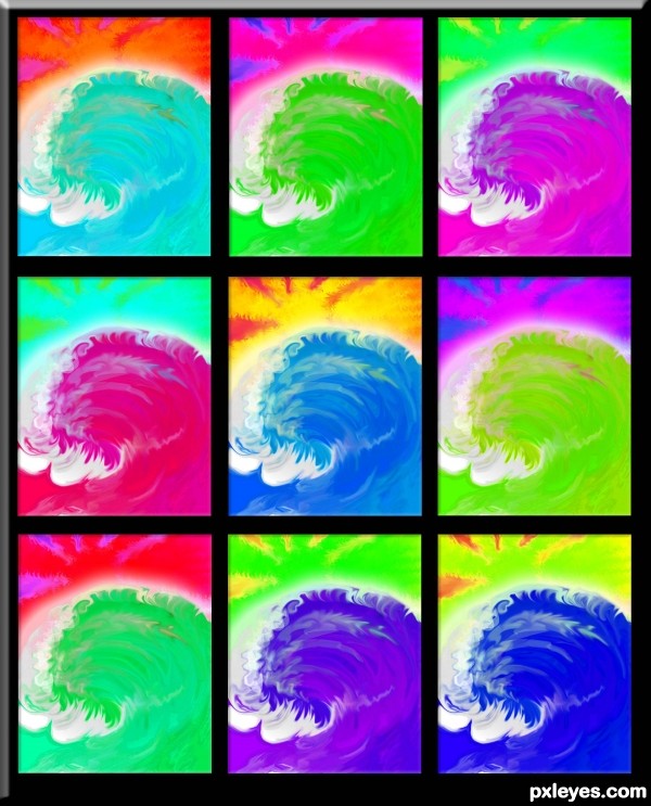
and nice colors they are "Dark Side of the Moon" 
i like it!
good one, yes...very, very "any colour you like".......
Beautiful! 
Reminds me of Andy Warhol work. 
Howdie stranger!
If you want to rate this picture or participate in this contest, just:
LOGIN HERE or REGISTER FOR FREE
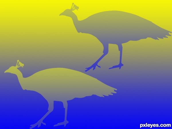
The two peacocks with an alike colour.
Thanks mzacha (5 years and 3601 days ago)
and where is the illusion at?
dandesign... the two birds are Identical, the gradients make them look different.. yet if you moved them over each other they would blend right into each other (good Luck author)
that's not an optical illusion, after my knowledge
illusion: An erroneous perception of reality
The erroneous Perception.. the two birds are different, the reality, they are exactly the same
Thank you for the help Ernest.
u gave me the meaning of illusion... not optical illusion  ) whatever ... lol
optical illusion: A visually perceived image that is deceptive or misleading.
Perceived image is two different birds... the deception is that they are exactly the same... and that's your English Lesson for today young man.. Now go out on the Jungle GYM and have a blast.. hehe
I got to admit, I don't really see an optical illusion either...
I've seen an optical illusion like that before, it was two squares appearently of different colors. But actually they were equal! It's very mysterious, like your work, author! Nicely done, and GL! 
It's an optical illusion alright.
An SBS displaying the two birds on a white background might help dispel the confusion.
good luck
Howdie stranger!
If you want to rate this picture or participate in this contest, just:
LOGIN HERE or REGISTER FOR FREE
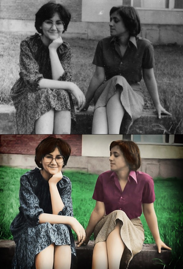
This is a photo of my mum and her best friend taken 33 years ago while they were still in high school. The photo is really small, I'd say as an average business card, so it was really hard getting it to look sharp. I used a special technique for making the edges look normal (since sharpening filters know to make that strange blurry glow on some places), check out the SBS. I also used some other images from flickr for facial parts and parts that were to small to be sharpened with filters (eyebrows, glasses, nose....), it's all listed in the sources.
Hope you like it. =) My mum sure did, she even made me some cookies :D
(5 years and 3744 days ago)
Well done. My favorite part is the look on the face of the girl on the left. She looking at the other girl as if to say, "Don't move. There's a huge bee on your shoulder" while girl 1 is blissfully unaware of the impending stingage. Great job. I'm looking forward to the SBS cause the edges are fantastic. The left eye of the girl with glasses looks like it's half closed. Not sure but it's the one point I see that looks a little unnatural.
Very nice work! In my opinion however, the skin and especially the grass looks very unnatural, i'm really no good at this type of thing so i wouldn;t know what to suggest, perhaps some different shades of green around the grass.
Thanks for the comments guys! Glad you like it =) The SBS will come during the day, I planned to finish it about now, but something came up, I really really have to go now.... Doesn't matter anyway if I lose a bit of reputation, just hope they don't expell it. =)
Oh, and about the grass and the skin.... Yeah, the skin really looks kinda... 'painted' in some parts, probably due to sharpening filters... I'll make sure I fix it.... =) However, I do like that the grass is blurred, kinda looks out of focus, and I really like the effect =) About the eye, hmmmm, it kinda does look half-closed.... Tho I didn't mess with her eyes, couldn't match any I found only with my mum's (the one without glasses)
the grass is surreal, its cool
Thanks all, I added the SBS. =)
An update.... I fixed the skin, and I did some touch-ups to the hair. =) Hope everyhting is OK now =)
You missed a lot of scratches that could have easily been fixed.
Wuuuuuuuuuut?! Where?! O.O I can't see what you mean.... I just can't see what you're aiming at? Have you looked at the SBS?
imo, there are still a number of areas that could be a lot better. the heads and hair on both ladies could be much better, in hi res you can see this...your mother, the one with glasses, her face needs some more work, her nose is not finished well........her arms also look like prosthetics, especially the left one, they lack definition.....imo
Hmmm, some parts could be better, but only if I used external sources for those parts, since they are to blurry. You must understand that the photo is not bigger than an average business card. I tried to do my best here, edges are much sharper, you must admit, but some things just can't be sharper.  Besides, TBH, I think this is maybe the only entry which has cleaner outcome than the original. Most of others are just colouring and scratch-removing and simple usage of filters.... Some are even blurrier than the original.Considering the original, the outcome is great IMHO.
Ummmm....nice work on your entry, but your last comment wasnt true .....Other entries did come out cleaner and sharper.... besides that, you shouldnt be putting down other entries to try and make yours look better.
TBH, I see only 3-4 entries in this contests which are cleaner sharper than the original. Others are just colouring and scratch-removing. I'm sorry for maybe putting down the other entries, I was just pissed off by the fact that I spent hours manually making the edges sharp and clean and even using outside sources to bring up the detail on faces etc and then somebody says that it's scratchy and blurry etc. I mean, maybe it is, but compared to the starting photo it's much better.  peace
peace
great 
Well i thought this should of made top 4 at least.....i have to say that the results are very dissapointing and just dont seem right.
Howdie stranger!
If you want to rate this picture or participate in this contest, just:
LOGIN HERE or REGISTER FOR FREE
I think that Photoshop requires a little more imagination, a little more creativity, no point to set anything !

let this be a guide :
cut - layer it - transform - insert - create - adjust - and prepare for critics
And welcome to the photoshop contest site
GL
I like the "Warhol Pop Art" effect. Nicely done! Sometimes, simpler is better.
I think there is creativity in treating the eyes differently and in making the great color choices, not to mention the overall concept. However, having all the images facing the same way would be more Warholian and compelling IMO. (BTW is the title an allusion to Warhol's 'Mao'?)
Love it ... I have to agree with Mossy and Dan ... nice replication of AW's work. Love what you have done with the eyes as well.
very Andy Warhol.. and very well done (this would look great on a side of a building.. or a floating center piece in a restaurant less is often more....good luck
Howdie stranger!
If you want to rate this picture or participate in this contest, just:
LOGIN HERE or REGISTER FOR FREE