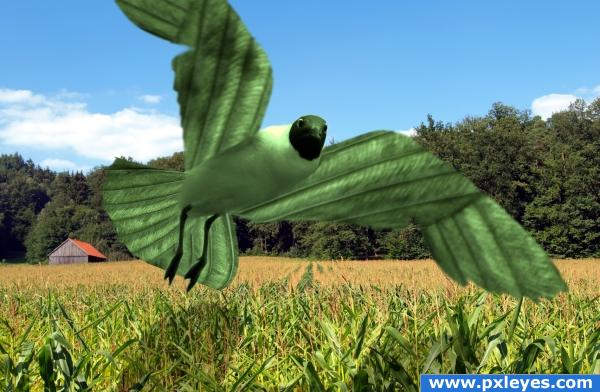
I have used two external sources of Bird and the back ground pictures.
thanks to http://www.sxc.hu/photo/1217138
Author: rolve
http://www.sxc.hu/photo/1217138
Author: oOlemon
(5 years and 3806 days ago)
- 1: Bird
- 2: Back ground

I have used two external sources of Bird and the back ground pictures.
thanks to http://www.sxc.hu/photo/1217138
Author: rolve
http://www.sxc.hu/photo/1217138
Author: oOlemon
(5 years and 3806 days ago)

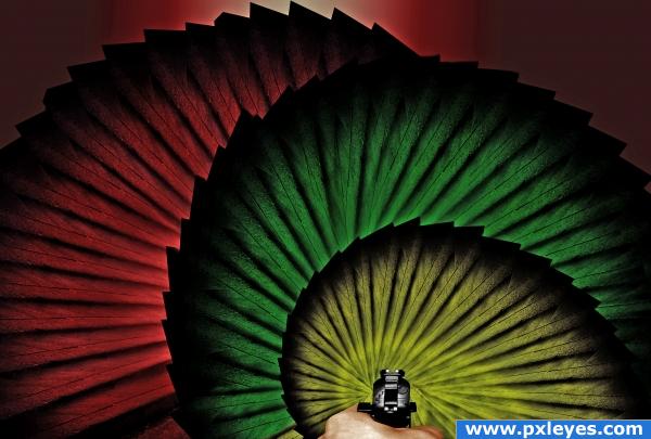
There isn't any real logic to this image.... I think I should just go to bed now :)
It kind of reminds me of the opening for 007 lol
Anyway... it looks like it was a simple image, but it was rather time consuming as I had to duplicate each peice for each side and transform each one.... :) (5 years and 3864 days ago)
It really is a visually pleasing image.
Very nice image... I like it!
Howdie stranger!
If you want to rate this picture or participate in this contest, just:
LOGIN HERE or REGISTER FOR FREE

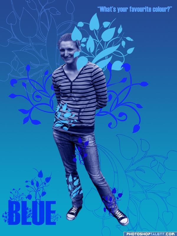
Cut image - feather edges - desaturated it - color balance to blue - used plant/flower brush - Dodge and Burn on 2 of the patterns for shadows etc. oh yea and gradient background. (5 years and 3947 days ago)
very nice and definately blue
Too much red...
To keep it more according to the contest goal, you should reduce the red in the blue, yes. Good luck!
awesome ill get onto that! thanks for the comments - keep em coming - pick the hec out of it  so i can learn from it please
heheheheheheheheheheheheheheheheheheheheheee...  just... heheheheheheheheheheheheee
 high!
high!
would be a great ad... for something LOL.. good luck
I agree that this could be an interesting ad. The lavender 'wings' are not blue, however. And as an ad, I think it would work better if (at a minimum) her skin and hair were their natural color -- which would be counter to the requirements of this contest.
need to remove the pink sorry.
good
You definitely should be designing ads for products. Really nice!
nice job 
I don't really like the blue skin on people  but the ornaments look great!
Howdie stranger!
If you want to rate this picture or participate in this contest, just:
LOGIN HERE or REGISTER FOR FREE
SBS of this entry will provide tomorrow.
Bird is too blury for this background.
I'm a big fan of this kind of effect.. It makes the bird look like a flying painting instead of just a green bird... but that's just me...he almost gives of the feeling he's a Kite.. good luck!
nice
Howdie stranger!
If you want to rate this picture or participate in this contest, just:
LOGIN HERE or REGISTER FOR FREE