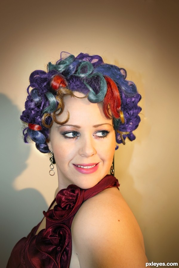
Thanks to Knox_x@sxc.hu for use of photo :) (5 years and 2957 days ago)
- 1: woman
(5 years and 3141 days ago)
Howdie stranger!
If you want to rate this picture or participate in this contest, just:
LOGIN HERE or REGISTER FOR FREE
(5 years and 3790 days ago)
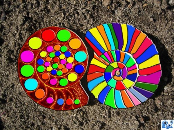
Very nice work and great idea...left one is a bit realistic then right one...gl author...
Very nice concept...looks too flat too me...
i think if you made better selections for your color and completely colored the other shell...i think it would look good
Howdie stranger!
If you want to rate this picture or participate in this contest, just:
LOGIN HERE or REGISTER FOR FREE
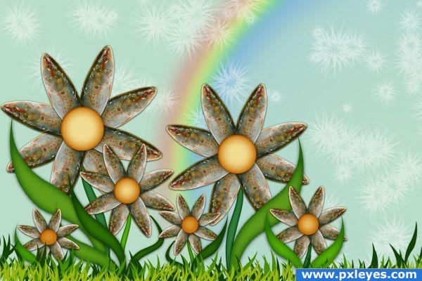
Micro Pattern Brushes: Obsidian Down (5 years and 3833 days ago)
hehehehehehehehehe..very well done... WOOO HOOOOO
Thanks GolemAura. Comments are always welcome 
Very very very very nice, good job 
Aw, very pretty image 
lol great use of source Author 
Way to take 'unpleasant' and transform to 'very pleasant'.
Nice, I'd have never made the link from fish head to flower petal. Well done
very good job 
Congrats for your third place, divair
Congrats!!!!
Congrats
Howdie stranger!
If you want to rate this picture or participate in this contest, just:
LOGIN HERE or REGISTER FOR FREE
(5 years and 3957 days ago)
Nice Job 
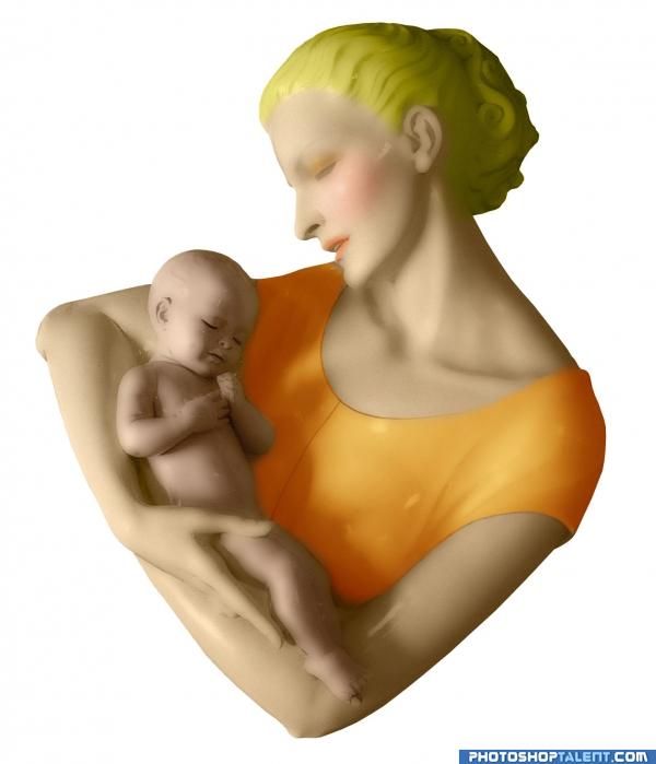
good onee i like blurry effect but a little artistic cllour effect iin backgrounnd will poliish its beauty
very nice smoothing of image....
Very nice, and I like the matte finish.
coloring need to improve
gl
nice blush.GL
Howdie stranger!
If you want to rate this picture or participate in this contest, just:
LOGIN HERE or REGISTER FOR FREE
IMO would be much better with the original background. This one just distracts.
I thought about, give me two minutes
No quibbles about the fun and convincing hair coloring, but the still-brown tresses seem odd to me. The Rule of Thirds would suggest cropping out much of the empty top portion of the image and a bit of the left side. I do find the background bland (with the model blending into it). I think a stark/dramatic ivory background or an out-of-focus environment where this look would shine would give this more oomph.
will have another play with it this arvo thanks for feedback CMYK and Dan
Howdie stranger!
If you want to rate this picture or participate in this contest, just:
LOGIN HERE or REGISTER FOR FREE