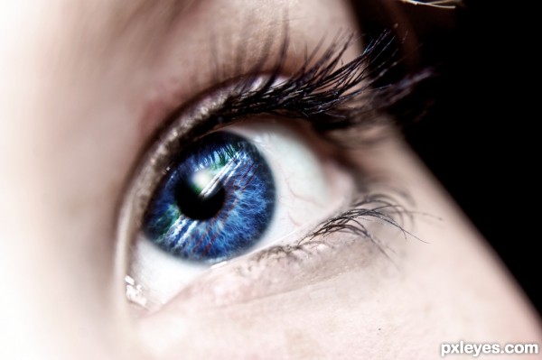
Blending, basic brushes, cloning tool and various adjustments (5 years and 3038 days ago)
- 1: eye
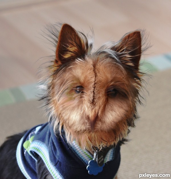
I just found this dog picture and I couldn't help myself not to make something from it. (5 years and 3062 days ago)
Good blend. 
TERRIFIC (IMHO, maybe a soft burn brush on the beak will make it stand out more, not necessary but the thumbnail looks like there is no beak there at all) great IDEA!!!
Thank you, CMYK46 and Drivenlush.
@ Drivenlush: I tried to make the beak more visible, I think I managed now.
Really nice blending and very convincing work!
Thanks.
Howdie stranger!
If you want to rate this picture or participate in this contest, just:
LOGIN HERE or REGISTER FOR FREE

Spec Thanks to Surrealpenguin for use of his map photo found on Flickr photo sharing.com (5 years and 3142 days ago)
Blue on blue, heartache on heartache. )
CMK46 Do you like that any better?..lol Thanks
Looks better to me. GL author. 
Much improved with the contrasting color.
veri nice
Hey Thanks all for your comments ...CMYK46 as always Your comments have bought me to where I am today through the years You and others....Thanks
like the colors man good luck
Thanks kushpatel .
Howdie stranger!
If you want to rate this picture or participate in this contest, just:
LOGIN HERE or REGISTER FOR FREE
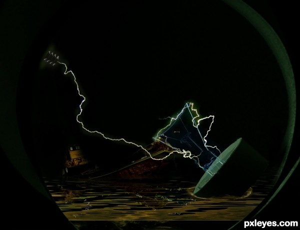
(5 years and 3159 days ago)
Interesting effect. Nice mood.
Howdie stranger!
If you want to rate this picture or participate in this contest, just:
LOGIN HERE or REGISTER FOR FREE
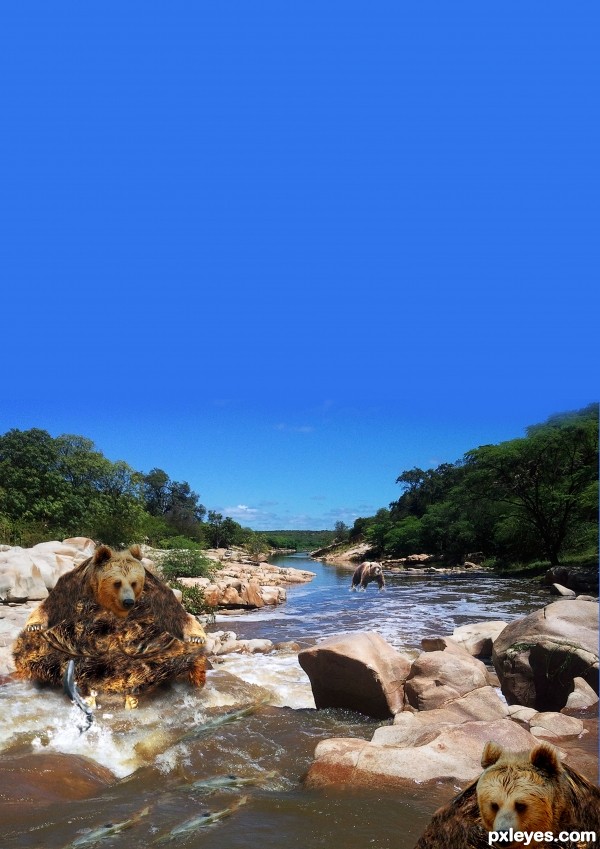
im to fat i cant (5 years and 3195 days ago)
The jumping salmon is very crudely extracted, with very sharp edges and a noticeable outline from the original background.
The contest source cloning you did for the bear is likewise quite crude and repetitive in patterning for the chest and stomach. The direction of the "fur" looks sideways, rather than vertical, which makes the cloning job look even worse.
The "pendulous breast" highlights between the chest and belly are non-existent in real bears. They don't have two breasts that weight would emphasize like that.
This is a good concept, but you need to be better aware of what you are attempting to render. Perhaps looking at some grizzly bear images would help. You also need to put a bit more effort into "seamless" cloning that is not so obvious, as well as taking more time to extract images with a bit more care so they do not look so harshly "cut and paste."
You might also consider cropping at least 1/3 of the empty blue sky off the top. It adds nothing to you image except too much dead space which detracts from your focal point, the bear.
Howdie stranger!
If you want to rate this picture or participate in this contest, just:
LOGIN HERE or REGISTER FOR FREE
Minimal use of source, but I really like the final result. Nicely done!
thanks, sometimes less is more ...
Howdie stranger!
If you want to rate this picture or participate in this contest, just:
LOGIN HERE or REGISTER FOR FREE