Thanks to Sheckler05 and AilinStock at DA. (5 years and 2795 days ago)

Just source (5 years and 3592 days ago)
woo hoo.. was hoping for a scorpion  .. great job
dude freaken awesome!
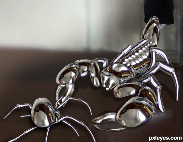
The shadow of the tail on the back wall wouldn't be there, according to the other shadows you've made. Still a good pic, though. 
well made..., good luck
Great job on the build -- like the way you kept the chrome and used the existing reflections to hi-light your creatures
Good construction of the creatures! I might have chosen a different background IMHO but still very nice work.
My sign! I like it a lot, very nice construction, author! GL... 
Very nice and shiney. Gl!
@ cmyk, you were quite right about the tail shadow, I must have had a mind melt there... I think thats much better now.
@ spaceranger, I thought the same thing about the background, but I do like to keep the source as recognisable as possible in these types of chops, so I opted for this. Thanks for the help though 
I agree with keeping the source visible in a source contest, for me that's a part of the challenge. I think what bothered me is that black rectangle in the source, it detracts a bit. If it were cloned out it would strengthen the focus on the creatures and still be faithful to the source. I want to emphasize that this is a really fine entry and my comment is in no way a criticism, only a suggestion
of possible alternatives. 
i like it ,good luck
Very very good construction,u used source image perfectly...and of course he looks freaking perishing...
Nice job keeping the original source. GL!
Good.
AWESOMENESS!!!!!!!!
Congrats on a well deserved first place!
Congrats!
Congrats Geexman  very nice work
Congrats! 
Congratulations, Gino! Cool... 
Congrats!! Well done!
Congrats indeed...good chop.
Howdie stranger!
If you want to rate this picture or participate in this contest, just:
LOGIN HERE or REGISTER FOR FREE

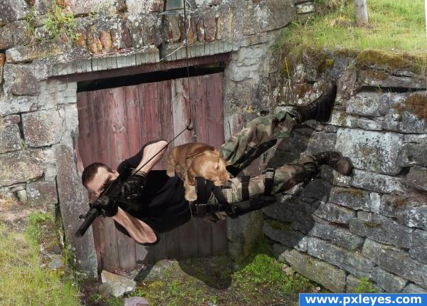
Puppy Bloodsport !
Go for the sausage !
Thanks, jademacalla on deviantart for the stock image of the guy, the wall is my own picture. (5 years and 4010 days ago)
What i really want to know is what was going through your mind when you made this?? Very random use of source!! Good job!!
Hm, what was going trough my mind ? Too much caffeine, I guess.
Wow, puppy doesn't seam to be concertating on training, very nice
High marks from me... though you are a loony author.. hehehe
oh Yeah.. forgot... OUCH OUCH OUCH OUCH OUCH
speachless  how to came up with a thought like that. ? clueless! i just, .. no, . i didnt,... no , .. i mean, ..no, ....just speechless


(oh, .. may caffeine issnt that, ... ah, forget it) 
put some shadows underneath the dog. look at the guy's arm, that's what you should be looking for 
pretty cool good luck
very funny
With a right arm like that the guy NEEDS a good dog! And what's he chewing on?????
Congratulations for 2nd
Congrats for your second place!
Congrats!!
Congrats!
congrats!
Congrats!
Howdie stranger!
If you want to rate this picture or participate in this contest, just:
LOGIN HERE or REGISTER FOR FREE

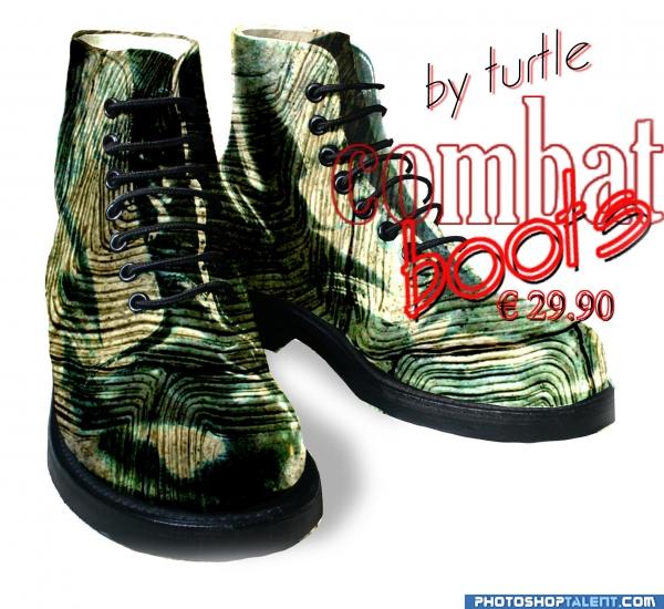
curves copy erase ligth screen (5 years and 4053 days ago)
Good idea, but high res is sloppy...fix & blur some edges. Try to give the center boot more volume, and make the type bolder. Maybe a shadow would be nice, too...
nice idea good luck!
Poor turtle  Good luck
no turtles were harmed in the making of those boots lol
nice
GL!
nice
Nice idea, but need some clean up here and there (for example, I see some of the turtle texture coming from under the soles). The right shoe (for viewer) looks more convincing than the left shoe, maybe a bit of more shading there were the sole and texture comes together so that the difference in quality (the shoe source looks sharper) is let noticeable. Good luck!
Howdie stranger!
If you want to rate this picture or participate in this contest, just:
LOGIN HERE or REGISTER FOR FREE
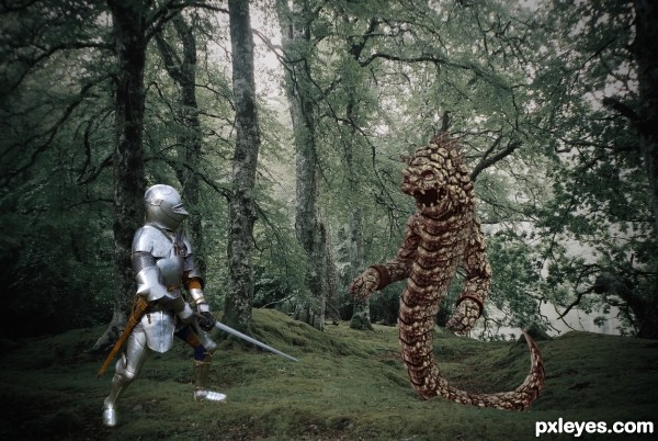
Nice job on your monster. The bright shininess of the knight seems out of place with the overall lighting though.
Never heard of a knight in shining armor?
the increase in brightness has helped the lighting issue....
Great realistic job!
You did a good job to transform the monster into something different. Good setting for the images. Good luck!
Howdie stranger!
If you want to rate this picture or participate in this contest, just:
LOGIN HERE or REGISTER FOR FREE