(5 years and 3149 days ago)
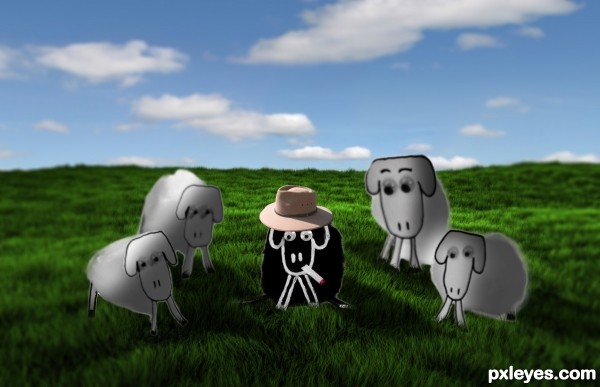
i used image adjustments, lighting, selection and a 3d program called blender for the background (5 years and 3195 days ago)
Love the hat, nice touch!
You need to adjust the lighting on the other sheep's faces. You have the ones in the sun shaded, and visa versa.
There are a couple areas for improvement on this one. I'm not sure what you used to cut out the sheep but it looks like they have an outer glow to them. I would suggest looking up masking with the pen tool. Also the depth of field is really shallow on the original source, so I would suggest using lens blur with a gradient channel to make your background match the DOF of the original source. Lastly if the sheep are in the grass, then some of the grass should be in front of them. Just use a mask on them and with a really small brush paint out some grass sticking up. Good luck!
Howdie stranger!
If you want to rate this picture or participate in this contest, just:
LOGIN HERE or REGISTER FOR FREE
(5 years and 3237 days ago)
my kind of entry...looking good!
Many thanks
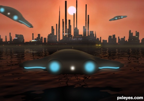
Cool idea. I like the non-traditional use of orange, but the sky seems kind of blah and in need of more-dramatic saturation. Compositionally, the centering of the sun, city, and foreground UFO is also kind of blah. (I'd move the sun left and the front UFO right for a diagonal composition—which would require a sun reflection in the water since the UFO shadow would no longer block it.) The identical blurring of the lights of each of the UFOs regardless of their distance from the viewer/photographer weakens their impact IMO.
Thank you very much for your views on this DanLundberg  I will take all your advice onboard
good concept..!!
nice work like it..gl author
Howdie stranger!
If you want to rate this picture or participate in this contest, just:
LOGIN HERE or REGISTER FOR FREE
(5 years and 3263 days ago)
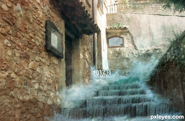
looks realistic! well done!
cool work author...gl
very convincing!
Is there any way we can stop it, I mean the 2012 thing? Can we just jump into 2013. Wew! What a big leap.. lol!
Very nice. Would be better without the text IMHO.
Agree with sgc,in regard to text..Looks good otherwise..GL author
FAVEEE!!
Howdie stranger!
If you want to rate this picture or participate in this contest, just:
LOGIN HERE or REGISTER FOR FREE
Credits to
Obsidian Dawn
falln-stock (5 years and 3281 days ago)
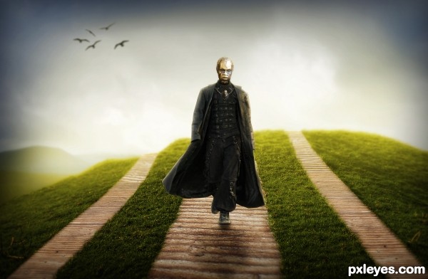
Very well executed, just few suggestion - decrease the size of the head and as the body is more to left side head is looking too much at right side!
Best of luck my friend... 
thanks for the comment..i purposely left the head the way it is because its meant to look as if its just a floating head (like an invisible man with a floating mask)..about the size, i'll work on it and see how it looks..again, thanks for the comment!
very cool
you have high vote from me
Head proportions look good at this point. Really nice chop, You just need to add a wee bit of back lighting behind the head and shoulders to match the coat at the bottom.
What a narcissist! Wearing a neck pendant of himself! Geeez....nice work, author!
very nice job 
fantastic very effective work...gl
Congratulations! 
Congratulations!!! Have a cookie!
note: cookie is purely hypothetical.
Congrats!!
Howdie stranger!
If you want to rate this picture or participate in this contest, just:
LOGIN HERE or REGISTER FOR FREE
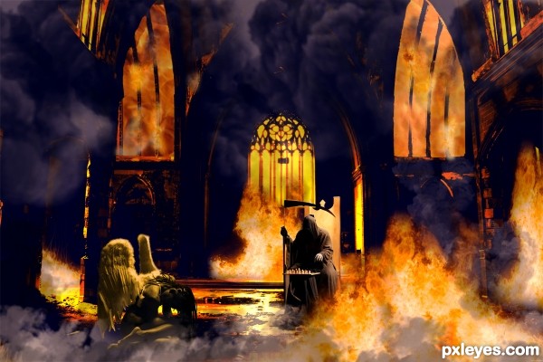
the plan was to find e devil source for the batle of the church but ditnot find one i like so , i com up whit this , thanks
Howdie stranger!
If you want to rate this picture or participate in this contest, just:
LOGIN HERE or REGISTER FOR FREE