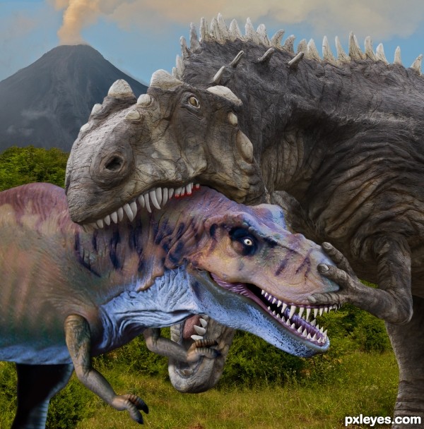
It seems there's always a bigger tough guy... (5 years and 2692 days ago)

Credit:
http://jademacalla.deviantart.com
(5 years and 3400 days ago)
A really great image!  I feel the danger..
Amazing ! So realistic you make this picture live...You create a story in it, you give the pics a soul. Bravo  Good luck author
Great pic.. I like the green tint. Goes very well with the soldiers.
Gripping Condition...Keep watch,there enemies everywhere..And beware for mines...
Very very GOOD Story...
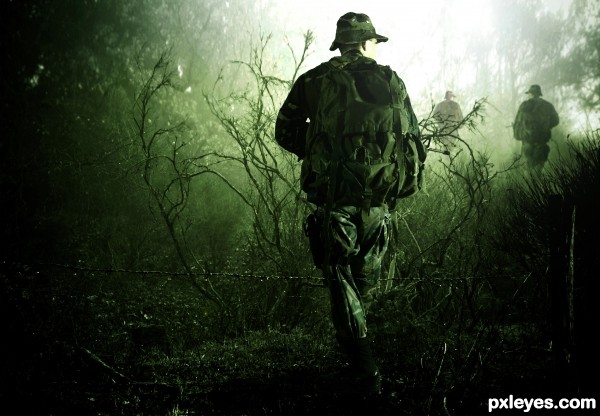
Great blend! The only thing that i don't like is that all 3 soldiers look the same ( flipping doesn't count).
You could search for other backheads, paint backpack, apply gasmask, helmets etc.
Since you're lvl 15+, blending shouldn't take you long, so no reason for lazyness :P.
Striking image! 
Nice chop, but I agree with greymval. I would use different guys in the background, as that was the first thing I noticed.
Have to agree, different guys needed. But still a great piece of work 
I honestly didn't even notice that the guys were all the same until someone pointed it out but overall it's an impressive blend so GL! 
Very impressive....looks like a call of duty c.d cover :P....but i agree with everyone else that u shud hv used different guys....
like an ideea!... Why should I use another guy,,,or soldier????...I want to know your opinion....not only as mere opinion...maybe even learn something....?!?!!!??
i se a lot of emotion, this is fabulous
"Why should I use another guy,,,or soldier?"
This way it will look like a platoon is advancing through enemy territory and it would make the image more realistic, cause right now most of the people can see it's the same guy pasted 3 times.
It will also mean you worked harder and bring you higher votes - but that's secondary.
As i said you can use the same guy, just change head, backpack, apply gasmask, helmets, etc.
Unfortunately the contest is over, so in case you modify your entry, just post it in your albulms, cause that would be really cool.
Congratulations! 
thx all...for your comm and tips!....
congrats ...
Congrtats.. very nice
Congrats!!
Howdie stranger!
If you want to rate this picture or participate in this contest, just:
LOGIN HERE or REGISTER FOR FREE
Really nice one (although the bottom jaw looks a bit large)
It's exactly the same as the source image(3) which you can see in Step one in the SBS.
Great scene. I like the positioning of the claw on the nose. it would be nice if you could apply some color to the bigger T-rex.
Thanks! The big guy isn't a T-rex he's a (take a deep breath) Acrocanthosaurus Atokensis, one of the largest theropods ever. Dinosaur colors are pure conjecture but I tend to go along with the camouflage scheme many experts favor and that's the coloring used on this Dinosaur Park exhibit seen in the source photo.
Good positioning of the claws both on head & jaw. Over all a great blend of sources to create a dramatic scene. GL author!
Great job author
One of the bests I've seen so far. Good job.
Good work nice blending of the Dino's
PS this is also about 3 points better than what I mistakingly gave it. Sorry.
You are good for finding these nice sources to go with the source image. It shows that the fight for survival was intense. I can hear the neck bones cracking under that strong jaw. Ouch! Very good and sharp image again. Good job.
Congrats Rein!
Congrats again, great job!
Congratulations my friend.... good job!
Congratulations !
Thanks to all for the kind comments and congrats!! Special thanks to kyricom for providing the source image!
Howdie stranger!
If you want to rate this picture or participate in this contest, just:
LOGIN HERE or REGISTER FOR FREE