(5 years and 1075 days ago)
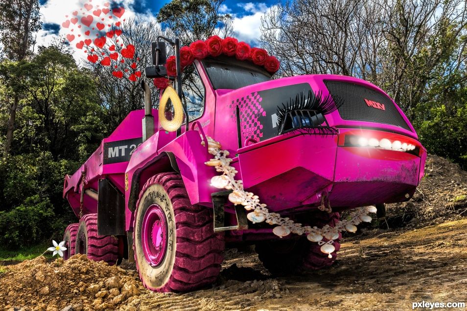
This is a giant construction machinery...but it has a very sweet, enchanting side, too! (5 years and 1083 days ago)
It's pank
Very funny !
Thank youu 
Author, sources 4 and 5 are OK, but 1,2,3,6,7 are illustrations, and not allowed.
Rules and Guidelines: 5.6. 3D Renders or Illustrations as Source:
Using other people's 3D renders or illustrations (even with permission and no matter in which form they are offered)
creates a false impression of your artwork. So 3D renders or illustrations can not be used as sources,
unless they are entirely created by yourself. Only acceptable non-illustration brushes and clip art may
be used, but you need to mention them as a source too. Don't use an image that has been altered by the
source owner nor an entire work created by someone else.
You will have to alter your entry to meet the guidelines, but you still have plenty of time to do so.
Sorry. I changed my artwork according to your instructions. Hopefully now everything is fine.
You are good to go.
Thanks!!
Can you hear me laughing? This is so......oh so........corny that it is hysterical. How did you change her to pink? Selective colour tool? Thank you also for your SBS. Wonderful work.
Oh thank you! I really appreciate that! Yesss, I used the selective colour tool to turn this beauty pink ;P Your comment just made me so happy, thank yoouuu
This should be made and used lol  good work
Howdie stranger!
If you want to rate this picture or participate in this contest, just:
LOGIN HERE or REGISTER FOR FREE
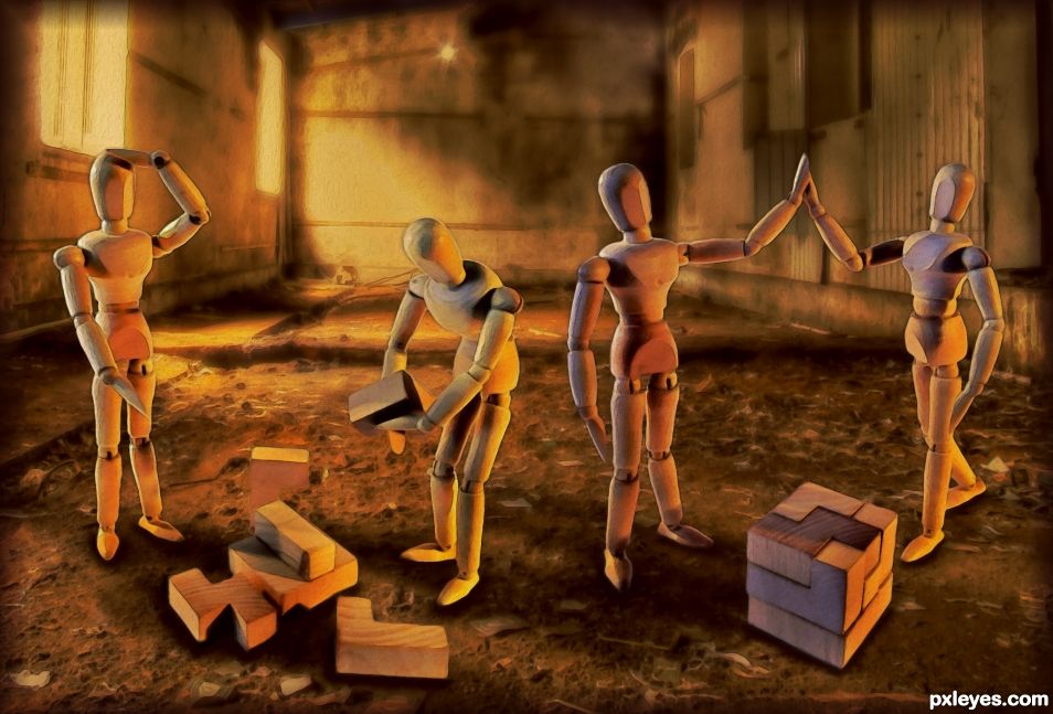
Busy solving construction puzzles. (5 years and 1268 days ago)
Author, there are many errors of perspective, light and shadow here, not to mention blurred or pixelated edges.
Yes, I know. It is a mess that I need to fix. I made a note to myself to not upload things in the middle of the night when I am half asleep any more. I need to wait till I am awake and alert and check things in high resolution before uploading.
Anyway, it's all part of the learning process. I need to get a lot better at perspective. I am having problems getting two different perspectives to match correctly. I need to watch more you tube tutorials and do a lot more practise.
Should I warp the background perspective to match the characters or vice versa?
Fun take on the contest author.. you may want to double the layer that contains the CUBE because you can see through it.. though that could have been your goal.. I like the overall color balance and the humor.. especially the High Five and the "Head Slap" hehehe.. good luck 
Thanks Drivenslush. There is obviously a lot I need to fix on this mess. Back to the drawing board for me. 
Now Now, considerable skill was put into this.. though I've been on those late night brilliance rides and in the morning I'm like, "What the hell were you thinking?" then I see the wine glass and say.. Oh yeah... hehehe
My late night artistic inspiration was simply clouded by tiredness. I can't blame any wine glasses. 
Anyway, I redid the whole thing.
I think the perspective looks a bit better now.
It's a P.I.B. trying to get perspectives right but I will get the hang of it eventually.
Congrats
Congrats on 3rd Place 
Congrats Skyangel!
Congratulations
Thank you very much everyone.
Howdie stranger!
If you want to rate this picture or participate in this contest, just:
LOGIN HERE or REGISTER FOR FREE
(5 years and 2641 days ago)
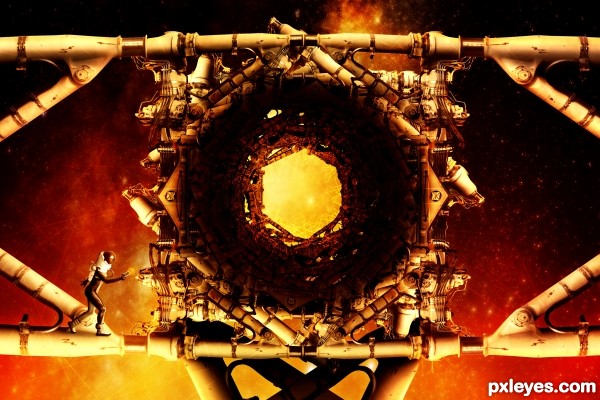
You put things together in a way that they look good. It is a nice idea, because the source gives you the imagination to create something like this. I like the orange - red background, and the space structure. Good luck.
nice work,great construction! GL
Howdie stranger!
If you want to rate this picture or participate in this contest, just:
LOGIN HERE or REGISTER FOR FREE
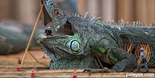
Ever wondered how lizards are made? This may be the proof you were looking for.
Source links and high res provided (5 years and 2664 days ago)
superb work
Terrific work, great sbs too 
Wowza! 
Fine work...GL author! 
Thank you so much for your comments and favs! Very inspiring. Happy New year!
Good creative thinking and well done! SBS is very good and informative!
High Resolution and SBS are awsome. Good thinking, very creative....good luck!
Beautiful !
Very original, and a lot of work in here too!! Good luck author!
Congrats, well done! 
congrats 
Congrats!
Congrats!!
Congratulations! Great entry! 
Great entry... Congrats
Howdie stranger!
If you want to rate this picture or participate in this contest, just:
LOGIN HERE or REGISTER FOR FREE
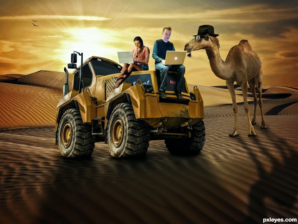
Even though another author also created a tractor style vehicle from the source it's interesting to see what the other author made in their entry. Even though the basic idea is similar each is different. Good luck to both!
I had no intentions of copying the other Author. Mine was done two days ago more or less but it took me some time yesterday and today to make the SBS. If I didn't make that damned SBS, mine would have been first haha. I guess it boils down to two great minds thinking alike.
Holy Guacamole.....You have even put in shadow effect. This is super professional work (to my eyes). Really well done.
Nicely done. The sand needs some texture and the two people are not useful in this picture. Good luck author.
Thanks for your suggestions lolu. I really didn't have time to worry about this too much as my mom had surgery and I spent a few days with her. I put the laptop people there just for the bizarre-ness of it. Yes it makes no sense, but along with the Curious Camel, I thought it made the Chop funny and weird.
If the people were not sitting, then laptops could not be held, if laptops could not be held then the camel would not be getting an education..
I concur!! Camels need their education!
There is a big problem of perspective in this image: the three visible wheels of the truck are at the same level which means that to be consistent with such an arrangement the horizon line should pass through the base of the wheels, Is not the case here ...
???????
I think you will understand better with an image:
http://i644.photobucket.com/albums/uu167/denlig/Image1_1.jpg
What I wanted to say is that if the wheels are aligned on the same line, it is necessary that your eyes are at the same level as this line (the horizon) neither higher nor lower and that it is impossible to see the dromedary above as is the case on the proposed image.
Thanks for your suggestions Denlig. I really didn't have time to worry about this too much as my mom had surgery and I spent a few days with her. Perhaps you are right, but at the time I didn't have time to mirco-detail this thing.
say what???
congrats !
Mahalo Denlig. Was surprised I won. So many good entries.
Congratulations...
Thanks George55.
Congrats
Mahalu nui MM!!
Congrats
^ Demi's smiling face. TY.
Congrats brah!!
Mahalo manong.
Congratulation
Howdie stranger!
If you want to rate this picture or participate in this contest, just:
LOGIN HERE or REGISTER FOR FREE