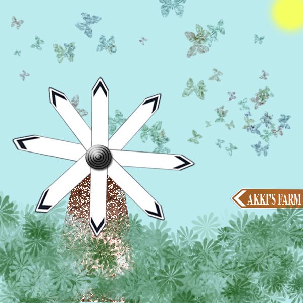
i have taken the image given and from that ive created a windmill surrounded by a farm.
*note-no external source used for this project. (5 years and 3734 days ago)
(5 years and 3844 days ago)
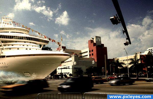
this one Impact!! excellent idea!!
You should have flipped the background and not the ship, now the name is the wrong way round.
nice idea.gl
wouldn't want to walk close by that place.... good job
Howdie stranger!
If you want to rate this picture or participate in this contest, just:
LOGIN HERE or REGISTER FOR FREE
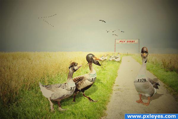
The masters of the air are making ready for take off. Pilot Goose, first officer Goostown and second officer Goosestreet will defend the gold medal from last year.
This is made by blending, scaling and rotating 12 layers. I have warped helmets and goggles to make them fit the geese heads. The most difficult part of this work was to find good stock images. I gave the image a color tone from the 50ties to match the leather helmets and goggles.
Thanks to flickr members:
Valerian Gaudeau
Kalense Kid
Pig Sty Avenue
Joel Abroad
Andy Hares
Joe Gasper
Thanks to deviantart members:
momerath
FantasyStock
Stock-Pony
thanks to stock.xchng members:
phelle
prepaan
These are two sources that I couldn't add in the form:
start number
http://www.flickr.com/photos/andyandorla/3691637380/
start line banner:
http://www.flickr.com/photos/gasper/14742015/ (5 years and 3852 days ago)
This is great and funny...but not so sure about the lack of contrast. It looks rather flat right now. If you could boost contrast here it would greatly help. Nice job 
EDIT: Lookin' Good!! 
nicely done.gl
I think your image is too dark, and like pixelkid says - lacks contrast, but your image is hilarious, and it;s a great idea! Good luck!!
Awesome! I think this is truly a brilliant idea... nicely done.
cool 
Thank you very much for your comments! I've lightened it up a bit now, and also increased contrast.
That is really nice. Good luck author
That's cute...
How lovely and funny! You did a great job with the googles and the helmets. Oh and could you please let me know, who won? I'm pretty curious  Good luck!
Congratulations for 3rd
Congrats for your third place! 
Thank you very much, all of you. Lelaina: I believe all of my geese won, they are a team, but the lost against the bournemouth boys and the surfin zebras, and that was totaly deserved
But they have the bronze medal! I'm sure, they'll get the gold medal back next year 
congrats for 3rd!
Congrats!
congratulations!
Congrats!
Howdie stranger!
If you want to rate this picture or participate in this contest, just:
LOGIN HERE or REGISTER FOR FREE
(5 years and 3884 days ago)
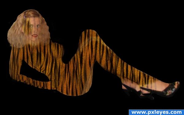
You've got the right Idea but you need to follow the natural shading of the body so the tiger print doesn't look so flat.. I'm sure other's will be along to help... good luck
Instead of using the whole piece of print and slapping it onto the woman's body and erasing around her, I suggest cutting out pieces of the tiger print that fit the different sections of the woman's body. What you have done here is make all of the tigers lines line up no matter what part of the body is showing. For example: the legs are sharing stripes at the knees as if the stripes were a dress. Even if you can't get the stripes to go in the right direction, you'll do better if the body didn't look flat.
Part 2. What you did with her arm isn't going to work, either. Try what I said before by cutting out parts of the print to make it fit the arm. There are much better ways to do this, but as a beginner, you might want to try this.
looks bad; please take into consideration the suggestions you received; you can also look at the comments of the entry before yours; that one has the same issues
thank you to all the people that left constructive criticism instead of insulting words. I will definately try your suggestions out and experiment, now that i have a starting point.
The idea is quite good. The best way to do this would be to use a displacement map after overlaying the texture at a 45 degree angle. Try following Eladine's displacement map tutorial, that should help.
good try! It is great that everyone tried to help too. I'm new and learning a bunch from others because we all start somewhere
Howdie stranger!
If you want to rate this picture or participate in this contest, just:
LOGIN HERE or REGISTER FOR FREE
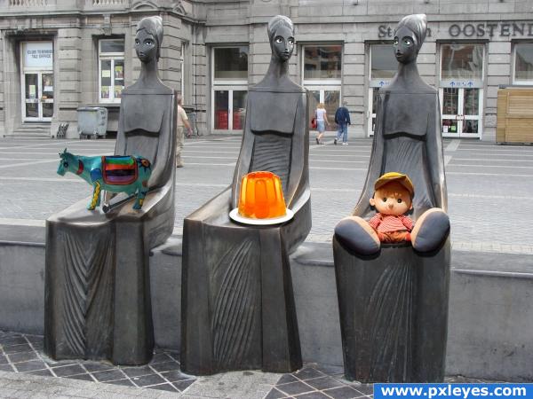
I made their eyes. Then couldn't think of anything else to do with them with their new eyes. So I figured, maybe they could hold something. Looked like they were holding something. So I looked through my own catalogue of images and found my folder of Pxleyes downloads and decided to give them cool stuff from the website.
PLEASE CHECK OUT HIGH RES TO CHECK OUT THE EYES!
All sources are from Pxleyes. (5 years and 3885 days ago)
you forgot to tweak the cow's shadow. i hope.  and why would you flatten the image at the end?
Nice
the shadow from the doll is wrong and the shadow from the cow doesnt match the others, i like how you did the eyes on the statues and the idea is cool...
Merge layers? Flatten layers? Someone want to tell me the difference? I tried different ways to make that cows shadow. I did it and redid it. It was kicking my butt. If anyone has any suggestions they would be greatly appreciated. There's one thing that I know I didn't try, but I'd forgotten how to do it and where I saw it before.
flattening the image IS merging all layers.. you should put the shadow layer below the cow layer, put some blur, play with blending options to see which one fits best. i don't see why you don't use the same technique you used with the other shadows
I didn't use the same technique with the cow as I did with the others because when I used the drop shadow on the cow it affected the others. I know that there's a way to stop that from happening, but I couldn't figure it out. I need to redo the whole cow because I accidently put the cow and the shadow in the same layer. Thanks a lot ELFICHO for the tips. I will try them out. Thanks to Eladine for pointing out the problem with the doll's shadow. I think that I had it right at first. I know what to do. Thanks everyone for the comments. They're appreciated. 
Please take a closer look now! I have fixed my cow shadow and the doll's shadow! Thanks to everyone for your feedback!
Cool  :*)
:*)
he he
Howdie stranger!
If you want to rate this picture or participate in this contest, just:
LOGIN HERE or REGISTER FOR FREE
You windmill blades are a little off. Try copy and pasting each plade after rotating each 45 degrees.
This is a different way of looking at the source, nice imagination
thnx dollmommy..this is what i really intended to do sumthing different from the sign board
Howdie stranger!
If you want to rate this picture or participate in this contest, just:
LOGIN HERE or REGISTER FOR FREE