(5 years and 3365 days ago)

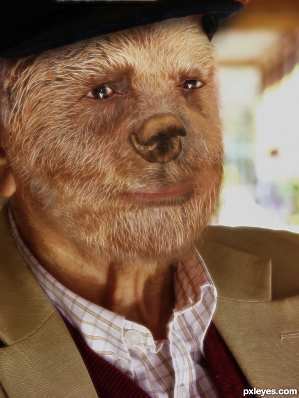
Thanks a lot to:
bear:
http://www.sxc.hu/profile/salsoul
old man:
http://www.sxc.hu/profile/pepo
(5 years and 3383 days ago)
Espetacular! Parabens.
cool work...gl
Howdie stranger!
If you want to rate this picture or participate in this contest, just:
LOGIN HERE or REGISTER FOR FREE

(5 years and 3411 days ago)

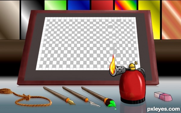
Love the rope and the blowtorch! After a few hours working on a piece, goodness knows I want to either burn it or hang myself!
Well drawn, very creative!
hahahaha yes i guess u can see it that way , it all supposed to be tools for work
(lasso selection and burn brush) 
Creative :
working so much at the moment, that is what my contest entry looks like at the beginning and for the last 6 months... at the end as well lol.
Creative idea author...
love the overall firmness of the image, almost waiting for PBS to make it into a tutorial and own show.. LOL
attention to detail is superb. I especially like the way the "heat" rises off of the flame of the torch and "distorts" your palette.
Excellent touch, author.
Made me smile. Nice job!
Super cool work author...best of luck
great idea ..... 
I agree with Mr. Big ... great attention to detail ... I love the cartoon/graphic feel to this ... your lighting is great and the concept is fun!
Nicely done, and yes, that's what I saw, too, Mr. Big - the heat maybe from the burst of energy for a new chop idea. 
Howdie stranger!
If you want to rate this picture or participate in this contest, just:
LOGIN HERE or REGISTER FOR FREE

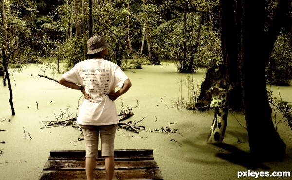
Competition shirts available now!! :) (5 years and 3507 days ago)
Love the t-shirt ... very clever!
Howdie stranger!
If you want to rate this picture or participate in this contest, just:
LOGIN HERE or REGISTER FOR FREE
This is a update from my previous avatar upload. I know there was another avatar in this contest,and i just want people to know that i didn't steal this idea. I was planning to make one my own before i saw the other avatar. Hope you like this one. (5 years and 3514 days ago)
Really nice... 
Just suggestion:
White dots is not looking real try to play with layer blending mode, I guess soft light can fix this.
Both avatars in this contest seem to be lacking the avatar ears and hair styles.
Thx Adhir, I thought the dots looked nice, but it is my first avatar and i guess theres always room for improvement, so I'll keep your comment in mind for my next one 
To jadedink, I was thinking about the ears but after spending almost an our of search with no results within the free images sections, i just had it with the ears.
You have plenty of time to improve this entry if you wanted to. I choose not to vote til closer to the end if I believe someone can make vital improvements to their image that will raise their vote.
And here is a tut with a link to the ears I used on my first try at an avatar. I have done a few since the one I entered here and found some new techniques for blending colors and getting more of the avatar look I was going for. http://www.webdesign.org/photoshop/photo-editing/na-vi-avatar-photo-manipulation-exclusive-tutorial.18015.html
Hope that helps.
Thanks jadedink, im working on a new avatar now with this tutorial as a guideline. Its to bad i cant use the ears from the link you gave me. My work would be removed (AGAIN!) if i use it. But thanks for the link. Its really helpfull.
Well, I actually think the overall effect is good but in terms facial construction it's not naavi... one thing I would like to stress though is that flare type lights in this type of image are a big NO NO!!...  LOL...
also you have to remember to put texture back into liquified areas as you're stretching the pixels out...
blending around the hairline is also noticeable but it's a tricky transition to pull off.
but overall, I think it's pretty good 
Your work wouldn't be removed for using them as long as they are clearly linked. I know because I used the same ears in a contest here when I first joined.
And don't be discouraged when something is removed momentarily. At least they give you the chance to fix it and go on.
I really like your idea and your approach. IMHO it looks a little too blurry. Good luck.
I can't stop looking at the eyes 
Try to lower the opacity of the white dots a bit more.
very nice Na'vi girl....good luck
Howdie stranger!
If you want to rate this picture or participate in this contest, just:
LOGIN HERE or REGISTER FOR FREE
Interesting work author...best of luck
Howdie stranger!
If you want to rate this picture or participate in this contest, just:
LOGIN HERE or REGISTER FOR FREE