(5 years and 2724 days ago)

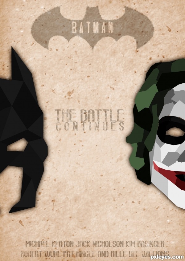
a retro poster for the batman series or something like that :p (5 years and 2927 days ago)
cool
Intriguing, but I'm not sure I see the retro element. The text seems very contemporary so I'm guessing that's not it. Compositionally, I find the Joker mask bigger and weightier than the Batman mask which doesn't suggest an equal battle. And since I read from left to right, I interpret the Joker as more important. Text on the Batman symbol seems almost sacriligeous.
Thanks Dan. I swappeed faces, to create the logical way of thinking, like you said. And I agree, this makes more sense.
And, also, I changed the font to a more retro font.
Howdie stranger!
If you want to rate this picture or participate in this contest, just:
LOGIN HERE or REGISTER FOR FREE
super duper well done
Howdie stranger!
If you want to rate this picture or participate in this contest, just:
LOGIN HERE or REGISTER FOR FREE