(5 years and 2463 days ago)
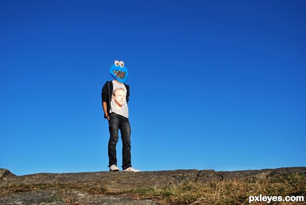
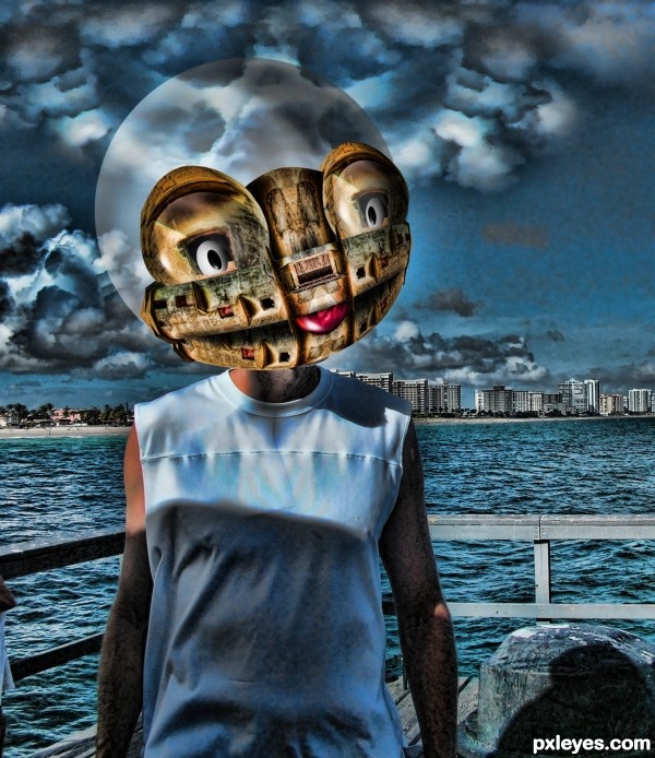
The cookie monster's face used to be n the guys t-shirt. Now he has the cookie monsters face on his head and his real face is on his shirt. (5 years and 2675 days ago)
its a puty you cant make the face a bit more rounded, rather than flat  , but good idea anyway and the shirt worked out well.
nice.......idea
lawl
Very funny! Good job and good luck!
Howdie stranger!
If you want to rate this picture or participate in this contest, just:
LOGIN HERE or REGISTER FOR FREE
(5 years and 2676 days ago)
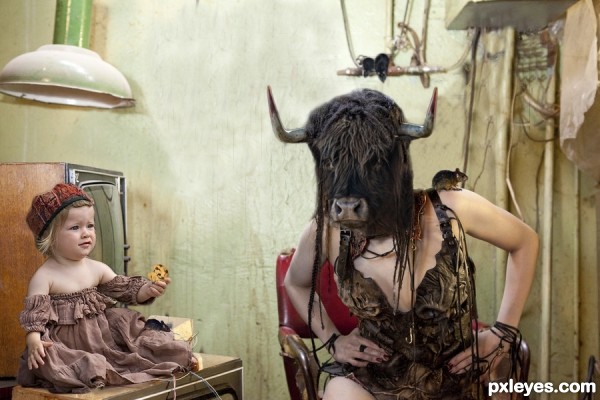
fantastic,, great imagination, great blend, bravo
Howdie stranger!
If you want to rate this picture or participate in this contest, just:
LOGIN HERE or REGISTER FOR FREE
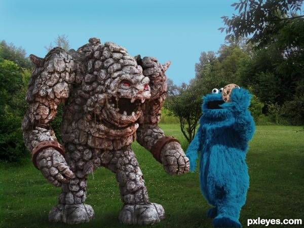
Monster meets monster! (5 years and 2709 days ago)
This is funny. Good job.
Nice... but the one on the left should have a cookie too 
Ummm...if he had a cookie, why would Cookie Monster be asking him if he wanted one?
Excellent job here!
It seems to me that the monster is not friendly, he is waiting for an opportunity to get the blue guy.... a cookie will not make the trick....! Good luck, good job!
LOL...who knows, George...maybe a cookie will make him friendlier! 
Howdie stranger!
If you want to rate this picture or participate in this contest, just:
LOGIN HERE or REGISTER FOR FREE
(5 years and 2820 days ago)
Howdie stranger!
If you want to rate this picture or participate in this contest, just:
LOGIN HERE or REGISTER FOR FREE
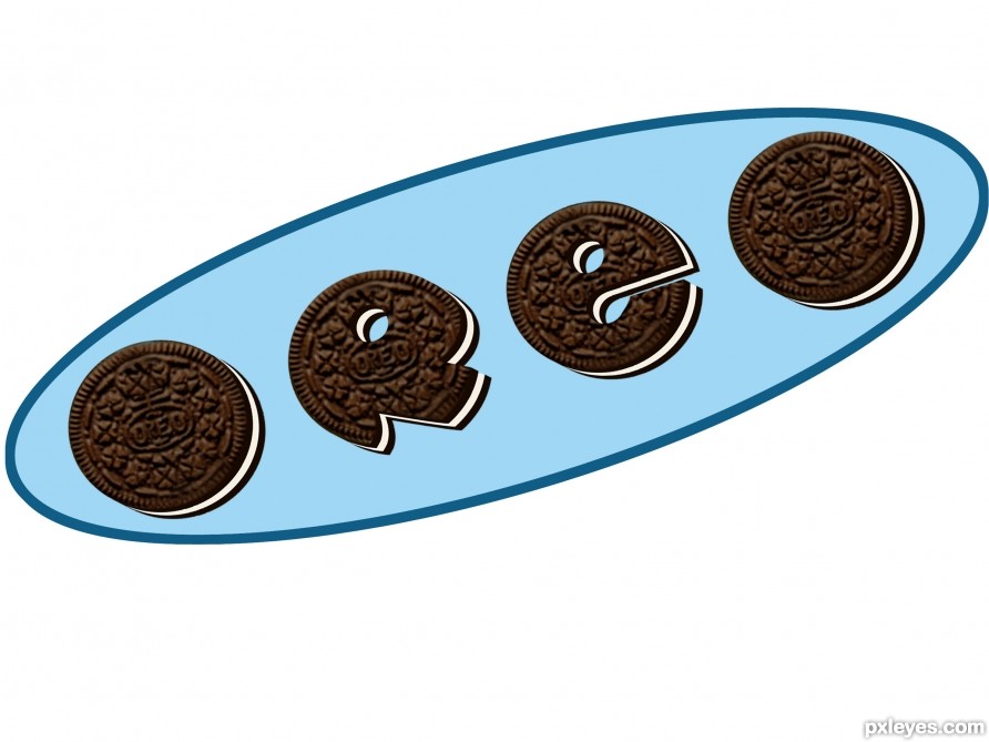
The background ellipse is not working for me. The different spacing between each letter is also disturbing.
I do like the cookie-letter idea, however. Maybe a more-compact logo with overlapping letters on varying baselines would be more compelling.
Thanks for the input. I missed the letter spacing entirely, guess I couldn't see the forest for the trees. The background elipse was meant to roughly indicate a plate. The real Oreo logo uses the overlapping letters on varying baseline, so I don't want to make this too close to the real thing according to the contest theme.
Anyway a thoughtful comment by you. You do sound like you know your logo design. I reposted the picture with corrections to the letter spacing. Thanks
The R is not easy to read... Looks like a mushroom.
But they all do look delicious!
Congrats!!
thanks
Howdie stranger!
If you want to rate this picture or participate in this contest, just:
LOGIN HERE or REGISTER FOR FREE