(5 years and 2619 days ago)

(5 years and 3595 days ago)
so cute
Haha, great job.
nice work
wonderful job author.. very nice 
very nice
Superb . . . . 
Cool!
very very nice chop...best of luck
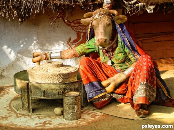
Nice work author. BTW this cow has s number tag of 9311  .
. 
:lol: this is good blending. i like the clothing, especially the addition of the accessories...bracelets and such. the way the cow is sitting isn't at all the way a cows build would bend, but...its still an awesome chop. considering the guidelines and all.
Nicely done. 
Good luck, you did a good job.
Great entry! 
very nice blend and choice of images
Congrats! for 3rd 
Congrats!!
Congrats...
Congratulations! 
Howdie stranger!
If you want to rate this picture or participate in this contest, just:
LOGIN HERE or REGISTER FOR FREE

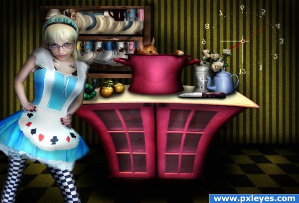
yummy kitty :)
thx for all these great stocks
source 4 and 6 by nkzs
tiles patterns from www.obsidiandawn.com
(5 years and 3903 days ago)
Great compilation author... really like what you have done here.... Brilliant work!
Whoa! This is a great peice of work! Love the 'Come hither' look from the cook!  The upside down clock is a clever addition.
Great job... 
really nice composition lykd da way u hve put all together.................................grt wrk
you must have worked hard on this!
Stunning entry!
Stunning entry!
great job 
Glückwunsch zum 2. Platz! 
Congrats
Congratulations for 2nd
Howdie stranger!
If you want to rate this picture or participate in this contest, just:
LOGIN HERE or REGISTER FOR FREE

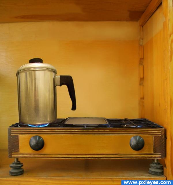
first i cloned out the scales and used the smudge tool..and placed the sources i wanted.....have replaced the pot by another one... thanx to rafragoso for the pot...http://www.sxc.hu/photo/387392 (5 years and 4014 days ago)
BHAAA HAA HAA... A WOODEN STOVE?!?!?!?!.. way to think outside the box author.. I would have never thought of that.. GOOD LUCK (though the coffee pot could be a bit larger to match the scale of the whole image but that would make you have to modify the burners as well. good luck
EDIT: Much better pot.. good job author
Very nice idea!The perpective on the stove itslef is very nice, but i'd watch out on the kettle or whatever that is, we shouldn;t be able to see the coffee inside (or whatever it is xD) Good luck!
Edit: Nice one, perpective matches now. Good job and good luck!
Nice idea using the image in this way. I like the concept a lot, but I agree with the other two. I would find a new image for the coffee pot one that is taken more on the side and I would have it so the scale is larger than the one you have used, its just too small 
cool
i have replaced the pot by another one..hope its ok now
thanx ponti55 
great idea!
Didn't see the first one, but this one looks great!
Edit: On high res, it looks like the bottom outside edges sag down a bit. If they could be warped up slightly so the bottom of the pot has a slight smooth curve, the perspective should be perfect. 
nice work author love the outcoming, very creative and outstanding. High vote.
nice job author and good idea  also nice blending for the stove .. GL
very believable , good job on this one 
amazing final result!! GL
wow! superb entry
good idea and good job 
Very nice work 
nice idea!! G/L
very good blending, wonderful job, good luck author
Very good
wow
heheheheee i hope you have your fire extinguisher somewhere close... 

Thanks to all for the nice comments...LOL Fille 
Alot of imagination in here. Looks soooo real :P like a photograph, well done.
The most clean and original image in this contest, IMO. Congratulations.
Howdie stranger!
If you want to rate this picture or participate in this contest, just:
LOGIN HERE or REGISTER FOR FREE
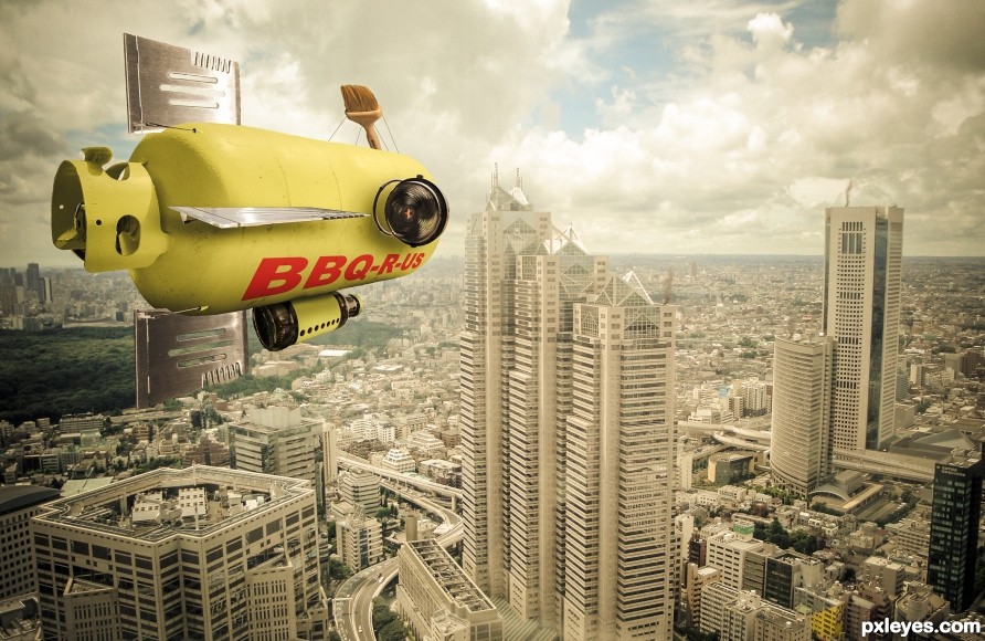
Great job I really like the lighting and the blimp is really inventive. It's the sort of thing I hoped to see when I suggested this comp.
Thanks, appreciate it!
Lots of fun! (The yellows in the foreground blimp would pop more if there were less yellow in the background.)
Thanks!
Creative mix of blimp and message! The yellowy background noted by CMYK46 may indeed mute the impact as I find Step 8 of the SBS intriguing.
What bothers me is that the tail elements of the propane tank are slightly tilted [the blimp is perhaps making a right turn?], but that has not been recognized in the placement of the wings, rudders, etc. onto the tank. I also think a tiny hint of shadow where different surfaces meet is more realistic.
Thanks for the comments!
very well done gl
Thank you!
Congrats on first place and best overall this week
Thanks!
Congrats Randy Terrific work
Thanks!
Congrats!
Thanks!
Congrats yet again Randy!!
Thanks!
Congrats
Thanks!
Howdie stranger!
If you want to rate this picture or participate in this contest, just:
LOGIN HERE or REGISTER FOR FREE