(5 years and 2429 days ago)
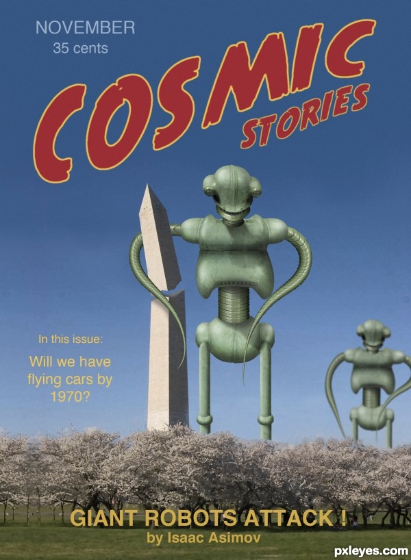
My take on the old science fiction pulp magazines from a bygone era. This cover would fit into the late 1940s-early 1950s. Some of the greatest SF stories of all time were written then. I wish I still had my old copies! The anthology of the best of the best from this era is ADVENTURES IN TIME & SPACE, edited by Healy & McComas. Movies like The Thing and The Day the Earth Stood Still were made from these stories. It's still in print, so get a copy for great reading!
Go here to see some of the fabulous old covers: http://www.google.com/search?tbm=isch&hl=en&source=hp&biw=1684&bih=1010&q=amazing+stories+covers&gbv=2&oq=amazing+stories+covers&aq=f&aqi=&aql=&gs_sm=s&gs_upl=0l0l0l1829l0l0l0l0l0l0l0l0ll0l0
(Cover logo font is True Crime). (5 years and 3184 days ago)
Excellent work, but do the trees in front count as "background?"
it's cool... 
nice take on the SCI FI concept.. good cover
Congrats for 3rd...nicley done
congrats
Howdie stranger!
If you want to rate this picture or participate in this contest, just:
LOGIN HERE or REGISTER FOR FREE
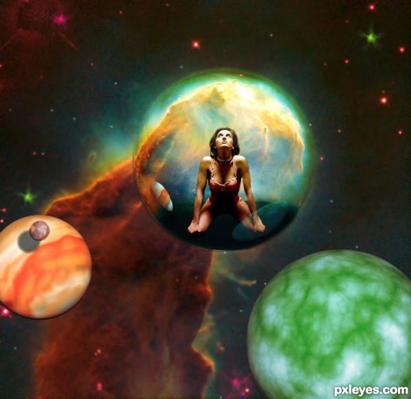
Created with 3D S Max and CS5. (5 years and 3276 days ago)
If you fix the bad shadow on the moon on the orange planet at left (Wrong angle, needs some edge blur) and put a highlight on the upper right of the moon you'll have a better image.
I was not to happy with the shadow either made an edit, thanks.

Scenic 
Howdie stranger!
If you want to rate this picture or participate in this contest, just:
LOGIN HERE or REGISTER FOR FREE
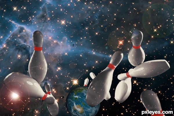
What will really happen on Dec 12, 2012. (5 years and 3451 days ago)
Fun idea, but I don't get the star shines (or lens flare) on the near sides of the bowling pins. Step 4 of the SBS seems more realistic and compelling to me.
the star reflections because space is three dimensional, there are stars in all directions so stars would reflect off the shiny surfaces of the polished pins.
I could go either way with the lens flare, but I thought it gave it a little more dimension. the pins seem to be lit a little more from the left so the lens flare kinda puts some emphasis on the left side light.
Thanks for the comments!!
cool game...nice execution author....gl
Nice entry, only distraction is the dark spot on the bottom of the center pin. Lighten that up and this is great. Good luck!
Howdie stranger!
If you want to rate this picture or participate in this contest, just:
LOGIN HERE or REGISTER FOR FREE
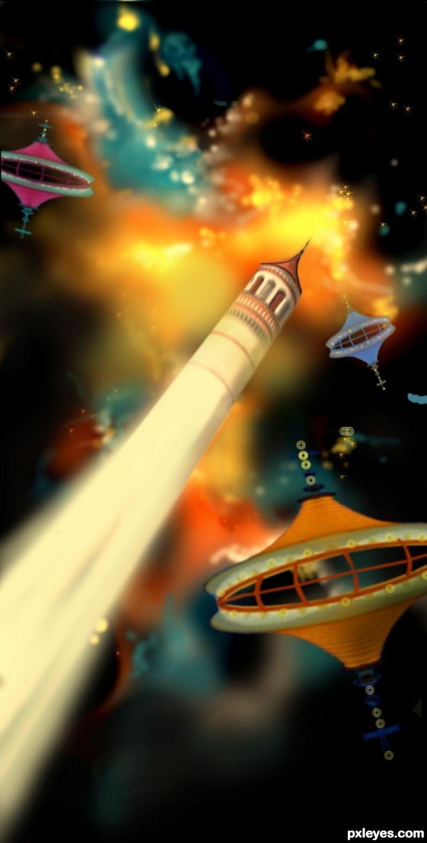
Only source photo was used for this entry. Was really exploring on my part to try to create a happening in the heavens. I'm sure a photo would have been better, but it was more of a challenge this way. (5 years and 3712 days ago)
great job
Very beautiful! The background (nebulosa) is sp ecial...
very melty.. like sucking on a jolly rancher and tasting the colors 
Nice one...gl
original entry...gl
awesome work.... gl 

nice work ............. 
Howdie stranger!
If you want to rate this picture or participate in this contest, just:
LOGIN HERE or REGISTER FOR FREE
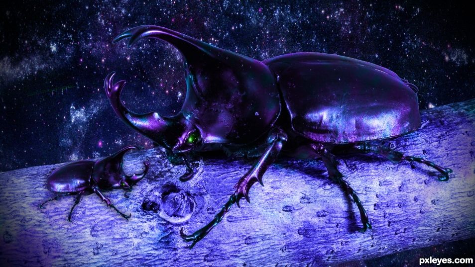
I figured coloring it was more effort then most things but I guess that doesn't count so I put in a background image instead of the rendered clouds I had before, and also added in a baby beetle to go with it sorta lets you know I did have to cut her out to color it the first time. I left the tree branch in tho, I hope that's alright. The galaxy image I used for the background is under the Creative Commons license. I'm brand new here so still learning how you guys do things. Hopefully I'm up to par now.. I'm not sure why just coloring it was not good enough tho because then it is a beetle that doesn't exist right? Well now you can tell it's not a beetle of this earth I think..
If you had entered this version initially, you would have scored higher. Welcome to the site, and good luck in the future.
Howdie stranger!
If you want to rate this picture or participate in this contest, just:
LOGIN HERE or REGISTER FOR FREE