(5 years and 2584 days ago)
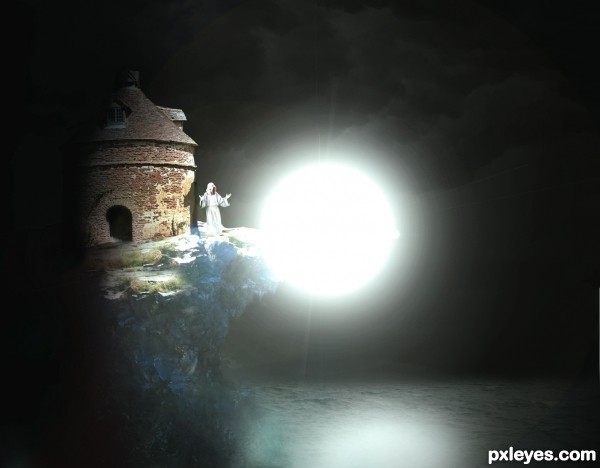
~First entry
Monk - Credit to *Georgina-Gibson on Deviantart
Ocean - Credit to ~serp-stock on Deviantart
Cliff - Credit to ~The-strawberry-tree on Deviantart (5 years and 2617 days ago)
I think the reflection could use a little tweaking..... maybe use the dodge tool on a non destructive layer - (if you don't know what that is it's a 50% grey fill then the layer set to overlay above the intended layer you wish to change) to whiten out the lighter parts of the water in that general area or set the layer that's on to screen or overlay depending on your preference.
There wouldn't be any shadows falling under the lips of the roof either....
Other than that it's a good entry; I like it!?!....  GL
GL
Thank you, I am kinda new to photoshop, so any feedback is good. Thank you 
Defo no lip shadow, infact that whole side would be flooded with light. Try dodge on a low setting .
If you moved the light source up it would match the original shadows on the source pic. Try to follow what JamesD said. This is very good for a first entry, so don't be discouraged. GL author. 
congrats!
Congrats on second....
Howdie stranger!
If you want to rate this picture or participate in this contest, just:
LOGIN HERE or REGISTER FOR FREE
(5 years and 2682 days ago)
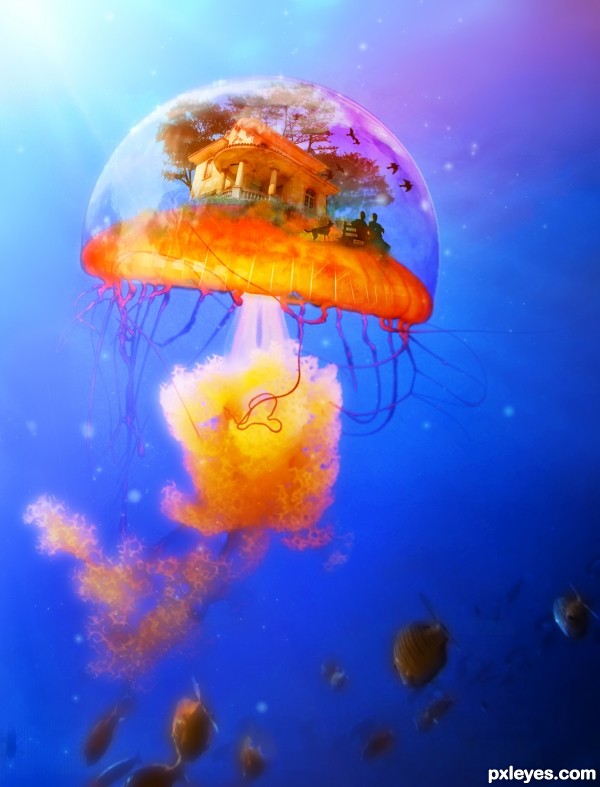
http://www.brusheezy.com/brushes/1473-bird-photoshop-brushes
Birds
It's a little inpractical when you need to go shopping, but it's a nice place. Beautiful image!
lol I thought the same thing! how to go to the store??
Howdie stranger!
If you want to rate this picture or participate in this contest, just:
LOGIN HERE or REGISTER FOR FREE
(5 years and 3249 days ago)
this is very very pretty author.. good luck!!!
very nice 
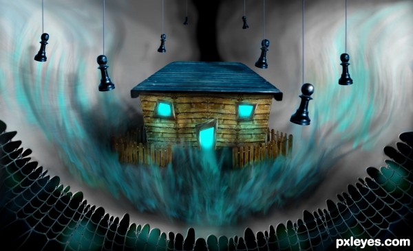
Sweet little haunted house 
Howdie stranger!
If you want to rate this picture or participate in this contest, just:
LOGIN HERE or REGISTER FOR FREE
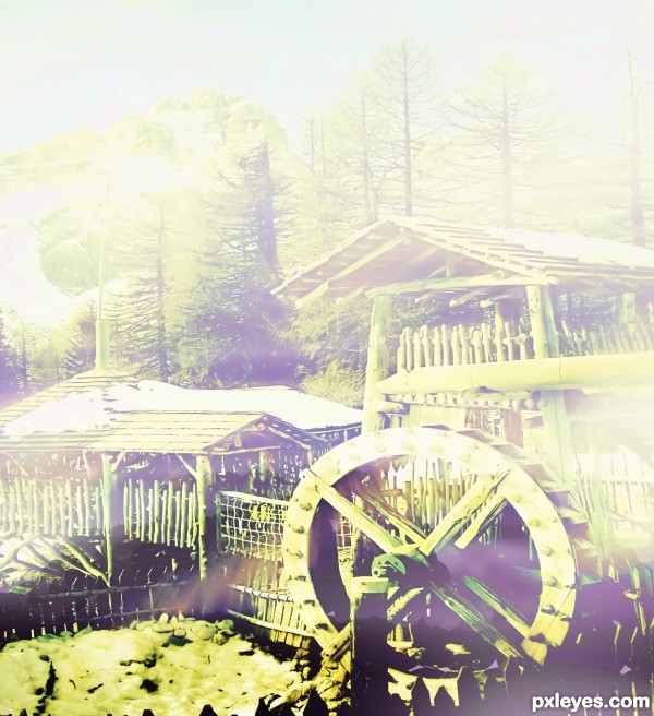
the orginal was already a beautiful picture. I created the mist in attempt to describe how beautiful its in a mist day (5 years and 3548 days ago)
not bad! the fog looks pretty cool but it seems to me that the image got pressed down somehow in the process of making this image
u mean the "yellowist".
yah
i tried to create a mist in the early morning
thanks
if u did use a gradient overlay for the mist, reducing the opacity might produce better result IMO, good luck!
Howdie stranger!
If you want to rate this picture or participate in this contest, just:
LOGIN HERE or REGISTER FOR FREE
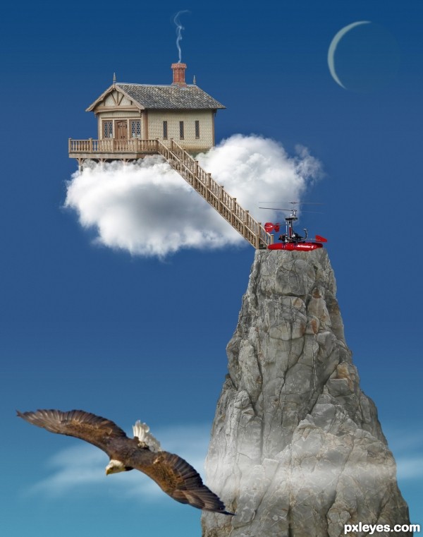
I love what you've done with this. There is a simplicity and clarity that I think works very well for this entry. I understand the purpose of the eagle, however, in my opinion, I don't think it's needed and that it detracts from the main elements.
Anywho, good luck!
IMHO the eagle creates depth, but I can see your point.
great fantasy and work, bravo
reminds me a little of the movie 'Up' . I like your clarity and simplicity . the eagle makes a nice extra focus point to help the rule of thirds & balance the composition i think. well done & good luck
the work is well done.. I think you could have nestled the house a little more into the cloud.... IMHO I find the house looks as if it is supported by the ladder.... but that's me... good luck
Howdie stranger!
If you want to rate this picture or participate in this contest, just:
LOGIN HERE or REGISTER FOR FREE