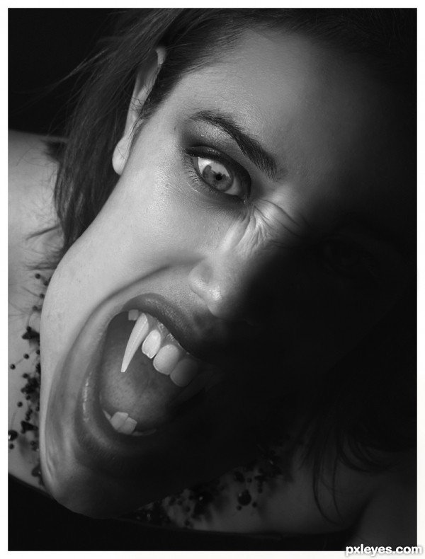
I can see a couple pf people have beaten me to this idea.....not to worry need to pull my finger *** ** ** *** quicker next time. S.B.S will follow in the next day or two. Work is taken priority at the moment.
One of the images I have used requires to be notified I have done this.....with a link back to the site if they wish to take a look.
(5 years and 3547 days ago)


Very realistic work author...i like gray scale choice...gl
She was so serene...
Author, there's a flaw in the dark side of her "jaw"; I particulary prefer natural proportions, but... GL!
Thanks for your comment erikuri but that really is of know help “flaw in the dark side of her "jaw";

What is the flaw, too big, too small, not in line, not dark enougth ect ect i can't fix it if you don't tell me what it is........
you should fix the slight bump in her jaw (below her ear),..i think its what throws off the proportion a bit. otherwise good job!
nice job!
Really good job.....but her one fang is on a different tooth than the other one. gl
Made a few changes……
 I do this sort of work and 3D modeling on a freelance basis I can not afford for my screen to be incorrect.
Many thanks for your comment Krystain, but I think this is a pretty accurate interpretation of what the face would be like if the face was elongated/deformed like this.
Many thanks for the comment gejopo, but I was unable to move the tooth back, as there is just not enough room to fit it in my chosen outside sources.
I welcome all comments good bad and the ugly, but I would like to point out that if you can see any details in the dark side of the face which is jet black. Then at best guess you monitor needs to be re-calibrated.
Whether the face is supposed to look like that in a vampire (although I don't think there's a specific vampire design guide to ad-hear to) but the mouse contrast is not looking good. I think in this particular design, color would have been a better choice, IMO.
Great blending of the parts, author. And that is one heckofa fang!
Howdie stranger!
If you want to rate this picture or participate in this contest, just:
LOGIN HERE or REGISTER FOR FREE