
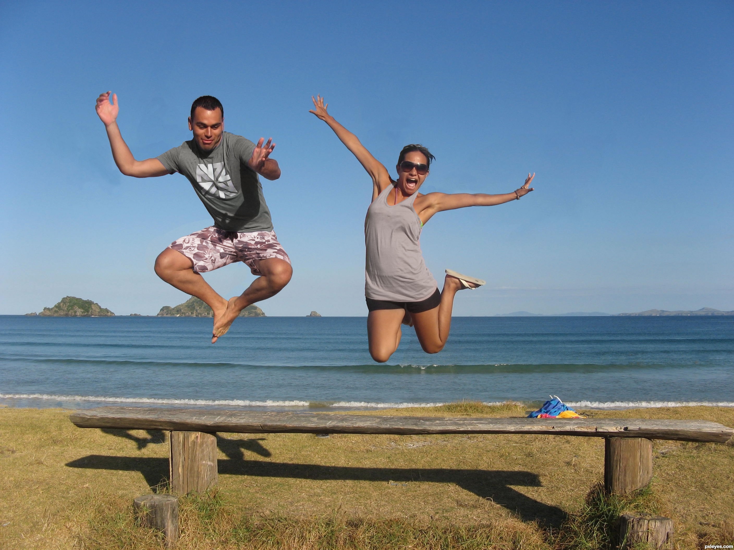
By looking this images it looks like they are in dancing mood... So here is my concept!
Hope you like it...
Suggestion and comments are most welcome. :) (5 years and 3703 days ago)
Edited cloth, removed some stuff in the background plus changed position (5 years and 3703 days ago)
You did a great job with their arms! Just try to fix the blue part near the boy's arm, cloning the color to get it uniform, so it will be perfect. You could remove the beach towel as well...
great job with the blending 
very nice
Good work!
cool.. i love the scene...it makes them look happy anf their enjoying themselves
nice work
Howdie stranger!
If you want to rate this picture or participate in this contest, just:
LOGIN HERE or REGISTER FOR FREE
Ashlea-http://ashzstock.deviantart.com/
Elisabeth-http://lunanyxstock.deviantart.com/
James-http://fatalpoisonwhisper.deviantart.com/
Enzo Forciniti-http://www.sxc.hu/profile/pseudoxx
Thanks guys for the great resources
SBS coming soon
Look High Resolution before voting (5 years and 3808 days ago)
Cool image
cool stuff going on, GL!
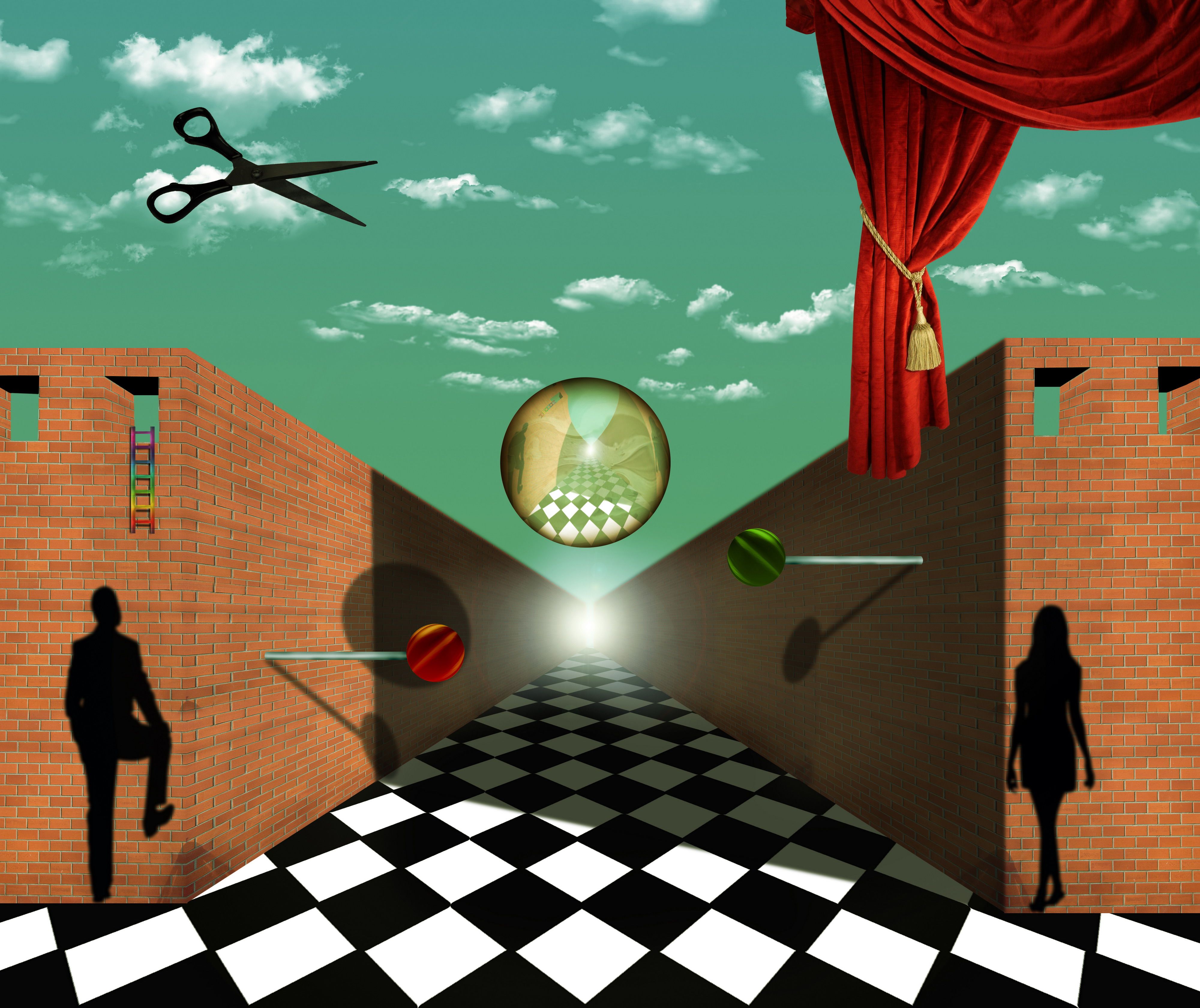
There's another image in this contest that uses a checkerboard floor. It's a great idea and you will find that the vast majority of renaissance paintings use some type of checkerboard pattern in the floor/ground to give the illusion of depth. Called an orthogonal grid. The problem with this image is that the angle of the checkerboard is such that you don't get that illusion because the vanishing points of the checkers is to the left and right of the vanishing point of the rest of the image. However, if this is your intention the image is fantastic. I am particularly fond of the lollypops.
In my art class professor of modern painting tell us this story about the some technique's.Salvador Dali was big fan of orthogonal shapes and that give's me inspiration for this entry.And because of Dali i wanted to create some distortion.At this all is in symmetry,ladders have curtain at opposite side,wall have wall,2 windows at left 2 at right,man at left,woman at right two lolly's,and sphere have scissors.Floor is only non fully symmetrical thing,and this was idea,to crash symmetry and to give some distortion.Thanks again for the fantastic comment.Its probably one of the best that i ever get.
Cool.....
THis could have been done by Magritte, though perhaps he wouldnt have used a lens flare and rainbow colored ladder. For the rest pretty good on theme. Good luck!
Author: Cool. I wasn't sure if you'd done it on purpose. I think that it's great! Good idea throwing off the symetry with that.
Howdie stranger!
If you want to rate this picture or participate in this contest, just:
LOGIN HERE or REGISTER FOR FREE
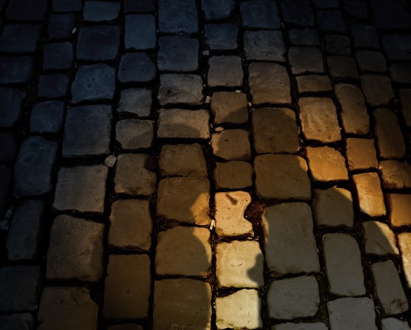
Minutes before the clock strikes midnight, Cinderella runs off hastily across the cold, dark streets of France. With one glass slipper missing, she could feel her bare foot getting numb.
As she run . . . she trips.
Unknown to her, her lover has been chasing after her the whole time. He came to pick up her fallen figure on the ground. As he did, he kissed her gently under the soft glow of the lamp light. After regaining her composure, she sped up once again and went into one of the dark alleys and swiftly faded into the night.
Thanks to atroszko for the pic~
(5 years and 3855 days ago)
aww thats sweet
Simple but I really like this. Recommend streching the shadow a bit. I don't think a shadow at that angle would have the same perspective as the object casting it.
I did change the perspective a bit. . but I was reluctant to overdo it because I was afraid that the couple's silhouette might get unrecognizable. . . 
Like it GL
i like it! nice job
simple, but effective. love the idea!I also love kisses 
Howdie stranger!
If you want to rate this picture or participate in this contest, just:
LOGIN HERE or REGISTER FOR FREE
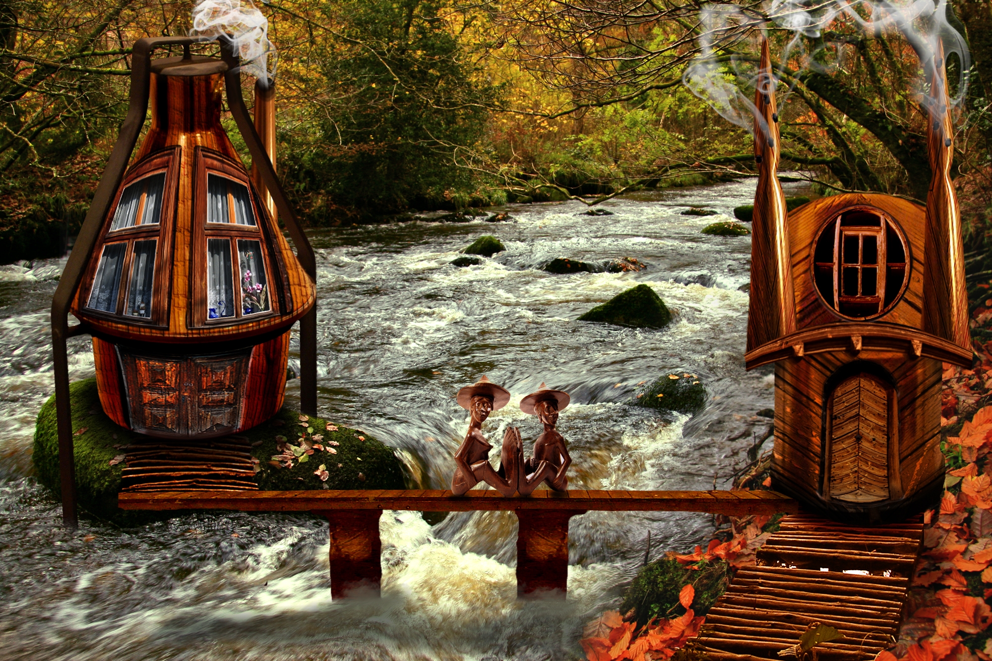
Hi everyone hope you like my wooden couple scene. In general the techniques i used were the warp tool to match the doors,windows and texture perspectives.Played a lot with color balance and levels adjustement layers to match the colors and brightness of my different sources and finally used the liquify tool to make the chimneys. Hopefully i will find some time tommorow to upload a proper guide..
As for the sources i don't know if there is a 10 sources limitation but anyway here are the 2 missing sources
''http://www.sxc.hu/photo/1179255''
''http://fbrushes.com/2008/11/03/smoke-brushes-collection/'' (5 years and 3888 days ago)
Great idea
nice work
I want to go there.... very creative
great use of source, fun image, very creative. would not want to fall off the walk bridge.
Congratulations!
congrats!
congrats to you
Congrats for your third place, Fedon!
Thanks to everyone for your comments,i'm glad you liked it
Congrats!
Howdie stranger!
If you want to rate this picture or participate in this contest, just:
LOGIN HERE or REGISTER FOR FREE
Photography and photoshop contests
We are a community of people with
a passion for photography, graphics and art in general.
Every day new photoshop
and photography contests are posted to compete in. We also have one weekly drawing contest
and one weekly 3D contest!
Participation is 100% free!
Just
register and get
started!
Good luck!
© 2015 Pxleyes.com. All rights reserved.


i like this alot.. simple.. looks like an advertisement for a refreshing drink
It doesn't look so much like a drink advertisement but one of those effects that you see in the Windows Media Player. I feel like the balance is a little off. I think placing the silhouette in the center with bars going across the page would make it look more balanced.
nice
Howdie stranger!
If you want to rate this picture or participate in this contest, just:
LOGIN HERE or REGISTER FOR FREE