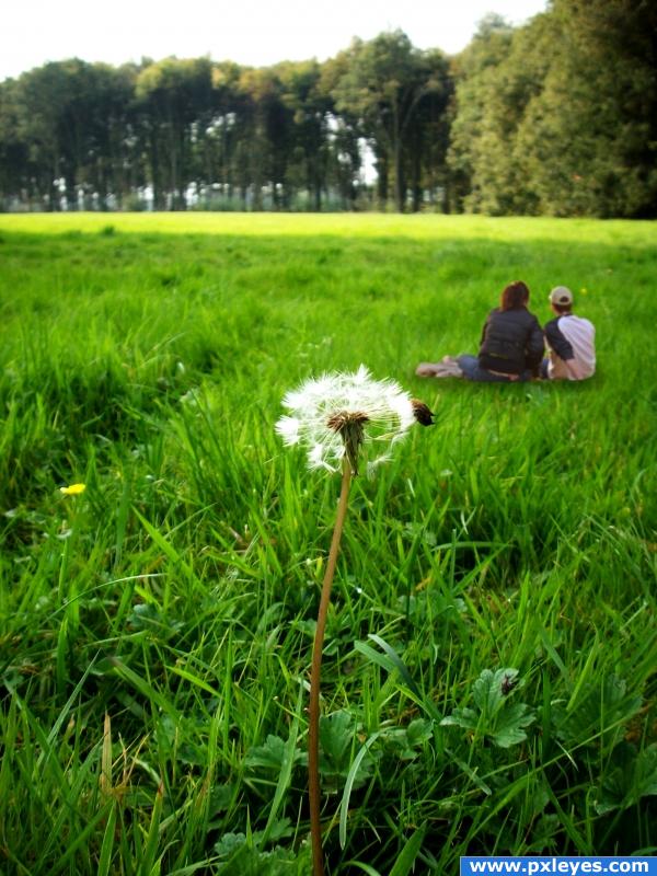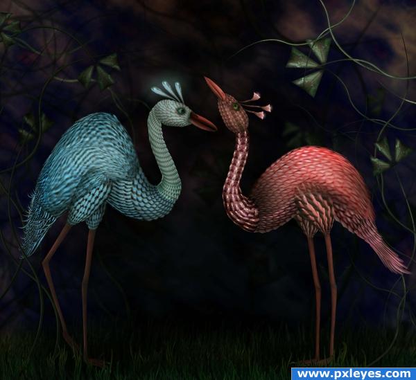
It's very easy work. First I improved contrast and then I added couple from source photo and their shadow.
This work is on http://creativecommons.org/licenses/by-sa/2.0/ license. (5 years and 3821 days ago)
- 1: Couple

Only the source image is used. (5 years and 3850 days ago)
Nice image.. good luck!
hehehe.. great work!!!
NICE IMAGE AUTHOR  !!!!!!!!!!!
The image looks really great but wondering about the use of source. That aspect is poor in my views; there's hardly anything left of it and you could have used any source to do this image. If it had been a theme contest entry you would have gotten a much higher score and better comment from me.
Sorry author 
Very nice! wow 
you build worlds, where i want to live... i know that this is something trap, but if i find the way into these worlds, i don't care - i will be happy in this kind of prison... with love! 
Awesome


Hi author, I think you did a good and wonderful job. The image source does not have much field to choose from, also, it is not that you and some of us used a particle of the image source and did something that does not look like it at all, but it is the time that you spend at the computer, thinking, and thinking, and at the end, you do these wonderful images. Thank you for showing your abilities to create something different!!!
i love this image it will deffinately do well!
its a great work but i kinda aggree with rob here, you could made this with basicly any source... and the source should be vissible and its not in my opinion... but yeah, the result is awesome 
Great work author 

Thanks to all for the comments 
Congrats, Cornelia! 
Congratulations Cornelia for a first and third place, and for marking mine as favorite.
congrats lady 
Congrats Cornelia, beautifully done 
Congrats!!
congrats!
congrats Cornelia
Congrats!! Lovely work.
Congratulations for 1st, lovely pic, great work
Your guide is very helpful. Congrats on your win.
THIS IS FANTASTIC!!!!!
Howdie stranger!
If you want to rate this picture or participate in this contest, just:
LOGIN HERE or REGISTER FOR FREE

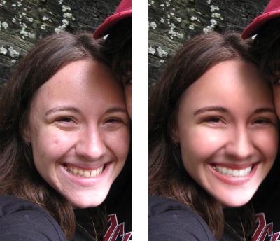
I hope the many differences are spottable, it's easier to see it in the .psd file with turning the layers on and off (can I provide a downloadlink here in the description?)
So the source photo is a private photo from a friend of mine and his girlfriend, they're surely gonna marry one day, but due to the contest-rules I had to cut out my friend, so only his girlfriend is in the spotlight, hehe.
As always, I forget to keep my layers , so i can't provide you a big step-by-step-guide, but I added a few little changes afterwards now, so it's at least a small guide with lots of description.
Special thanks to akasha for reminding me about the contest rules and my friend (and his girlfriend) for allowing me to take this photo.
I'm sorry for the bad quality, next time I'll try to chose a high quality snapshot. (5 years and 3885 days ago)
Classy. Your artful touch-ups capture exactly how they think they look -- they're gonna want a lot of reprints!
nice job but read the contest guidelines(limited to a girl's face)
looking better
different??
Oh thanks a lot akasha, I must've overread (or ignored) it, I will cut the guy out !
Howdie stranger!
If you want to rate this picture or participate in this contest, just:
LOGIN HERE or REGISTER FOR FREE
very sweet take on source... you got two more.. be a little more adventurist.. but great start.. good luck
The people are too small, but it's a nice idea, good luck!!
the people are rather small, and when you mask them in, try and put them within the grass a bit and not on top of it, this should help with the distant feel and may just fix the sizing issue..
Nice relaxing feel
its a good idea but those ppl are not sitting IN the grass but ON the grass.. you should redraw some grass over them like in my puss in boots tutorial, also have a look at the shadow tip i give in that tut.
they'r floating?

GL !
the people look way too small for some reason.
Howdie stranger!
If you want to rate this picture or participate in this contest, just:
LOGIN HERE or REGISTER FOR FREE