(5 years and 3106 days ago)

(5 years and 3362 days ago)
Like the idea. GL 
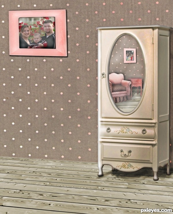
Maybe a mirror instead of the photographie should be interesting...Very well done !
Wow! I love the way the cabinet reflects the rest of the elements, the lightning... well, for me it's perfect, and the picture detail of - I guess - your family it's awesome!!!
Thank you for the well wishing! I get comments like the first one on most of my entries. Good idea, like the idea, or veriations of that. I think they mean better luck next time... lol. But hey, at least I have good ideas, I'll keep playing 
Great work and I agree about the reflection ... well done and very interesting!!! I have been away for a few weeks so I am a little late but WELCOME!

Lots of suggestions here at the PXL ... sometimes it is a great idea that can really improve your work, sometimes it is something you just don't agree with (or is just poor critiquing) and those you can ignore. Either way, most of the time it is meant kindly and to help you improve ... A good critique is more valuable to me than winning (well maybe that is a little white lie but it is close)! 
Nice take on theme!
Cosy room 
Very neat work author...gl
Howdie stranger!
If you want to rate this picture or participate in this contest, just:
LOGIN HERE or REGISTER FOR FREE

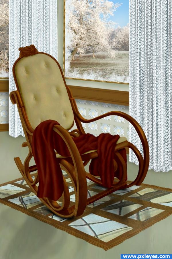
Thanks to shelleycun for the picture of the rocker and to obsidian dawn for the frost brushes (5 years and 3883 days ago)
looks great 
chair is well done -- like the curtins and the work in the window
Beautiful scene.. good luck 
wow,amazing transformation.i loved the frosted glass window.gr8 work !!
Incredible good!
cleverly constructed well done 
Simply beautiful  It looks so real, lovely details!
Excellent work. Great SBS too. Perhaps put a slight set down shadow under rug. 
Very lovely use of source... the carpet KICKS!!!!
the rug kind of looks like mirrors still in the thumbnail version. Maybe if you brought the color white down just a bit, maybe to a grayish or offwhite. I love this though--it is very cozy.
wow
great job
Thanks so much for your comments. Pixelkid, I did try putting a slight shadow under the rug before I uploaded, but no matter how much or how little shadow or how much or how little opacity, it still turned into a magic carpet (floating), so I left it as it is. K5683, I think the mirrors in the source look like rug. lol I guess what you're thinking determines what you see. Thanks again for all the comments! 
Wow. Good job!
This is nicely done. I think your problem with the rug may be not so much in shadow, or lack thereof, but the shape of the rug. Its more obvious in the sbs, but therug, imo, has a bit too drastic of a perspective, giving us the illusion that it is lifted. That being said, nice job over all! 
Oh, I'd love to sit there... Lovely composition and extremely inviting  Good luck!
Congratulations for 3rd
congrats
Congrats for your third place!
Congratulations on the top-three place! 

Congrats!
congrats
Thank you for your votes! 
congrats!
Howdie stranger!
If you want to rate this picture or participate in this contest, just:
LOGIN HERE or REGISTER FOR FREE
Howdie stranger!
If you want to rate this picture or participate in this contest, just:
LOGIN HERE or REGISTER FOR FREE