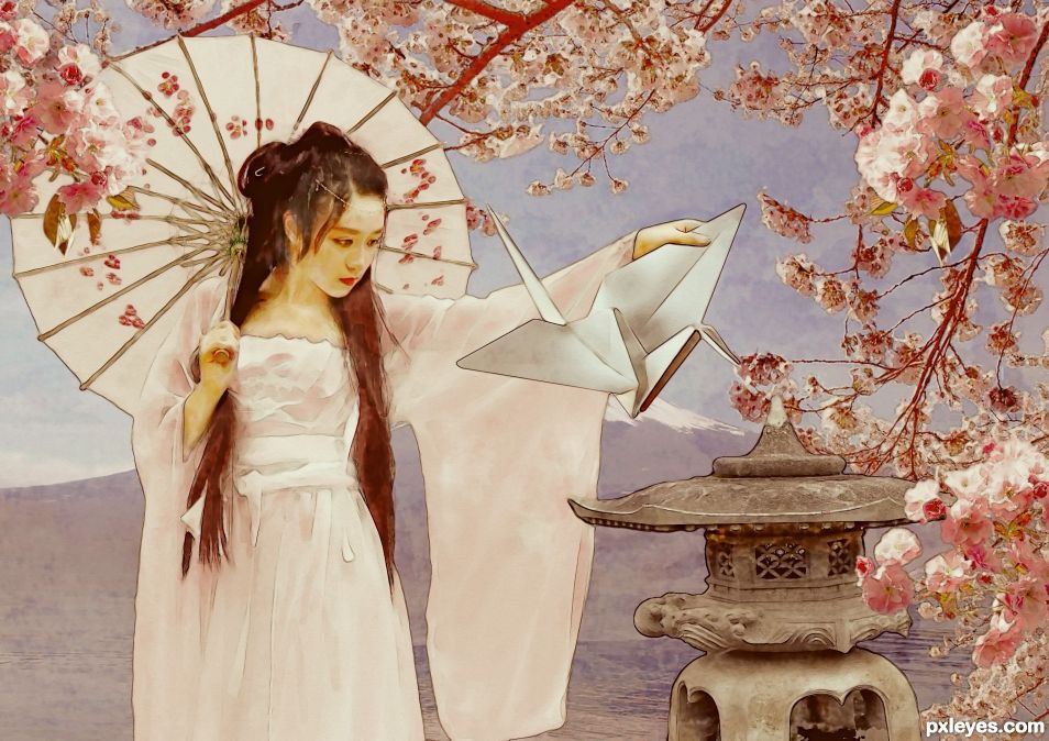
Once upon a time a Geisha made an origami crane and placed it on a stone lantern. The wind caught it and the crane flew into the cherry blossoms, never to be seen again. (5 years and 1368 days ago)

(5 years and 3627 days ago)
superb work! great tip on the ripples too
wow!
wow!
amazing!!!!
Impressive work, great SBS! 
Beautiful work 

very very nice work ,good luck
Awesome!!!!!
I'm very well impressed!
Congratulations!
The SBS is perfect.
Bother...In Step 12, I said I used a distortion map. No, I didn't. I used a *displacement* map. Otherwise known as that thingamacallit that makes ripples. 
super creation......I like the way you used the provided pic,....
Great execution!... and very good use of source. Nice image!
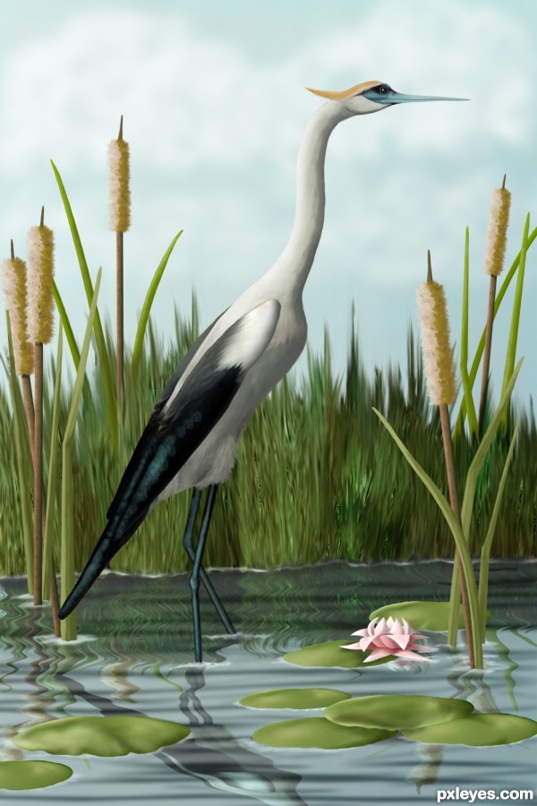
It's simply incredible how perfect is the crane. Sometimes when I go fishing at the dam I see cranes there... and it's the same, perfect, realistic.  But I think cattails are darker, brownish.
Lovely. Reflections don't shrink, however, so the reduction in heights to 30% in SBS Step 11 was unnecessary. (See the reflection in this week's 'Shore' contest or stack stuff on a mirror.)
Gorgeous, great attention to detail too =)
Thanks, all, for your comments. Erikuri, I think cranes and herons are the most graceful birds, altho hawks are the ones I long to fly with. These cattails have gone thru the skinny green phase, past the solid brown phase and are in the blown beigey, yellow, fuzzy stage. Can I go fishing with you someday?
Dan, I know that at this angle, the reflections would be long and not shrunk, but...well...I liked the way it looked this way. I've got my artistic license here somewhere and I'm pretty sure I renewed it this year...hmmm... 
Fabulous work author,u did great job here,i like small details,like feather's at top of the legs and greenish highlight...well done author
Very quality job author.., I think the body of the bird near the wing/tail need a little more darker shade.. ( may be I am wrong), whatever..., OUT STANDING JOB Goes my favorite.... and definitely on the top 3... Good luck 
Really nice job here! I personally would've liked a mix of step 11(left one) and the final piece for the reflection. Regardless, a timeless piece. Good luck and Congrats.
When you enter a contest...no one should even bother to enter after lol. Simply beatutiful work...I wish I knew how to draw like that. :p
CORRECTION: Saw the SBS. Not even a drawing. WOW. That is quite an amazing piece of work there.
This is amazing! Good luck! 
great job ! good luck
So, last night, just about asleep, thinking about this entry and feeling something still wasn't quite right with it, one of the little voices in my head whispered, "Birds' legs don't bend that way. They bend backward. Duh."
I redid the legs, which meant I had to redo the reflection, which threw the balance off, so I put another lilly pad in to rebalance it.
I think I deserve a gold star. 

very incredible!
Well done! I like the fact that you stayed pretty close to the source image. Just a few things that could improve the image. There are still a few parts of the concrete structure visible in the grass in the background. The cattails in the background are just as big as the ones in the foreground. That way you loose depth in the image, I would either make the front one a lot bigger (I think this would create a lot more depth) or the back one smaller. Good luck!
hereisanoop, when I fixed the legs, I took the opportunity to darken the under tail feathers. Thanks! Ressiv, that was one of those details I didn't think of, concentrating on the balance of the image. I've made the back cattails smaller. I thought the unsmudged parts of the grass kinda looked like grass seed, but I went ahead and smudged them some so they wouldn't stand out quite as much. Thank you!
Great! It's a very nice image, to finish it all of you could transform the right legs reflection and move it to the right, it's not underneath the real leg anymore 
Its done. Thanks again, Ressiv. 
This is way cool Author 
Great job! And thanks for the good SBS.
i would put this on my wall 
awsome work author.....first place for sure...gud luck
Fan-Damn-Tastic!!!
absulutely stunnishing !
WOWIE
Gl author 
Ravishing creation, Author! Congrats! 
Lovely job...congrats!
Congratulations, Cheryl! 
Congrats...... very nice job!
Thank you for the many comments and your votes. 
Wonderful work, Congrats Cheryl 
GRATZ on a very well deserved win. 
congrats .......... 
congrats .......... 
Congratulations !!
Congrats! for your win. 

Congrats on your deserved win 
congrats for the 1st place, well deserved...
Congratulation for the great work and 1st place...
Congrats for first!
congrats!
Congrats!!
Howdie stranger!
If you want to rate this picture or participate in this contest, just:
LOGIN HERE or REGISTER FOR FREE

From the old PST site.
Made from a screen shot of the contest. (5 years and 3902 days ago)
great
Nicely done!!
CLEVER again!
nice
Yikes! I really like what you did. The shadings are beautifully spot on...but are you sure you didn't use the following link as a reference?...I didn't see any reference sources noted... http://tmacwright.files.wordpress.com/2008/05/grulla-en-origami.jpg
Nice source used author : D.
you could tone down on those shadows a bit imo
very good
exellent work
Very nice...
great 
Congrats for your second place, Brandon!
Congratulations for 2nd
Congratulations for 2nd place!
This is really great job Brandon, congrat for your second place 
Congrats 
Howdie stranger!
If you want to rate this picture or participate in this contest, just:
LOGIN HERE or REGISTER FOR FREE
Good composition, but too filter heavy.
Fair enough. Thanks for the critique.
I redid it.
Like the subtlety now.
Thank you very much.
Big fan of the Origami
Thank you.
Thank you.
Congrats on 2nd place!
Congratulations...
Congrats!
Thank you everyone.
Thank you everyone.
Congrats!!
Howdie stranger!
If you want to rate this picture or participate in this contest, just:
LOGIN HERE or REGISTER FOR FREE