Definitely too nice to eat! (5 years and 1083 days ago)
This image is based and created on my own pictures, and I have all rights reserved but still under PxLeyes.com's condition. My image may therefore not be reproduced in any form without my written permission. (5 years and 2541 days ago)
You might want to smooth/blur a few hard/ jagged edges.
Author, you need to post each of your photos uncut in a step-by-step guide. (SBS).
5.3. Use of Personal Images as Source: If you use your own personal images, the uncut source must be placed in the step by step with an explanation that it is your image.
Please take time to read http://www.pxleyes.com/guidelines/photoshop/
Thanks! It has all been fixed by now.
I can't see the images in your sbs... just a progression of your work.
you should place each original image uncut as a seperate step, this way it's much clearer.
Sure, I will show you as fast I reach my computer, I'm at work you see.
Clean up looks good, nice work overall!
Thank you so much Spaceranger!!
Good job author, good luck 
Well thank you very much James, I hope for the best!
Clearly Photoshopped per the contest requirements, but I wish I understood the point of the image. The title makes sense without the little you. Alternatively, a little you also reaching for the apple with a new title could be intriguing (and more fun).
Given that the title references the iPhone, it should be crisper to stand out more.
I think replacing the variegated apple with a more-solid-colored red delicious or golden delicious apple would add a smooth texture and a stronger focal point.
The shadows are too strong IMO. The little you has a much more intense shadow than the apple. The slightly vague arm/apple shadow (that inexplicably extends far into the bottom left corner of the image) is way too expansive.
Thanks! I Well, I did not figured out any good name so it end up with this.. If you have any ideas, please, feel free to share them!
I just did turned up the colors on the apple a bit but I wont do it more then so since it's gonna look to extreme.
Yes, I agree with you that the shadows were looking to strong and therefore I did changes them, how about now?
Great take on the theme... I love the abstraction
It's nice to hear that you like it, Bob, thank you so much!!
Congrats!!
Thank you so much!!
congrats .....
Thank you!
Howdie stranger!
If you want to rate this picture or participate in this contest, just:
LOGIN HERE or REGISTER FOR FREE
The Song that inspire me to create this picture is called \"Lost at Sea\" by Zedd, Ryan Tedder with the specific citation from the first verse:
I was a boat drifting out into sea
I had nothing but pieces of thoughts
Of the hope that you would see me
And I was a stone\\\'s throw away from land
But thousands and thousands of miles
Away from reaching your hand
(5 years and 2542 days ago)
Good image! (I think we'd see the oar in the water).
Thanks so much for the constructive criticism! However, I doubt if the detail is so visually important, but I took to me what you said and tweaked it even though you may not see, this water creates the hazy effect that makes small objects hardly noticeable. Again thanks for your note! I appreciate it!
nice job with the details
Well thank you very much!
This is really cool... Good luck
Thank you Bob!!
Congrats!!
Well thank you very much Spaceranger!!
Wonderful job, congrats on your well deserved win!!
Haha thank you so much Daniela!!
Congrats!
Thank you!
Congratulations......
Thanks!
I just saw this today, don't know why I didn't see it before, GREAT GREAT entry. Congrats of well deserved first.
THANK YOU so much Tor!
Howdie stranger!
If you want to rate this picture or participate in this contest, just:
LOGIN HERE or REGISTER FOR FREE
Thanks to lockstockb - girl picture (5 years and 3149 days ago)
nice work.
good hard work and outa the box!
It took a while but I finally saw the images in the girl's shirt, in the egg and in the background, nicely done. I especially like the reflected light off the egg. The edge of the shirt collar on the left is a bit too blurry though.
Howdie stranger!
If you want to rate this picture or participate in this contest, just:
LOGIN HERE or REGISTER FOR FREE
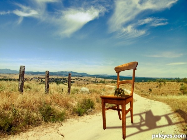
HI everybody, this is my first competition entry and I hope you like my work.
Basicly for this image I got a nice countryside backround. Found a chair and cut it out. Onto the chair I put the competition image, firstly though, I cut it out and puppet wrapped it so it looks like a helmet. Then I added a camo texture to the helmet and played around with the different blend modes. Lasty I put everuthing together by adding some extra shadows, and then I added a nice Brown and Orange gradiend and blended that to look nice.
Take care! (5 years and 3688 days ago)
Welcome to the competition. Just a thought for your entry... The shadow on the chair doesn't match the high noon image it is placed on. It also looks like you distorted the image of the chair (if you hold down shift while resizing the aspect ratio will remain constant thus avoiding the distortion).
Also a high res copy would be nice so that we can see what you did with the turtle shell.
Cheers and good luck.
Have to admit, the shadow is fascinating . It's not correct, but on the other hand...who cares  . A high resolution version would be nice though (if you want that, then go to topnavigation My stuff - My contests, there you see your entry and then you can check the option High Resolution, something like that...). Good luck!
good luck
Howdie stranger!
If you want to rate this picture or participate in this contest, just:
LOGIN HERE or REGISTER FOR FREE
Photography and photoshop contests
We are a community of people with
a passion for photography, graphics and art in general.
Every day new photoshop
and photography contests are posted to compete in. We also have one weekly drawing contest
and one weekly 3D contest!
Participation is 100% free!
Just
register and get
started!
Good luck!
© 2015 Pxleyes.com. All rights reserved.


Wonderful idea. I like the smoke but maybe try a different brush? Also, I know the source chimney is a lighter color on the inside, but maybe darken it to make it look more like a regular chimney?
Oh thank you!! This is the type of comment everyone appreciates to read below their picture! I instantly followed your advice with the darker color on the inside of the chimney.
Titles matter, they are part of the creative process and help viewers to focus on what you have created. I am always amazed by work posted on this side of pyxleyes and want to tell you that I am WOWed by your work. It is clear and so easily seen and well manipulated. Top notch in my humble book.
It's so motivating to read comments like this. I really appreciate that. Thanks for your love and have fun with all the other creative stuff on this site!
Congrats
Deserved win Christoph!!
Congrats Christoph
Christoph where are you??!!! Come bask in your glory!!
Haha, here I am! Thanks to everyone for the congrats and the votes that made me win this contest! Super happy, it`s my fourth entry and already first place, unbelievable!!
Howdie stranger!
If you want to rate this picture or participate in this contest, just:
LOGIN HERE or REGISTER FOR FREE