King Crimson info
http://en.wikipedia.org/wiki/King_Crimson
Pendent by
http://www.flickr.com/photos/brenda-starr/3467407784/
(5 years and 3532 days ago)
Photography and photoshop contests
We are a community of people with
a passion for photography, graphics and art in general.
Every day new photoshop
and photography contests are posted to compete in. We also have one weekly drawing contest
and one weekly 3D contest!
Participation is 100% free!
Just
register and get
started!
Good luck!
© 2015 Pxleyes.com. All rights reserved.


yah
XD
anyway great work
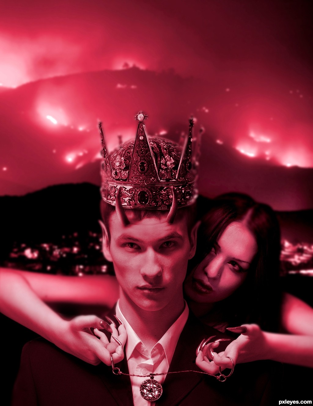
Nice work. The only nitpick I could have are the horns. There where they are now they dont look convincing for me. Is it an option to use just the top of the horn and place them in the guy's face (forehead/ side of his head)? Just an idea. For the rest well done! Good luck!
Interesting. To me, the crown seems too high, like its floating slightly above his head rather than resting upon his head. And in any event, the crown is facing in a slightly different direction than he is. Not sure what the horns add. The pendant appears to be floating -- no evidence of gravitational pull. I would darken the background a bit as the red tint is too uniform IMO.
cool!
well executed
Howdie stranger!
If you want to rate this picture or participate in this contest, just:
LOGIN HERE or REGISTER FOR FREE