(5 years and 4022 days ago)
Photography and photoshop contests
We are a community of people with
a passion for photography, graphics and art in general.
Every day new photoshop
and photography contests are posted to compete in. We also have one weekly drawing contest
and one weekly 3D contest!
Participation is 100% free!
Just
register and get
started!
Good luck!
© 2015 Pxleyes.com. All rights reserved.

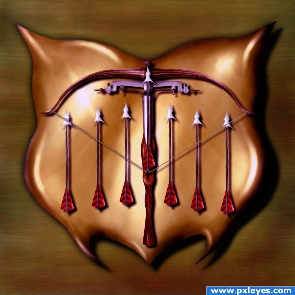
Very elegant author... really effective trompe-l'Å“ila.. you really do feel you could just pick up the crossbow and shoot.. AWESOME
Splendid work! Really great o.o
This is an excellent entry. I especially like the lighting. It has a bit of a painting feeling to it which i personally love.
cool
very cool. good idea author
good work
nice work
Great entry!
Excellent use of the source file to create this crossbow. I'm not sure if I like the golden plaque it is hanging on (maybe more of a bronze/brownish color?) but your manipulaton of the photo is top notch. Also, just to nitpick, why is the crossbow hanging on a brick wall? I think the image would be more effective if you placed it on an ordinary living room wall (with maybe a hint of a fireplace/mantle poking out from the bottom). In any event, I love this work and wish you the best!
Agree with magicsteve...perhaps tone down the saturation of the yellow. Minus some yellow in yellows in selective color. This might help.
Very, very cool! I have nothing negative to say!
The weird background distracts from the realism of the crossbow. This would be much better with a realistic background...
thats very creative
Classy work the only thing that lets this down is the brick wall just dose not fit IMHO how about some sort of wooden B.G. lots of wood in the source image
nice idea!
thanks for the constructive comments, made some sugested changes - i hope i'ts better
The crossbow in Step 1 is great, but after that I don't get the point. What does all the purple mean? Why is the display plaque that odd shape? I also think a less shiny, eye-catching plaque would display the crossbow better (which should be the center of attention). Actually, I think a plaque is unnecessary when mounting directly onto an interesting wall would be sufficient.
ooooh nice!
good colour
good idea, well executed
you can have only seven enemies!
Congratulations!!!!
Howdie stranger!
If you want to rate this picture or participate in this contest, just:
LOGIN HERE or REGISTER FOR FREE