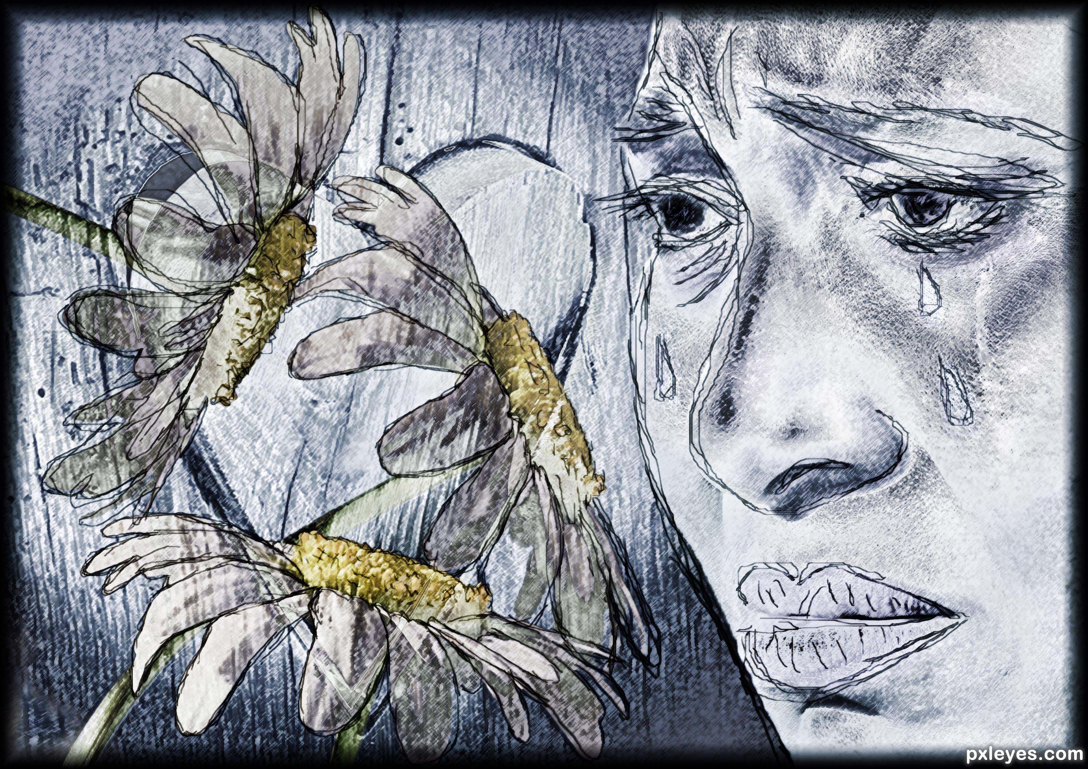
Can the daisies tell you if you are loved or not? (5 years and 1367 days ago)
2 Sources:
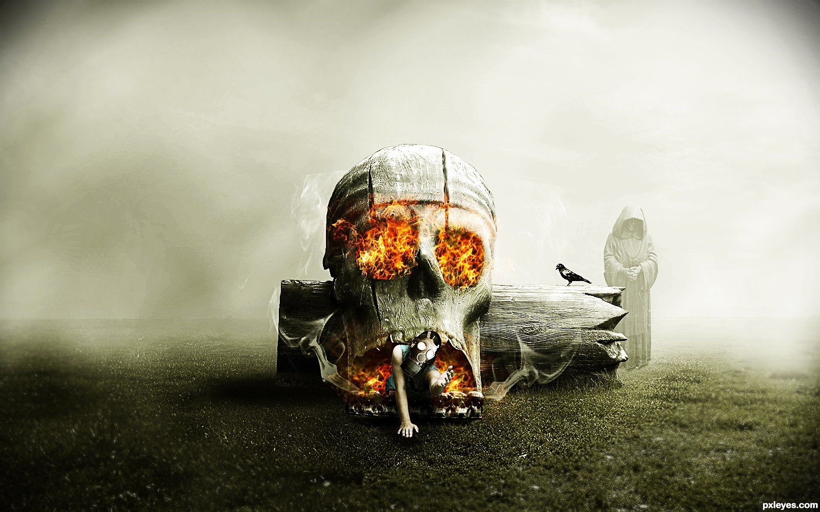
all set! :) (5 years and 1410 days ago)
Very Artsy Fartsy.. hehehe.. awesome Good luck! Just be careful when using sources from FLICKR.. make sure you thank the Artist directly or they can get a little bitchy. Just from my experience. I forgot to mention an artist by name and I got reamed... just a cranky letter but it was enough to make me twitch. hehehe GREAT JOB!
Lol good advice Ernie
I like it!
 thank you Randy!
Very artistic linework.
Great use of filters and effects.
Thank you Angel!
Howdie stranger!
If you want to rate this picture or participate in this contest, just:
LOGIN HERE or REGISTER FOR FREE
(5 years and 2606 days ago)
Good job author!
Thank you 
Congrats!
thanks
Howdie stranger!
If you want to rate this picture or participate in this contest, just:
LOGIN HERE or REGISTER FOR FREE
thanks to eirian-stock
shudder stock,faestock
gloomwriter,FairieGoodMother (5 years and 2978 days ago)
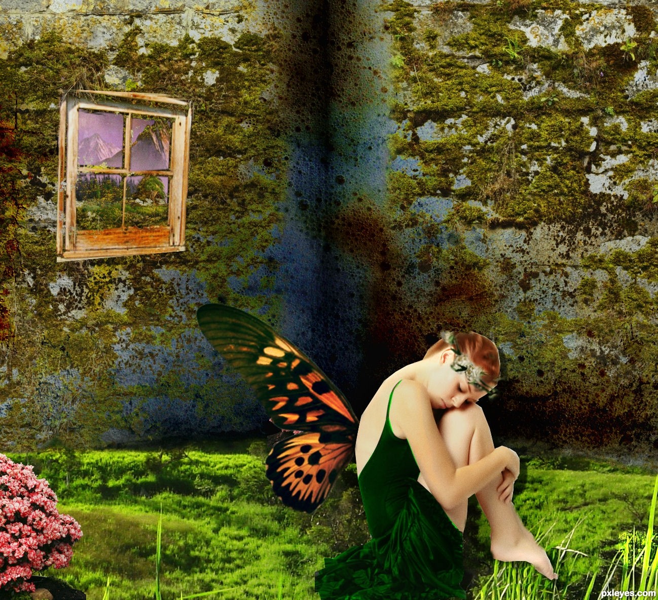
i like how you made the grass and trees a smaller land line cute image author, goodluck
The figure needs some fixing on the edges, white lines and some over erasing near the wings. You've given a drop shadow shifted to the right that wouldn't be there. Figure is lighted from upper right so shadow would be beneath and to the left. The blades of grass are in the foreground and they would be over the figure. Mask work is essential to a good chop, many use the pen tool for this but however you prefer doing it you should use layer mask for this. Layer mask allows you to restore edges you cut into by mistake so you can go back and forth to tweak the silo. Study the shadows in the model source photo as a guide to creating your shadows. The overall look is good, the devil is in the details.
Edit: I see you've changed things, you reversed the girl but now you have angular knife sharp edges.
I agree, the grass on the foreground should be before the fairy toes, and the shadows are not proper, it seems like she's floating. The use of dodge and burn would have made the 3 dimensional effect looks better, moreover, more depth of field is needed. By the way, the composition is good, maybe there's too much saturation, but plenty of people love color explosions, so it's just my opinion.
Howdie stranger!
If you want to rate this picture or participate in this contest, just:
LOGIN HERE or REGISTER FOR FREE
(5 years and 3020 days ago)
A bit too much empty space on the sides, particularly on the left. I'd suggest cropping some of the excess away to put the focus more on subject.
Thanks for the observation, but was aware of empty space while chopping...i made a blur around the edges of the canvas to put more focus on the subject..other the empty space is the any other technical observation...your opinion are always welcomed.
Howdie stranger!
If you want to rate this picture or participate in this contest, just:
LOGIN HERE or REGISTER FOR FREE
Photography and photoshop contests
We are a community of people with
a passion for photography, graphics and art in general.
Every day new photoshop
and photography contests are posted to compete in. We also have one weekly drawing contest
and one weekly 3D contest!
Participation is 100% free!
Just
register and get
started!
Good luck!
© 2015 Pxleyes.com. All rights reserved.


Really love the pencil sketching
Thanks. The scribbly sketch is all mouse drawn because I don't have a wacom tablet.
I hope it adds something to the messed up emotions concept when people don't feel loved. That was the general idea anyway.
Awesome!!! Great job of getting into the top 5... awesome skill
Thanks for your encouragement Driven.
Howdie stranger!
If you want to rate this picture or participate in this contest, just:
LOGIN HERE or REGISTER FOR FREE