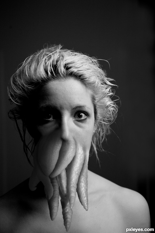
http://www.starling-fitness.com/archives/2009/03/06/how-to-eat-a-buddha-hand/
http://en.wikipedia.org/wiki/Cthulhu (5 years and 2671 days ago)

Cthulhu f'taghn!
http://en.wikipedia.org/wiki/Cthulhu (5 years and 3500 days ago)
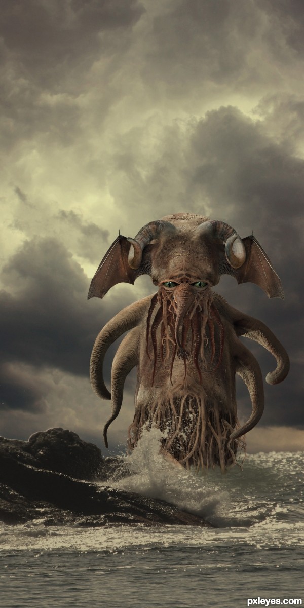
Need to darken the parts that are submerged and at the water line. Try to give it a wet look.
From the Wiki entry: "Cthulhu is made up of some unknown and foreign matter." It doesn't get wet. 
high res is a must to the the full detail of this ---very well done
fantastic construction & blending, well done and very best of luck to you 
Kraken I'll give you... Tulu...no way... this creature is an elephant goat squid... with useless bat wings... doesn't instill the fear of the Dread Thu Thu...
Sill a beautiful chop.. and wonderful use of discovered sources but to use the name CTHULHU.. I just don't find a Disney Monster that scary... IMHO 
EDIT: Chappy is correct.. the monster already shows a little in the water, you should finish the work
Slushy, Cthulhu has been depicted in hundreds of ways. Go Google some. This is my version, and it fits nicely within the mythos... As for your edit, you don't know what you're talking about.
finish what you started where the body meets the water.. there's remnants everywhere (still not scary.. I think I will call him Mr. Snuffleupagus's older brother).. I'll sneak him treats under the table LOL
See previous comment.
Drivenslush, your critique might be held in a higher regard if you didn't resort to petty remarks that have nothing to do with the work of this piece.
Please go read the entire article provided. It fits all criteria and the work performed here seems to be top notch.
Opinions on what you consider scary are not only uncalled for, but irrelevant.
(or at least take it to the forums)
Author, well done as well as your SBS.
tentacles look a bit flat in my opinion.. some highlights would make it much better.. Good luck 
Overall I think this is pretty good... there are a few issues with your edges - (purple fringes)
I see you made some surface ripples... It doesn't look as though it's fully finished in my opinion... might also want to just give a little disortion to the roots which are underwater... or darken them slightly, or atleast make more a distinction that they are in water...
Some of your source images aren't matching up in terms of sharpness... and there isn't really a convincing DOF because of that BUT!... putting that aside I think it's well put together...
That is so cool, i have nothing more to say author 
Well done 
Quite cool with great color matching of parts. Beard tentacles need to cast some shadows, however. Horn shadows and water-edge shadows are also needed.
Hi Author!! It's a great entry. Nice combination of images, the color and mood also interesting. I have some suggestions. 1) merging of the roots image and body area is sudden, make it gradual merging. 2) Re-look the bat's wings position and size. 3) may be you can add a lightning to get more feel. Best of luck!!
Superb work!
Very good blending and construction.., But I think (only my opinion) If you rotate the ears a little downwards, It will give an extra effect to the figure (head).., (feel free to ignore) Good luck...
EDIT: now it's more good.. 
Pretty good construction. The left side (viewers angle) has a lightsource coming from the top, the right side has a source coming from the left. The roots on the bottom don't really look like they are part of the body (probably because they are just blurred into the body). But the biggest problem is the lightsource, or lack of one. Plenty of time to work on it, unless you think the image is perfect as it is now...
Fabulous work..........Super creativity......Good Luck Author.
This cthurtainly looks good cthu me. Really a nicely done creature. One little nit... on the left that light gray line on the rocks (highlight?) is a bit distracting. Might look better without it, IMHO.
(wasn't Cthulhu the guy on Star Trek?) 
As Cthulhu is a ficticious creature, you can depict it the way you imagine what it's like. And your Cthulhu is quite real... Very nice blending of the images. Maybe if the wings are bigger, more "fantastic" mood can be added (but this is IMHO). 
This. Is. FREAKING AWESOME!!!!!
I think this fits as a Cthulhu quite nicely. I mean, seriously...have you ever SEEN a Cthulhu?? Do you know what a Cthulhu looks like?? This is just another rendition of the fabulous beast. Some clawed hands would be nice, but that's just my idea lol. It looks really great as is.
EDIT: Ahhhh now I understand why Drivenslush was being so picky. 
AWESOME!!!!! A creative genius.
Sinister sea creature, great idea to replace the ears with bat wings 
wowwwwwwwwwwwwwwwwwwwww .. wow n wow n wow ..  amaaaaaazing one
Congratulations on your first place!
Congrats for your great first place, Bob! 
Congrats on 1st . . . . Great work . . . . 
in the bag from the start, congrats buddy!!!! 
Congrats, great job!
congrates.. hearty congrates  i`m so very happy that my fav is the best
Congrats CMYK46, what a fantastic entry! and the thumb up/down result is fantastically dramatic too lol
Congrats! Bob, for great win. 

congrats, this is fantastic,....well deserved....
Congrats!!
Congrats 
Congrats 

Congrats.., deserved 1st place..
glad you got 1st place 
Congrats !
Congrats!!
Congrats, Bob!!!!
Howdie stranger!
If you want to rate this picture or participate in this contest, just:
LOGIN HERE or REGISTER FOR FREE
You are a very strange person with a slightly -- OK majorly warped mind -- nicely done by the way
Many thanks...it's so much fun being warped.
always nice to see the work of a victim of the 70's
Howdie stranger!
If you want to rate this picture or participate in this contest, just:
LOGIN HERE or REGISTER FOR FREE