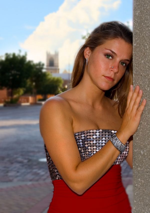
Thanks to Scottsnyde at sxc.hu for the stock
Stock: http://www.sxc.hu/photo/828815
Edit: fix the bracelet
create nose stud (5 years and 3713 days ago)
- 1: Stock - girl

Thanks to Scottsnyde at sxc.hu for the stock
Stock: http://www.sxc.hu/photo/828815
Edit: fix the bracelet
create nose stud (5 years and 3713 days ago)
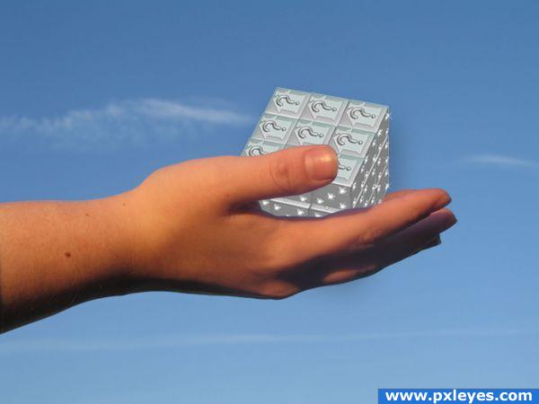
i try to make a Rubik's Cube (5 years and 3845 days ago)
This does remind me of a Rubiks Cube. If I may suggest darkening the part of the cube under the thumb. That area should be in shadow. I also see some dark overspray on the right side of the cube over the sky and also under the hand. I might have made the little dice different colors like a Rubiks Cube but that's just my take on it.
Howdie stranger!
If you want to rate this picture or participate in this contest, just:
LOGIN HERE or REGISTER FOR FREE
(5 years and 3870 days ago)
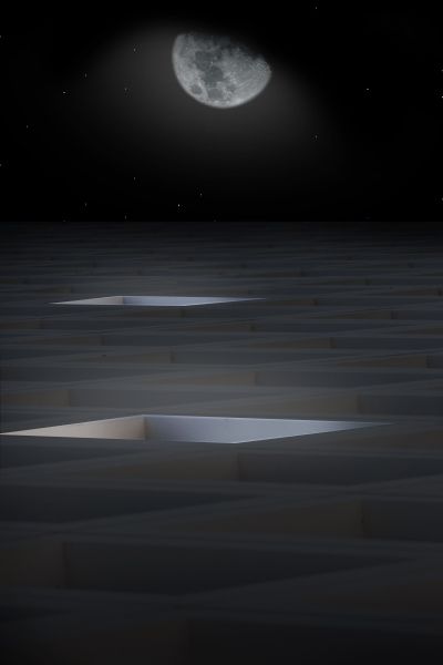
Very interesting take on the source...the glow from the moon should be rounder.
This is a good conception, I'll agree with CMYK46 about the moon glow, but it's still a nice piece 
i like the final effect, good luck!
has a nice look to this
Congrats for your second place!
Congrats!
Howdie stranger!
If you want to rate this picture or participate in this contest, just:
LOGIN HERE or REGISTER FOR FREE
(5 years and 3903 days ago)
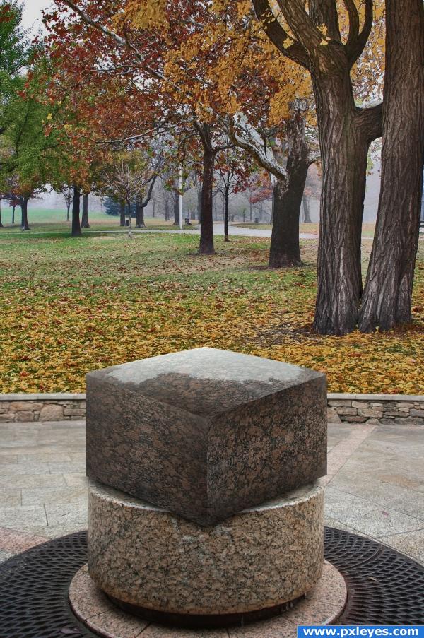
i like this image dont get me wrong...its just some thing about the cube that doesnt look right to me(dont know what it is about it)
nice job, I was thinking about doing that
Good idea, perspective is off....
hm, yea the cube doesnt really look ok. Tried to make it look like the source picture but maybe I should've put it on top of the other stone instead
Hehe, nice one!
It looks out of place..But not bad... good luck author!
nice idea--the stone looks off because there isn't a shadow under it. Try putting a shadow under it.
I added some shadow now. Thanks k5683
Stone the crows this is good
gl
This is the best idea here...well done!!!
your welcome. it looks awesome!
Howdie stranger!
If you want to rate this picture or participate in this contest, just:
LOGIN HERE or REGISTER FOR FREE
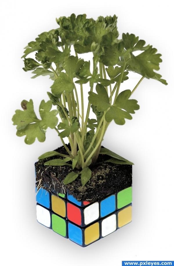
My first contest submission. I was going for a combination of the organic and the mechanical. Created using masks and the cloning stamp tool for color changes. (5 years and 3922 days ago)
Not bad for a first, good luck! 

very nice image (hehehe.. I remember pulling those a part and then reassembling them to solve them, until my brother showed me how to just remove the stickers... OY..hehehe) very nice image good luck
nice image
I like this, but maybe the change should be a little more gradual, to have a more natural bio-mechanic feel to it. Either way it's very nice, so no worries if you're happy with it the way it is. Good luck!
Good job
Like this one good job!!
Interesting...........needs shadow and seperation from background!
very nice 
Howdie stranger!
If you want to rate this picture or participate in this contest, just:
LOGIN HERE or REGISTER FOR FREE
Perspective looks a bit off on the braclet, lovely outcome
Cool...
Nice blend....and a nice work....
nice!
nice...solid blending
Howdie stranger!
If you want to rate this picture or participate in this contest, just:
LOGIN HERE or REGISTER FOR FREE