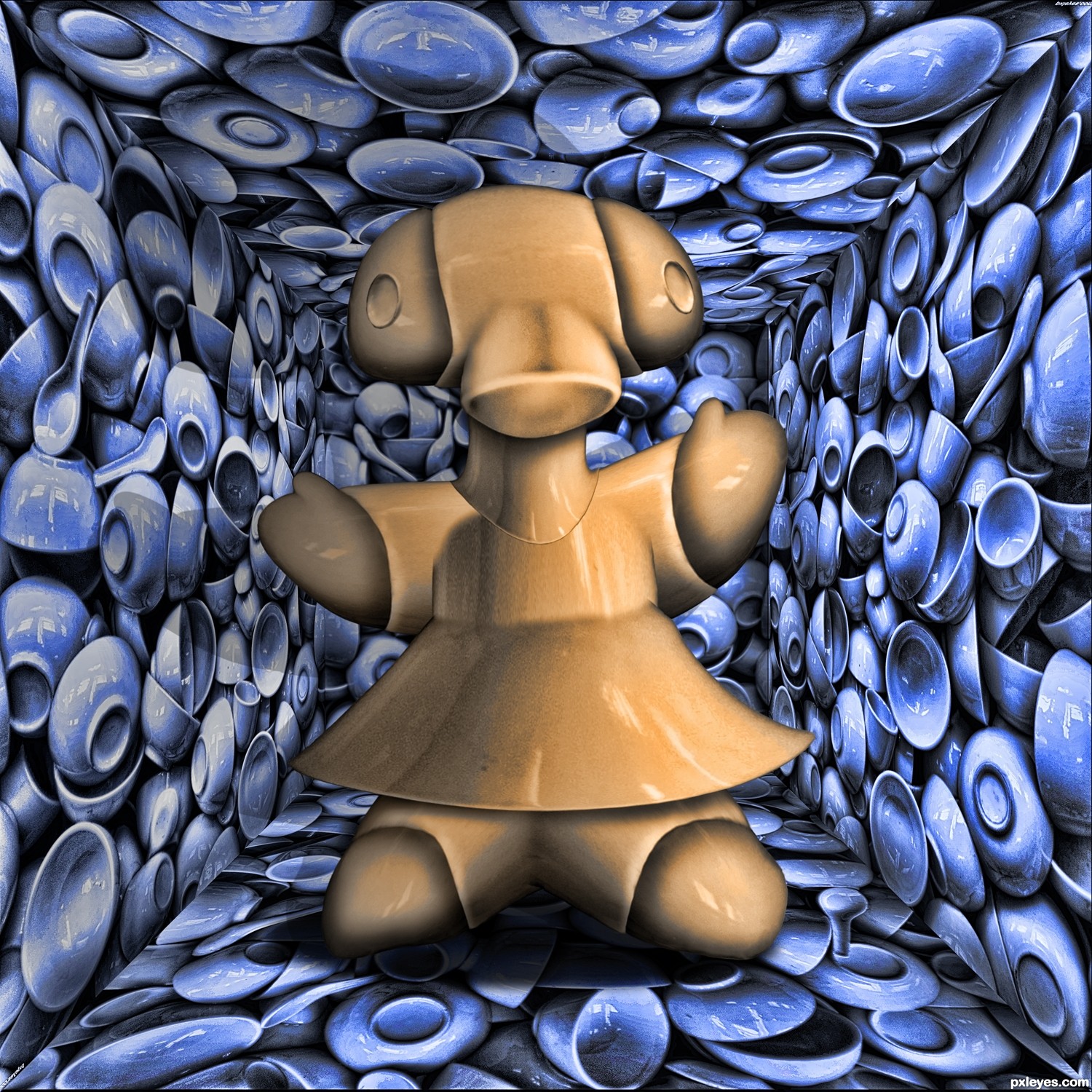
used source only (5 years and 3186 days ago)
Only source image used. (5 years and 3242 days ago)
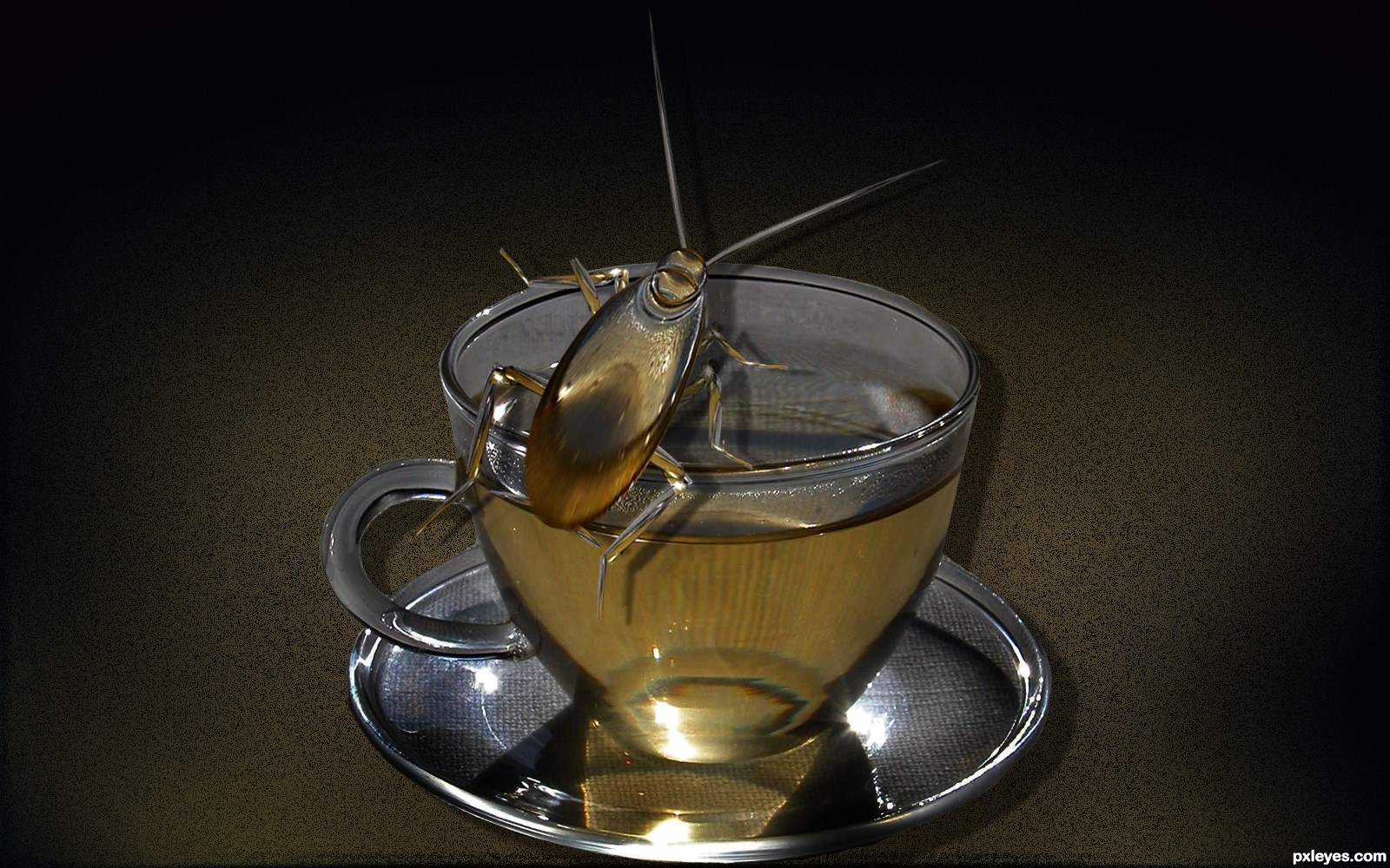
and that tea goes IMMEDIATELY into the garbage.. filthy disgusting creatures... oh GREAT CHOP.. but still.. stomp on him stomp stomp stomp... (we have those guys down here in Florida, and you can't use a brick on them, because if you don't kill them in the first strike, they in turn will now have a weapon)
GOOD LUCK AND SUPER JOB!!!
WOW, great work!!! 
EEEeeeeewwwwwww, get the spray! Any spray, whatever's handy. This Floridian hates them! So creative, tho, author, nice work! 
Congrats 
Thanks all for comments.
wow so cool congrats
Howdie stranger!
If you want to rate this picture or participate in this contest, just:
LOGIN HERE or REGISTER FOR FREE
(5 years and 3244 days ago)
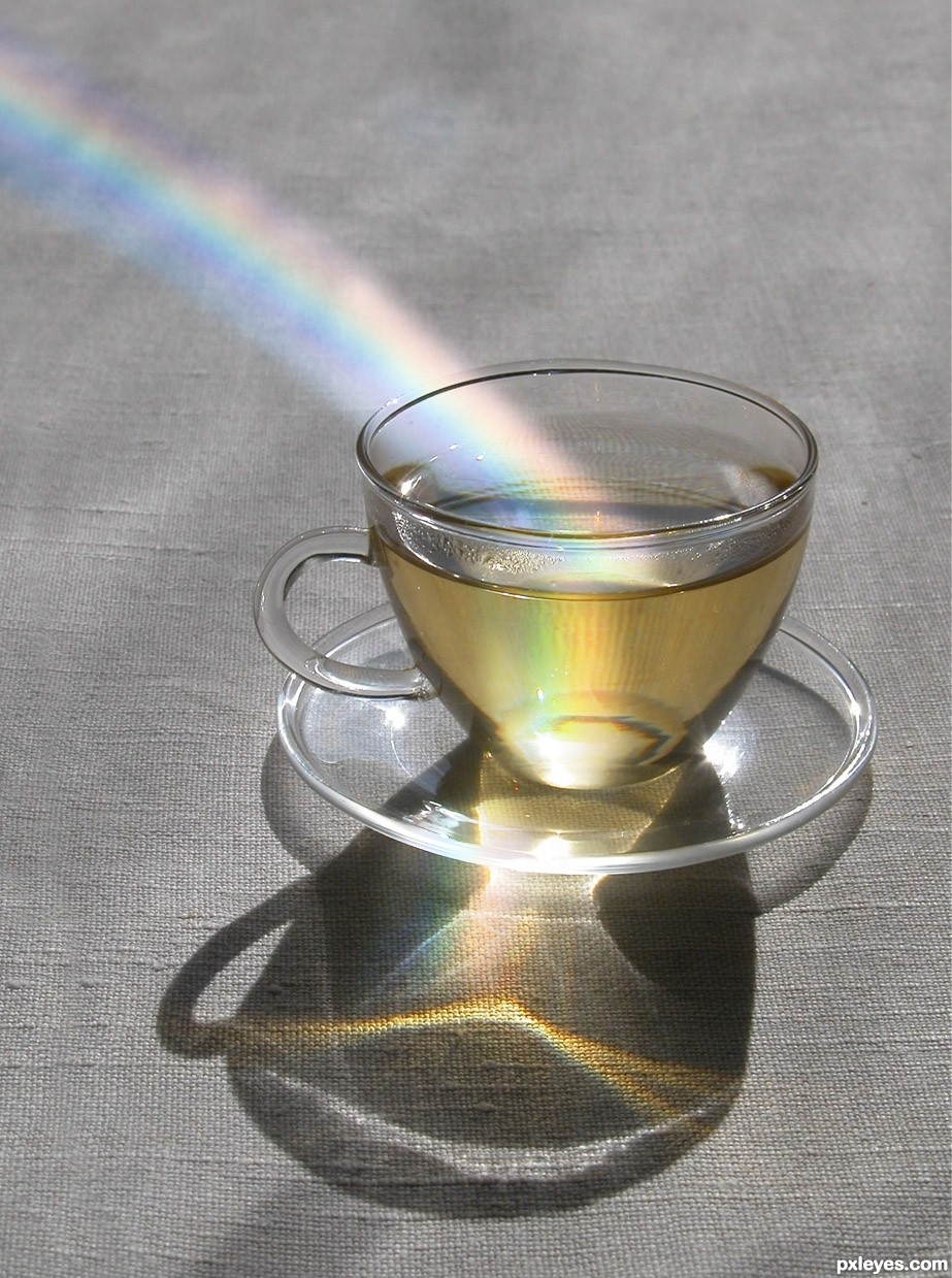
The rainbow wouldn't cast a shadow, as much as the rainbow would also be showing on the canvas beneath the cup, albeit much fainter.
Howdie stranger!
If you want to rate this picture or participate in this contest, just:
LOGIN HERE or REGISTER FOR FREE
(5 years and 3249 days ago)
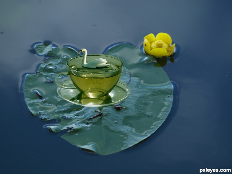
First I decided to keep ant inside then suddenly I kept 2 Swans. I deleted one and kept in lotus.
if you flipped the swan (and cup) it would follow the pattern of shadow of the lily (Light is hitting the back of the swans neck) and flipping it would make the swan face the inside of the creation as opposed to looking out of the picture..(a bit of dark faded disk under cup would give you a grounding shadow).. just a suggestion.. Peeps are such a stickler for shadow accuracy.. the overall image is quite lovely.. (you could even mask out the original shadow of the source and reduce it's opacity and place it into the image (pin light would be an easy add on)
Good luck and IMHO
Thank you for your remarks..i am just being use to photoshop..lot more to learn . I will consider your suggestion and work more ....thank you very much .
It would be better if you would make cup actually pressed in liliy
Thank you I will Take care next Time....
Keep it up..Best of Luck..
Howdie stranger!
If you want to rate this picture or participate in this contest, just:
LOGIN HERE or REGISTER FOR FREE
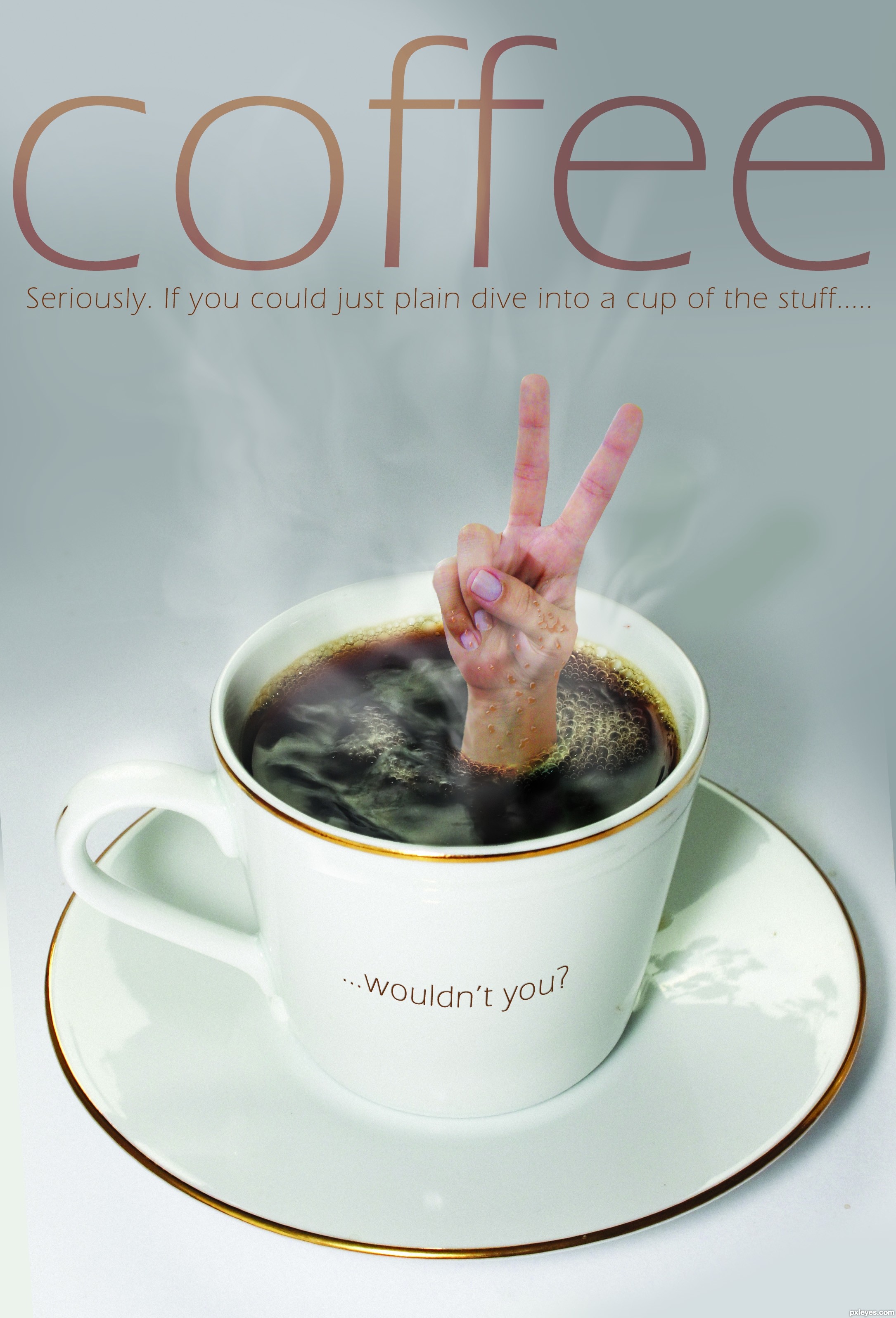
I found two versions of the coffee cup on SCX, one version with bubbles from coffee being poured in and the same cup without the pouring. Melded the two to get a bubbly surface. Also, tilted cup straight, then added in a bit more diffuse grey background.
Sourced a hand, cropped and placed in the middle of the bubbles. Added some more bubbles around the wrist, by duplicating, clipping and flipping a few times. Also used 'multiply' on some of the layers until was happy with the look. Added in some stream by drawing a few lines with big soft brush, then smudging back and forth with different sized brushes, doing this over a few layers, and changing the transparency in places.
Added in the shadow from the fingers. Added in the lettering at the end.
(5 years and 3348 days ago)
Well done, nice result. The hand image is from a it less quality than the coffee cup, but that's a nitpick. Good luck!
Yeah, I might (dive in that is). Nicely done, good luck.
Nice... I think it would be much better if the "... wouldn't you?" was curved to match the curvature of the cup... and yes I'll have one... long black please
Yes, the hand was a bit less quality than the cup...I did actually try to even it up a bit, by adding some 'noise' to the cup image, but didn't want to add too much and spoil *that* image!
Have gone ahead and curved the text to the cup. I had pondered over this at the start, but had decided against it, for some reason. But as it's been mentioned, perhaps I should have gone that way to begin with. Any better, you think?
Nice job! I like the shadow the wrist and hand are casting on the surface of the coffee. My only thought is that the droplets on the hand could be shaded a dark brownish color to help realism.
EDIT: I think it looks better...but perhaps not all need to be the same brown. Vary it up a bit since light refracts differently at different angles. Sorry to nitpick with all these suggestions...just like the image and would like to see it do well.
very very nice work...gl
Have just tweaked the droplets to a brownier/tanner colour on the hand, I hope, to better effect.
Oddly, the coffee doesn't appear toooo dark on the skin in real life (my coffee, anyway - just tried it!), but is darker than previously as in retrospect I agreed - either the drops were too light, or it was a very weak cuppa!
Very nice work on this, Always love the Mary Poppins Bag effect, reminds me when she pulls the lamp out of the bag and in this case you can pull the Person out of the cup
very nice work, love the idea. Only thing I would have suggested (if I would have seen this in time ) is to lessen that pinkish look on the fingers, to try to blend it more in the rest of the image. Cool stuff!
Best entry IMO, great job.
Congrats, well done
congratulations...
Congrats!!
congratulations...
Thanks, everyone, for the congrats, the help and the votes!
Howdie stranger!
If you want to rate this picture or participate in this contest, just:
LOGIN HERE or REGISTER FOR FREE
Photography and photoshop contests
We are a community of people with
a passion for photography, graphics and art in general.
Every day new photoshop
and photography contests are posted to compete in. We also have one weekly drawing contest
and one weekly 3D contest!
Participation is 100% free!
Just
register and get
started!
Good luck!
© 2015 Pxleyes.com. All rights reserved.


Cute concept, love the color contrast.
Sweet ... but poor auntie!
Howdie stranger!
If you want to rate this picture or participate in this contest, just:
LOGIN HERE or REGISTER FOR FREE