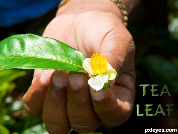
Thanks for the image of leaf and hand by minglespy. (5 years and 3507 days ago)
(5 years and 3577 days ago)
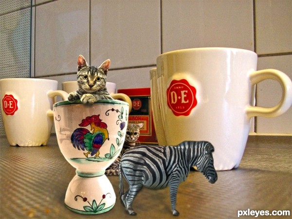
I think it's not only resizing the animals; you have to chop and stick parts... Resizing is easy! 
Author, now it's great! 
Decent photoshop work, silly setting.
Good job and good luck
Silly setting, authors discretion...lol

Howdie stranger!
If you want to rate this picture or participate in this contest, just:
LOGIN HERE or REGISTER FOR FREE
(5 years and 3585 days ago)
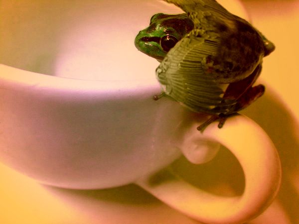
Original image. But why did you change the colors on the cup? The original white colors are a lot better. Also upload a high res 
Very cute... 

i hope u stay in the contest m8, mine is just removed ( a few hours before closing..) cause my image wasnt flying so good luck
Howdie stranger!
If you want to rate this picture or participate in this contest, just:
LOGIN HERE or REGISTER FOR FREE
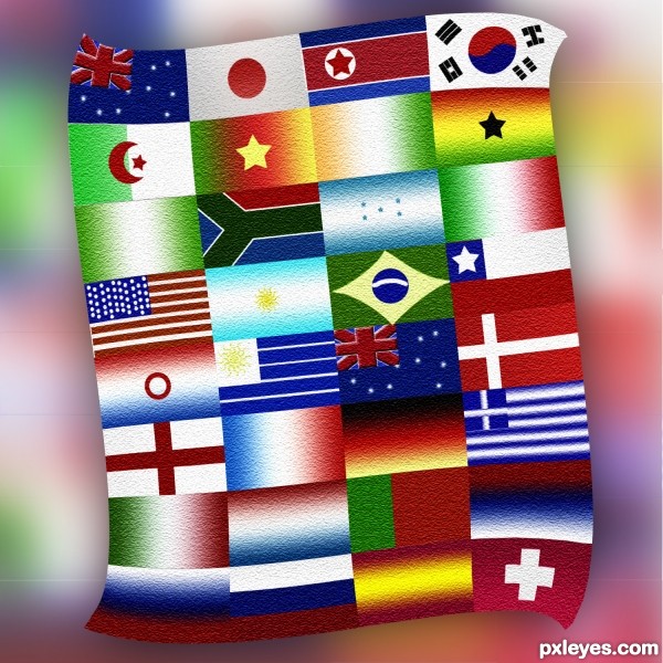
made all flags by myself (5 years and 3627 days ago)
YES!!!!!!!! World Cup! Can't wait. The only time I ever called in sick for work and I was not actually sick was to see France vs Italy in 2006. That was definitely worth it!
Hi points for you!
Nice effort! I suppose you had a lot of work researching all those flags, the colors... 
I'd just like to know what are those lines on the background; if you can remove them it's better. 
nice........ gud luck author..... 
Serbia is there...good,good...lol...nice work author...best of luck
GL
Yay, my flag is in!! weeeeeeeee 
Good Luck! great work!!!!
very smart idea
Howdie stranger!
If you want to rate this picture or participate in this contest, just:
LOGIN HERE or REGISTER FOR FREE
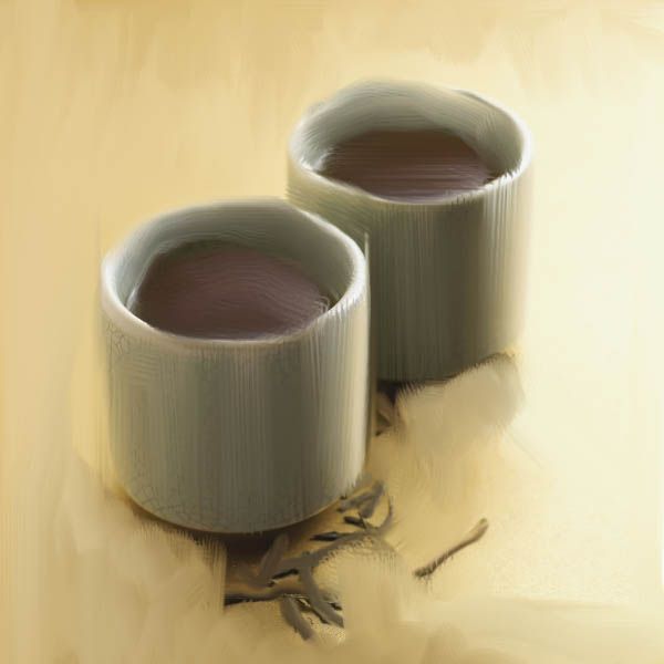
Used just brush tool and smudge tool.
(5 years and 3630 days ago)
Someone has CS5 :P
Yaaa but I used that technique of brushing only for the brown things over there. But I didn't like the effect and again started to use the smudge tool with new 'self-designed' brush.
Best of luck
gud luck
Howdie stranger!
If you want to rate this picture or participate in this contest, just:
LOGIN HERE or REGISTER FOR FREE
Very CBR.
Oh dear, sorry you think that Lamantine, quite a bit of work went into it, and I've seen a LOT worse! (See SBS)
I have to agree with Lamantine!
You only used the source in the text?
...and a 9 step sbs to show it.
i think you could have made the source more relevant to the piece. such as making a background for the hand to be over instead of the original sources background. would have brought more attention to the source image of the contest.
No CMYK46, I also used it for the leaf in the persons hand and used overlay and a few other things - it's all in the sbs. I think jadedink has viewed them, if so - thanks!
Ah jadedink, I used the whole of the background image because it was a tea plantation and that was the whole point of my pic - making the single leaf into a tea leaf. I really don't want to say this: but tea comes from leaves...... THAT'S the point I was making.
my point still is, you can't really SEE the source being used. i mean, i HAD to look at the 9 step sbs just to see if you'd tried to use the source in any other way.
Don't take all of this the wrong way, its just, there are SOOOO many entries in different contests in which the source is minimal, or...barely seen at all. I was just trying to be helpful in suggesting using it in a way which people could see without having to look through 9 steps on how to make a leafy text.
I don't get it...except for being lighter, the leaf is the same as in the source pic.
CKYM46, that's a compliment really although I appreciate that you didn' mean it to be. Well - the leaf is taken from the source image as shown in step 6 of sbs and then I used overlay. So in all the source image is used roughtly nine times in all to create this picture. That's 8 times to make the text and once for the leaf. Now I'm leaving the building!
like the font. good luck Author
It's hard to deny the author's observation that "I've seen a LOT worse!" Nevertheless, this still seems rather slight. Making the text a lot more prominent, and perhaps more of an advertising message instead of just a label, might help.
Seriously, not much use of the source here. I don't need to go to your SBS to see where you used it.
This isn't CBR'd. It's minimal use and you COULD have used more of the source.
Yes, seriously jawshoewhah, you're right!
Howdie stranger!
If you want to rate this picture or participate in this contest, just:
LOGIN HERE or REGISTER FOR FREE