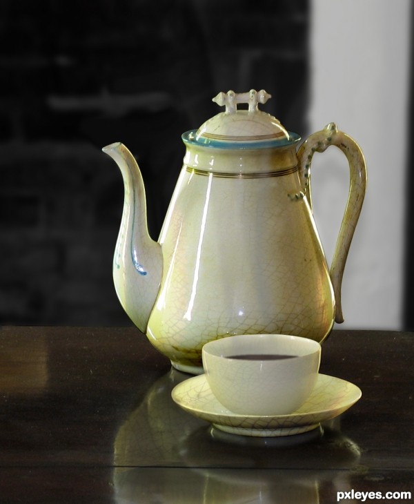
source 1 (5 years and 3634 days ago)
- 1: source1
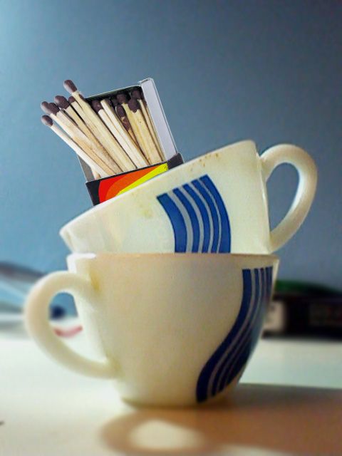
Blur tool,
Bevel and Emboss,
Contour,
Image of Cups is captured by me only, so no use of any external source. (5 years and 3664 days ago)
Future reference: try to upload a high res version when possible.
Howdie stranger!
If you want to rate this picture or participate in this contest, just:
LOGIN HERE or REGISTER FOR FREE
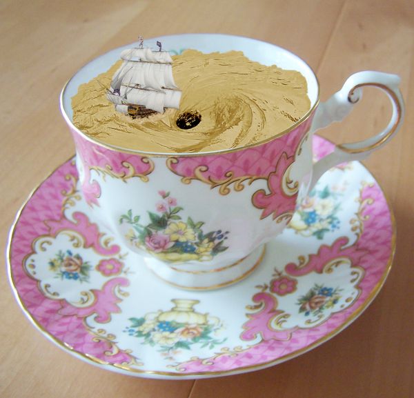
Thanks to arrsistablestock, angelmoon17 and obliteratedstock of deviantart.com for the use of their images. (5 years and 3674 days ago)
nice idea -- the edges of the water (tea) are too smooth the waves and ripples should disrupt the edge -- the colour of the tea seem a bit off (Maybe because it don't take cream) IMHO it would be a better effect if the colour was more tea like
great 
Nice  agree with alan about the color, it could use some contrast. Cool so far good luck author.
Thanks for your comments and tips guys. Much appreciated. Hope this looks better.
edges are good improvement colour of the tea is still a bit odd. I found playing with this image that using comibination of Curves & Hue and saturation layer set to a hard light mode I was able to get a more tea like appearnce to the water
Or change it into a hot chocolate cup! 
Well, thanks again Alan. I really appreciate you taking the time and effort to help me out on this one. I played around with the light modes and this is about as close as I can get it. I think it looks more like the correct colour now.
P.s lol at erikuri. That would have probably been easier 
Unique idea! GL!
Howdie stranger!
If you want to rate this picture or participate in this contest, just:
LOGIN HERE or REGISTER FOR FREE
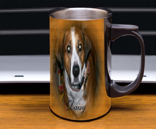
Photo used is my dog Daisy (5 years and 3751 days ago)
Top of cup isn't round after step 2...warp type to match bottom curve.
agrees with cmyk
Hey thanks guys hope this is better
If i never see a reflection in a steel cup again... it will be to soon :P
a little better
Howdie stranger!
If you want to rate this picture or participate in this contest, just:
LOGIN HERE or REGISTER FOR FREE
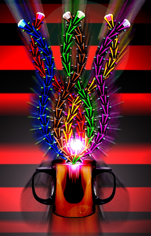
all source (5 years and 3751 days ago)
Creative a nice colors , I like it ! 
Wow, now that's pretty trippy! Unique chop without chopping the source beyond recognition. Way to think outside the mug! (h)
Howdie stranger!
If you want to rate this picture or participate in this contest, just:
LOGIN HERE or REGISTER FOR FREE
Nice job except for the halo around the teapot.
very nice job with the transform tool Just a suggestion, the texture of the jar looks really like the size has been increased (when using the transform tool , all detail is lost in the texture) , i would suggest making a more detailed texture by assembling various texture layers together and by doing the same thing,
  Good luck !
Looking better but IMHO , I think you should increase the opacity, the texture is a bit hard to see, good luck !
Good
Nice job Author.....G/L.
wow, great job putting the texture on the plain white surfaces!
good job
nice chop Author good luck
Really like the job you´ve put into this. It looks very real and conviscing.
High votes from me.
very well done!!! GL
very nice ...... all the best....
Wonderful work.....gl
cool effect
Very realistic look
the steam from the cup damages the look of the big object: 1.it's grey... 2. it looks like a cigarette smoke... long and slim...it would have been looking great without it... GOOD LUCK
Congratulations for 3rd
Congrats for your third place!
congrats nice chop
thanks everybody for the comments and support, they're very helpfull, i appreciate them alot...thanks for the votes....
Congratulations!
congartulations!!!...
Congrats!
Congrats!!
Congrats!
Howdie stranger!
If you want to rate this picture or participate in this contest, just:
LOGIN HERE or REGISTER FOR FREE