(5 years and 3752 days ago)
- 1: source1
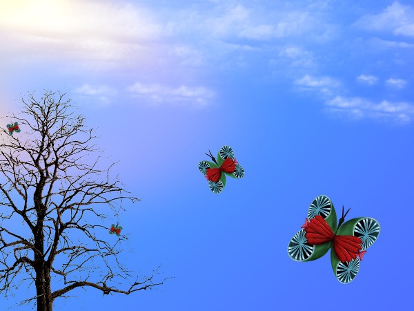
Teacup butterflies source image only - See SBS for details
Providing credit to:
Obsidian Dawn
www.obsidiandawn.com
for Tree Brushes and images
Providing Credit to:
www.ardis-creative.com
for Cloud Brushes (5 years and 3771 days ago)
nice work
I really like the butterflies, but i think your background is a bit weak, I would suggest finding a real sky source, there are plenty out there and good give this a touch of realism, and also the tree is "over masked" and some of the branches seem a bit thin. Nice work withj the butterflies though, very beautiful.
Howdie stranger!
If you want to rate this picture or participate in this contest, just:
LOGIN HERE or REGISTER FOR FREE
(5 years and 3771 days ago)
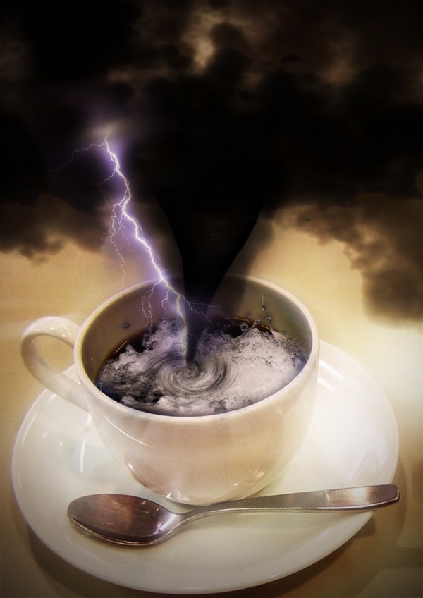
interesting. you could add more lightning 1 
Maybe add a little more detail to the tornado and clouds but still a unique entry.
Funnel cloud is way too hard edged, and needs a swirling effect...you can make this better, it's a good concept.
Howdie stranger!
If you want to rate this picture or participate in this contest, just:
LOGIN HERE or REGISTER FOR FREE
(5 years and 3895 days ago)
nice
Very, very nice.
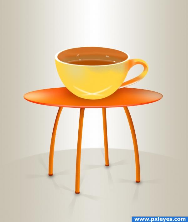
Perspective of top of cup should match the table...
Thats really cool. Nice idea. Theres 2 things i would change about the shadows: 1 nice job on the shadows on the legs but they should all be going nearly the same direction. 2, make the shadow of the cup darker right where te cup meets the table. maybe try the same thing as you did with the legs (just an idea. that might be too much) Great job otherwise!
i love the table! the cups shadow needs more work and the perspective isnt quite threre
Agree with CMYK. If perspective is fixed, might want to consider a flatter shadow from the cup onto the table. Everything else is really good.
nice job
not bad...very simple... but still good
Howdie stranger!
If you want to rate this picture or participate in this contest, just:
LOGIN HERE or REGISTER FOR FREE
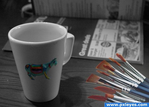
Because the last cup was cc, i've changed the picture, hope you like it (5 years and 3911 days ago)
Very creative idea! It looks very realistic. Good luck 
I don't think, that you can use this source. Don't google images! Instead have a look at the top of the page and click the "resources"-tab. There you find a lot of pages with usable sources.
very clever and different.. Hope this is allowed.. the work is really nice
great idea! looks great! good thing there are a lot of stock images of cups out there 
great entry i think it looks real, i like the shading on the cow good work here author!
should have masked it out better.... try re-doing this with the pen tool.  your lines will be much smoother, the magic wand tool, or quick selection makes it choppy like this.
cup was cc so i changed the source.
Author, please remove your signature. Entries are supposed to be anonymous.
the new image.. the brushes need the edges cleaned and lighting to match the rest of the picture.. still in the same feel of the original submission.. cc will bite you in the rump every time
i agree with golem.. you should work on those brushes more 
thx for the observations i will work more on them
You may also want to a some shadow for the brushes
Just something on CC author: CC means Creative Commens, those are images you are allowed to use overhere it's the copyrighted sources (©) you can't use 
Nice blending of the cow on the cup, it has the right curve and the shadows look OK too 
nice idea . a little work on the shadows etc would improve. GL
Howdie stranger!
If you want to rate this picture or participate in this contest, just:
LOGIN HERE or REGISTER FOR FREE
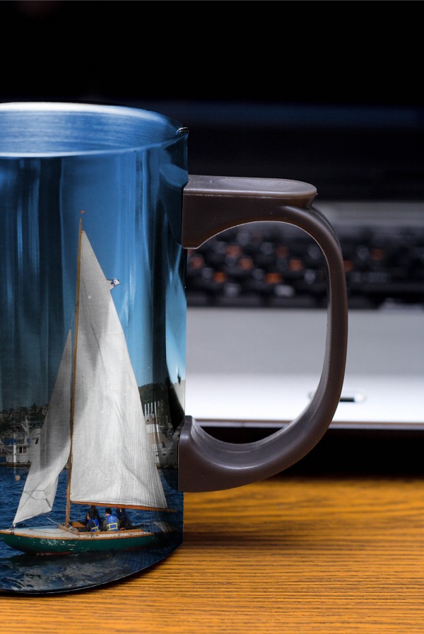
Nicely done.
Beautiful!!! Like how the blue holds on to the metallic feeling
Not too original..
Howdie stranger!
If you want to rate this picture or participate in this contest, just:
LOGIN HERE or REGISTER FOR FREE